Engage NY Eureka Math Algebra 1 Module 1 Lesson 5 Answer Key
Eureka Math Algebra 1 Module 1 Lesson 5 Example Answer Key
Example 1.
Consider the story:
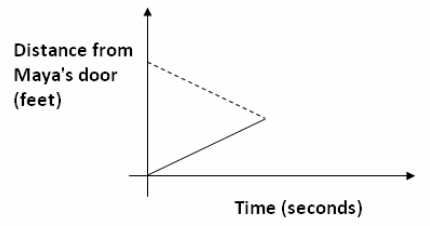
Maya and Earl live at opposite ends of the hallway in their apartment building. Their doors are 50 ft. apart. Each starts at his or her own door and walks at a steady pace toward each other and stops when they meet.
What would their graphing stories look like if we put them on the same graph? When the two people meet in the hallway, what would be happening on the graph? Sketch a graph that shows their distance from Maya’s door.
Eureka Math Algebra 1 Module 1 Lesson 5 Exercise Answer Key
Exploratory Challenge/Exercises 1–4
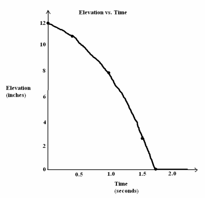
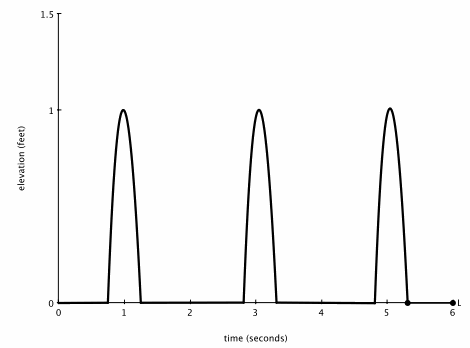
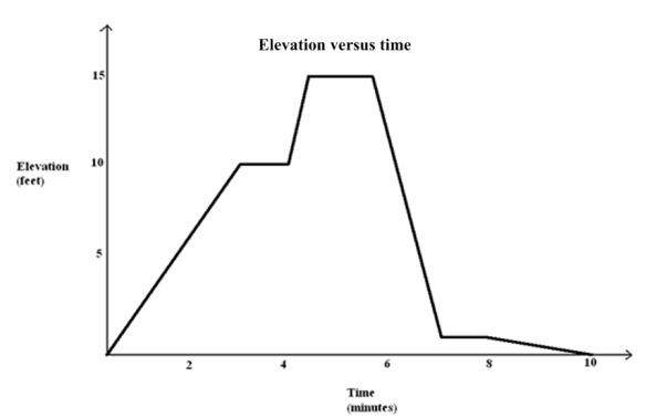
Watch the following graphing story.
http://youtu.be/X956EvmCevI
The video shows a man and a girl walking on the same stairway.
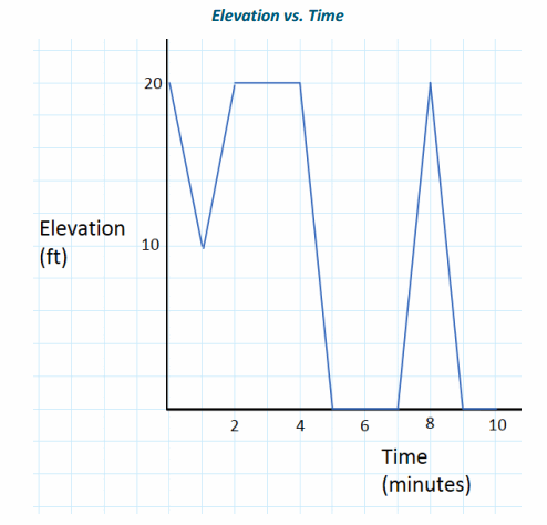
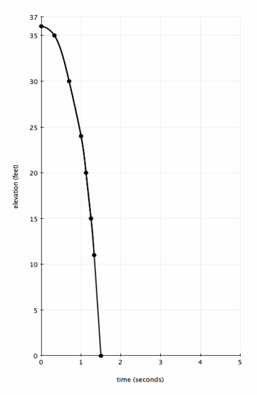
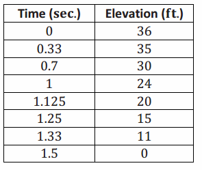
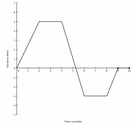
Exercise 1.
Graph the man’s elevation on the stairway versus time in seconds.
Answer:
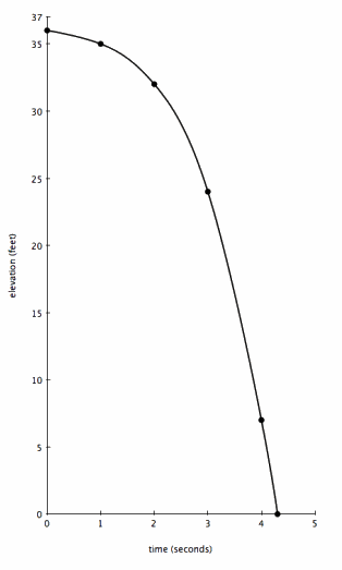
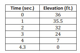
Exercise 2.
Add the girl’s elevation to the same graph. How did you account for the fact that the two people did not start at the same time?
Answer:
Students’ answers should look something like the graph to the right. Student work should also include scales.
Exercise 3.
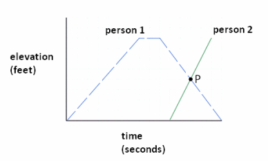
Suppose the two graphs intersect at the point P(24,4). What is the meaning of this point in this situation?
Answer:
Many students will respond that P is where the two people pass each other on the stairway.
Lead a discussion that highlights these more subtle points before proceeding.
→ We have two elevation-versus-time graphs, one for each of the two people (and that time is being measured in the same way for both people).
→ The point P lies on the elevation-versus-time graph for the first person, and it also lies on the elevation-versus-time graph for the second person.
→ We know the coordinates of the point P. These coordinates mean that since the first person is at an elevation of 4 ft. at 24 sec., the second person is also at an elevation of 4 ft. at 24 sec.
Exercise 4.
Is it possible for two people, walking in stairwells, to produce the same graphs you have been using and not pass each other at time 12 sec.? Explain your reasoning.
Answer:
Yes, they could be walking in separate stairwells. They would still have the same elevation of 4 ft. at time 24 sec. but in different locations.
Give students time to revise their work after discussing this with the entire class.
Example 2/Exercises 5–7 (10 minutes)
Exercise 6 has a similar scenario to Example 1. After students work this exercise in small groups, have each group share their results as time permits. Circulate around the classroom providing assistance to groups as needed. Use the results of the exercises in Example 2 to close this session.
Example 2/Exercises 5–7
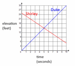
Consider the story:
Duke starts at the base of a ramp and walks up it at a constant rate. His elevation increases by 3 ft. every second. Just as Duke starts walking up the ramp, Shirley starts at the top of the same 25 ft. high ramp and begins walking down the ramp at a constant rate. Her elevation decreases 2 ft. every second.
Exercise 5.
Sketch two graphs on the same set of elevation-versus-time axes to represent Duke’s and Shirley’s motions.
Answer:
Exercise 6.
What are the coordinates of the point of intersection of the two graphs? At what time do Duke and Shirley pass each other?
Answer:
(5,15)
t=5
Exercise 7.
Write down the equation of the line that represents Duke’s motion as he moves up the ramp and the equation of the line that represents Shirley’s motion as she moves down the ramp. Show that the coordinates of the point you found in the question above satisfy both equations.
Answer:
If y represents elevation in feet and t represents time in seconds, then Duke’s elevation is represented by y=3t and Shirley’s elevation is represented by y=25-2t. The lines intersect at (5,15), and this point does indeed lie on both lines.
Duke: 15=3(5) Shirley: 15=25-2(5)
Eureka Math Algebra 1 Module 1 Lesson 5 Problem Set Answer Key
Question 1.
Reread the story about Maya and Earl from Example 1. Suppose that Maya walks at a constant rate of 3 ft. every second and Earl walks at a constant rate of 4 ft. every second starting from 50 ft. away. Create equations for each person’s distance from Maya’s door and determine exactly when they meet in the hallway. How far are they from Maya’s door at this time?
Answer:
Maya’s Equation: y=3t
Earl’s Equation: y=50-4t
Solving the equation 3t=50-4t gives the solution =7 \(\frac{1}{7}\). The two meet at exactly this time at a distance of 3(7 \(\frac{1}{7}\))=21\(\frac{3}{7}\) ft. from Maya’s door.
Question 2.
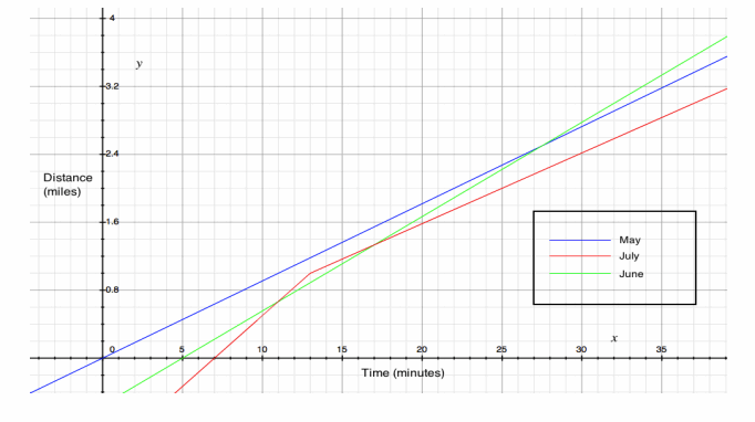
Consider the story:
May, June, and July were running at the track. May started first and ran at a steady pace of 1 mi. every 11 min. June started 5 min. later than May and ran at a steady pace of 1 mi. every 9 min. July started 2 min. after June and ran at a steady pace, running the first lap (\(\frac{1}{4}\) mi.) in 1.5 min. She maintained this steady pace for 3 more laps and then slowed down to 1 lap every 3 min.
a. Sketch May, June, and July’s distance-versus-time graphs on a coordinate plane.
Answer:
b. Create linear equations that represent each girl’s mileage in terms of time in minutes. You will need two equations for July since her pace changes after 4 laps (1 mi.).
Answer:
Equations for May, June, and July are shown below. Notice that July has two equations since her speed changes after her first mile, which occurs 13 min. after May starts running.
May: d=\(\frac{1}{11}\) t
June: d=\(\frac{1}{9}\)(t-5)
July: d=\(\frac{1}{6}\) (t-7)”,” t≤13 “and” d=\(\frac{1}{12}\) (t-13)+1″,” t>13
c. Who was the first person to run 3 mi.?
Answer:
June at time 32 min.
d. Did June and July pass May on the track? If they did, when and at what mileage?
Answer:
Assuming that they started at the same place, June passes May at time 27.5 min. at the 2.5 mi. marker. July does not pass May.
e. Did July pass June on the track? If she did, when and at what mileage?
Answer:
July passes June at time 11 min. at the \(\frac{2}{3}\) mi. marker.
Question 3.
Suppose two cars are travelling north along a road. Car 1 travels at a constant speed of 50 mph for two hours, then speeds up and drives at a constant speed of 100 mph for the next hour. The car breaks down and the driver has to stop and work on it for two hours. When he gets it running again, he continues driving recklessly at a constant speed of 100 mph. Car 2 starts at the same time that Car 1 starts, but Car 2 starts 100 mi. farther north than Car 1 and travels at a constant speed of 25 mph throughout the trip.
a. Sketch the distance-versus-time graphs for Car 1 and Car 2 on a coordinate plane. Start with time 0 and measure time in hours.
Answer:
A graph is shown below that approximates the two cars traveling north.
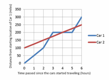
b. Approximately when do the cars pass each other?
Answer:
The cars pass after about 2 \(\frac{1}{2}\) hr., after 4 hr., and after about 5 \(\frac{1}{2}\) hr.
c. Tell the entire story of the graph from the point of view of Car 2. (What does the driver of Car 2 see along the way and when?)
Answer;
The driver of Car 2 is carefully driving along at 25 mph, and he sees Car 1 pass him at 100 mph after about 2 \(\frac{1}{2}\) hr. About 1 \(\frac{1}{2}\) hr. later, he sees Car 1 broken down along the road. After about another 1 \(\frac{1}{2}\) hr., Car 1 whizzes past again.
d. Create linear equations representing each car’s distance in terms of time (in hours). Note that you will need four equations for Car 1 and only one for Car 2. Use these equations to find the exact coordinates of when the cars meet.
Answer:
Using the variables, d for distance (in miles) and t for time (in hours):
Equation for Car 2: d=25t+100
Equations for Car 1:
d=50t, 0≤t≤2
d=100(t-2)+100=100(t-1), 2<t≤3
d=200, 3<t≤5
d=100(t-5)+200=100(t-3), 5<t
Intersection points:
First: solving 100(t-1)=25t+100 gives (\(\frac{200}{75}\), \(\frac{(25)(200)}{75}\)+100)≈(2.7,166.7),
Second: solving 200=25t+100 gives (4,200), and
Third: solving 100(t-3)=25t+100 gives (\(\frac{400}{75}\), \(\frac{(25)(400)}{75}\)+100)≈(5.3,233.3).
Question 4.
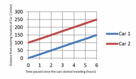
Suppose that in Problem 3 above, Car 1 travels at the constant speed of 25 mph the entire time. Sketch the distance-versus-time graphs for the two cars on a graph below. Do the cars ever pass each other? What is the linear equation for Car 1 in this case?
Answer:
A sample graph is shown below. Car 1 never overtakes Car 2, and they are 100 mi. apart the entire time. The equation for Car 1 is y=25t.
Question 5.
Generate six distinct random whole numbers between 2 and 9 inclusive, and fill in the blanks below with the numbers in the order in which they were generated.
A (0 ,_______), B (_______,_______), C (10 ,_______)
D (0 ,_______), E (10 ,_______).
(Link to a random number generator http://www.mathgoodies.com/calculators/random_no_custom.html)
a. On a coordinate plane, plot points A, B, and C. Draw line segments from point A to point B, and from point B to point C.
b. On the same coordinate plane, plot points D and E and draw a line segment from point D to point E.
c. Write a graphing story that describes what is happening in this graph. Include a title, x- and y-axis labels, and scales on your graph that correspond to your story.
Answer:
Answers will vary depending on the random points generated.
Question 6.
The following graph shows the revenue (or income) a company makes from designer coffee mugs and the total cost (including overhead, maintenance of machines, etc.) that the company spends to make the coffee mugs.
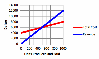
a. How are revenue and total cost related to the number of units of coffee mugs produced?
Answer:
Definition: Profit = Revenue – Cost. Revenue is the income from the sales and is directly proportional to the number of coffee mugs actually sold; it does not depend on the units of coffee mugs produced. Total cost is the sum of the fixed costs (overhead, maintaining the machines, rent, etc.) plus the production costs associated with the number of coffee mugs produced; it does not depend on the number of coffee mugs sold.
b. What is the meaning of the point (0,4000) on the total cost line?
Answer:
The overhead costs, the costs incurred regardless of whether 0 or 1,000 coffee mugs are made or sold, is $4,000.
c. What are the coordinates of the intersection point? What is the meaning of this point in this situation?
Answer:
(500,6000). The revenue, $6,000, from selling 500 coffee mugs, is equal to the total cost, $6,000, of producing 500 coffee mugs. This is known as the break-even point. When Revenue = Cost, the Profit is $0. After this point, the more coffee mugs sold, the more the positive profit; before this point, the company loses money.
d. Create linear equations for revenue and total cost in terms of units produced and sold. Verify the coordinates of the intersection point.
Answer:
If u is a whole number for the number of coffee mugs produced and sold, C is the total cost to produce u mugs, and R is the total revenue when u mugs are sold, then
C=4000+4u,
R=12u.
When u=500, both C=4000+4∙500=6000 and R=12∙500=6000.
e. Profit for selling 1,000 units is equal to revenue generated by selling 1,000 units minus the total cost of making 1,000 units. What is the company’s profit if 1,000 units are produced and sold?
Answer:
Profit = Revenue – Total Cost. Hence,
P=R-C=12∙1000-(4000+4∙1000)=12000-8000=4000
The company’s profit is $4,000.
Eureka Math Algebra 1 Module 1 Lesson 5 Exit Ticket Answer Key
Maya and Earl live at opposite ends of the hallway in their apartment building. Their doors are 50 ft. apart. Each person starts at his or her own door and walks at a steady pace toward the other. They stop walking when they meet.
Suppose:
→ Maya walks at a constant rate of 3 ft. every second.
→ Earl walks at a constant rate of 4 ft. every second.

Answer;
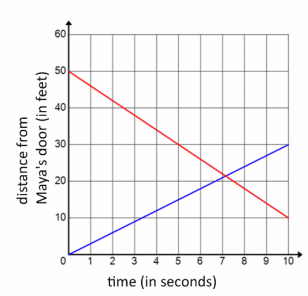
Question 1.
Graph both people’s distance from Maya’s door versus time in seconds.
Answer:
Graphs should be scaled and labeled appropriately. Maya’s graph should start at (0,0) and have a slope of 3, and Earl’s graph should start at (0,50) and have a slope of -4.
Question 2.
According to your graphs, approximately how far will they be from Maya’s door when they meet?
Answer:
The graphs intersect at approximately 7 sec. at a distance of about 21 ft. from Maya’s door.