Go through the enVision Math Common Core Grade 8 Answer Key Topic 4 Investigate Bivariate Data and finish your homework or assignments.
enVision Math Common Core 8th Grade Answers Key Topic 4 Investigate Bivariate Data
3-ACT MATH
Reach Out
Reach for the skies! Who in your class can reach the highest? That height depends on how tall each person is and the lengths of their arms.
Now stick your arms out to your sides. Sometimes this horizontal distance is called your wingspan. The wandering albatross can have a wingspan of up to 12 feet. How does your wingspan compare? Think about this during the 3-Act Mathematical Modeling lesson.
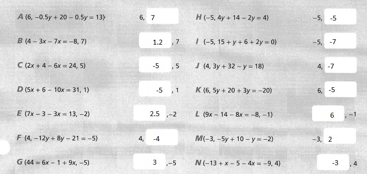
enVision STEM Project
Did You Know?
A fishery biologist collects data on fish, such as the size and health of the fish population in a particular body of water.
Largemouth bass and smallmouth bass are the most popular game fish in North America.

Biologists often use tagging studies to estimate fish population, as well as to estimate catch and harvest rates.

The average lifespan of bass is about 16 years, but some have lived more than 20 years.
Research suggests that bass can see red better than any other color on the spectrum.

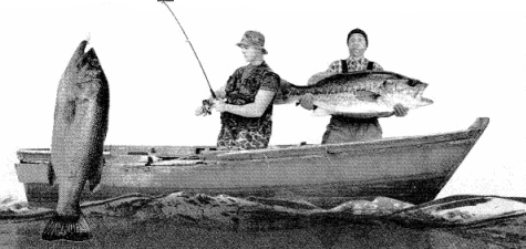
Your Task: How Many Fish?
Suppose a fishery biologist takes 500 basses from a lake, tags them, and then releases them back into the water. Several days later, the biologist nets a sample of 200 basses, of which 30 are tagged. How many basses are in the lake? You and your classmates will explore how the biologist can use sampling to describe patterns and to make generalizations about the entire population.

Answer:
It is given that
A fishery biologist takes 500 basses from a lake, tags them, and then releases them back into the water. Several days later, the biologist nets a sample of 200 basses, of which 30 are tagged.
So,
The total number of basses = 500 + 200
= 700
The number of basses tagged = 30
So,
After netting, the number of basses = 700 – 30
= 670
Hence, from the above,
We can conclude that after the biologist nets 200 basses,
The total number of basses present are: 670
Topic 4 GET READY!
Review What You Know!
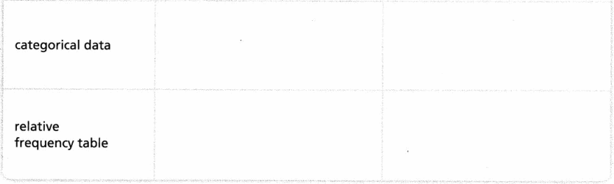
Vocabulary
Choose the best term from the box to complete each definition.
Question 1.
____ is the change in y divided by the change in x.
Answer:
We know that,
“Slope” is the change in y divided by the change in x
Hence, from the above,
We can conclude that the best term to complete the given definition is: Slope
Question 2.
A relationship where for every x units of one quantity there are y units of another quantity is a ____
Answer:
We know that,
A relationship where for every x units of one quantity, there are y units of another quantity is a “Ratio”
Hence, from the above,
We can conclude that the best term to complete the given definition is: Ratio
Question 3.
The ____ is the horizontal line in a coordinate plane.
Answer:
We know that,
The “X-axis” is the horizontal line in a coordinate plane
Hence, from the above,
We can conclude that the best term to complete the given definition is: X-axis
Question 4.
The ___ is the vertical line in a coordinate plane.
Answer:
We know that,
The “Y-axis” is the vertical line in a coordinate plane
Hence, from the above,
We can conclude that the best term to complete the given definition is: Y-axis
Graphing Points
Graph and label each point on the coordinate plane.
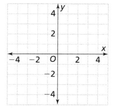
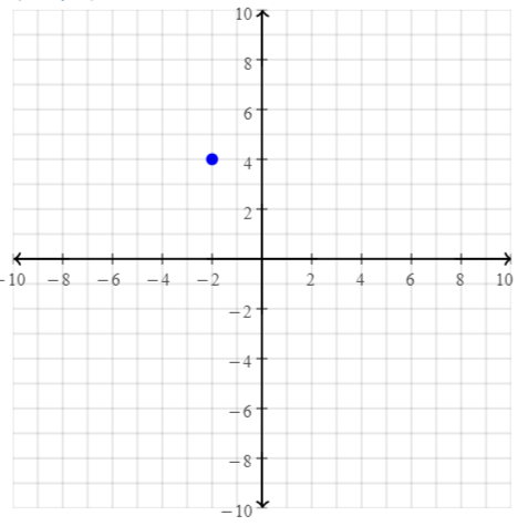
Question 5.
(-2, 4)
Answer:
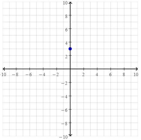
Question 6.
(0, 3)
Answer:
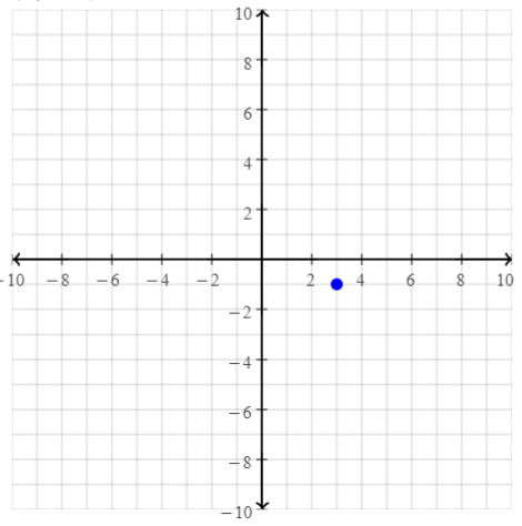
Question 7.
(3, -1)
Answer:
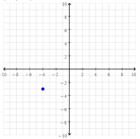
Question 8.
(-4, -3)
Answer:
Finding Slope
Find the slope between each pair of points.
Question 9.
(4, 6) and (-2, 8)
Answer:
The given points are: (4, 6), (-2, 8)
Compare the given points with (x1, y1), (x2, y2)
Now,
We know that,
Slope = y2 – y1 / x2 – x1
So,
Slope = \(\frac{8 – 6}{-2 – 4}\)
= \(\frac{2}{-6}\)
= –\(\frac{1}{3}\)
Hence, from the above,
We can conclude that the slope between the given points is: –\(\frac{1}{3}\)
Question 10.
(-1, 3) and (5,9)
Answer:
The given points are: (-1, 3), (5, 9)
Compare the given points with (x1, y1), (x2, y2)
Now,
We know that,
Slope = y2 – y1 / x2 – x1
So,
Slope = \(\frac{9 – 3}{5 + 1}\)
= \(\frac{6}{6}\)
= 1
Hence, from the above,
We can conclude that the slope between the given points is: 1
Question 11.
(5, -1) and (-3, -7)
Answer:
The given points are: (5, -1), (-3, -7)
Compare the given points with (x1, y1), (x2, y2)
Now,
We know that,
Slope = y2 – y1 / x2 – x1
So,
Slope = \(\frac{-7 + 1}{-3 – 5}\)
= \(\frac{-6}{-8}\)
= \(\frac{3}{4}\)
Hence, from the above,
We can conclude that the slope between the given points is: \(\frac{3}{4}\)
Writing Fractions as Percents
Question 12.
Explain how to write \(\frac{36}{60}\) as a percent.
Answer:
The given fraction is: \(\frac{36}{60}\)
We know that,
1 = 100%
So,
\(\frac{36}{60}\)
= \(\frac{36}{60}\) × 100%
= \(\frac{36 × 100%}{60}\)
= 60%
Hence, from the above,
We can conclude that the value of \(\frac{36}{60}\) as a percent is: 60%
Language Development
Complete the graphic organizer. Write the definitions of the terms in your own words. Use words or a sketch to show an example.

Answer:
Topic 4 PICK A PROJECT
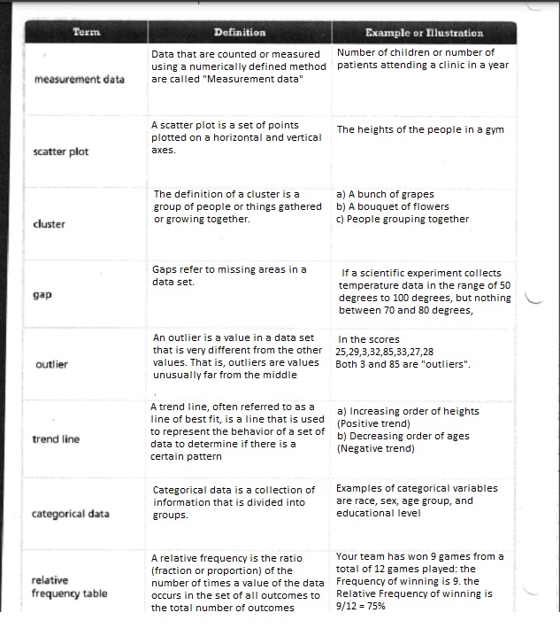
PROJECT 4A
What carnival games do you have a good chance of winning, and why?
PROJECT: BUILD A CARNIVAL GAME
PROJECT 4B
If you had a superpower, what would it be?
PROJECT: SUMMARIZE SUPERHERO DATA
PROJECT 4C
What makes a song’s lyrics catchy?
PROJECT: WRITE A SONG

PROJECT 4D
How does your dream job use math?
PROJECT: RESEARCH A CAREER

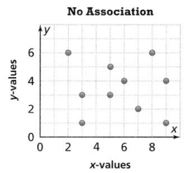
Lesson 4.1 Construct and Interpret Scatter Plots
Solve & Discuss It!
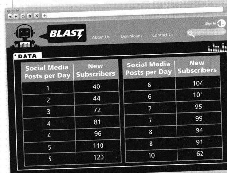
Luciana is starting a two-week social media campaign to attract new subscribers to Blaston, a music website for teens. She has the following data from her last campaign to help plan her strategy.
Look for Relationships
How are the number of media posts and the number of subscribers related?
Answer:
The given data is:
If we observe the total data,
We can find that there is no particular pattern for the given data
But, if we observe the given data in parts, then
From 1 – 5 posts per day,
Social media posts per day ∝ New subscribers
From 8 – 10 posts per day,
Social media posts per day ∝ \(\frac{1}{New subscribers}\)
From 6 – 7 posts per day,
There is no pattern between the social media posts per day and the number of subscribers
Based on this data, what should be Luciana’s strategy for the new campaign?
Answer:
Based on the pattern of the given data (As mentioned above),
Luciana’s strategy for the new campaign must be:
The social media posts per day and the new subscribers must be in an increasing trend only
Focus on math practices
Use Structure What patterns do you see in the data from Luciana’s last social media campaign?
Answer:
If we observe the total data,
We can find that there is no particular pattern for the given data
But, if we observe the given data in parts, then
From 1 – 5 posts per day,
Social media posts per day ∝ New subscribers
From 8 – 10 posts per day,
Social media posts per day ∝ \(\frac{1}{New subscribers}\)
From 6 – 7 posts per day,
There is no pattern between the social media posts per day and the number of subscribers
Essential Question
How does a scatter plot show the relationship between paired data?
Answer:
The scatter diagram graphs pairs of numerical data, with one variable on each axis, to look for a relationship between them. If the variables are correlated, the points will fall along a line or curve. The better the correlation, the tighter the points will hug the line.
Try It!
Luciana collects data about the number of entries and the ages of the subscribers who enter the concert giveaway.
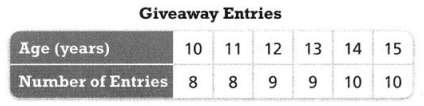
The point that represents the data in the fourth column has coordinates 
Answer:
The given data is:
Now,
We know that,
The x-axis always represents the independent variables
The y-axis always represents the dependent variables
So,
From the given data,
The independent variable (x) is: Age
The dependent variable (y) is: Number of entries
We know that,
The ordered pair must be in the form of (x, y)
Hence, from the above,
We can conclude that the point that represents the data in the fourth column has coordinates (13, 9)
Convince Me!
Explain how Luciana would choose scales for the x-axis and y-axis.
Answer:
In a graph,
The scales for the x-axis and the y-axis is nothing but the rate of change between the values of x and y
Ex:
The given data is:
From the above data,
The scale for the x-axis is:
Rate of change between the values of x = 11 – 10 (or) 12 – 11 and so on
= 1
The scale for the y-axis is:
Rate of change between the values of y = 9 – 8 (or) 10 – 9
= 1
Hence, from the above,
We can conclude that
The scale for the x-axis is:
1 unit = 1 year
The scale for the y-axis is:
1 unit = 1 Entry
Try It!
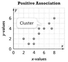
Avery also tracks the number of minutes a player plays and the number of points the player scored. Describe the association between the two data sets. Tell what the association suggests.
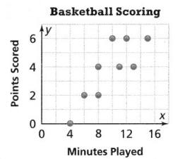
Answer:
It is given that
Avery also tracks the number of minutes a player plays and the number of points the player scored.
So,
The given scatter plot is:
Now,
From the given scatter plot,
We can observe that the overall pattern is in an increasing trend
But,
When we observe the number of points in the perspective of minutes,
The pattern is in clusters
Now,
At 4 minutes,
The number of points scored is: 0
At 6 and 8 minutes,
The number of points scored is: 2
Between 8 and 14 minutes,
The number of points scored is: 4
Between 10 and 16 minutes,
The number of points scored is: 6
KEY CONCEPT
A scatter plot shows the relationship, or association, between two sets of data.
The y-values increase as the x-values increase.
The y-values decrease as the x-values increase.
There is no consistent pattern between the y-values and the x-values.
Do You Understand?
Question 1.
? Essential Question
How does a scatter plot show the relationship between paired data?
Answer:
The scatter diagram graphs pairs of numerical data, with one variable on each axis, to look for a relationship between them. If the variables are correlated, the points will fall along a line or curve. The better the correlation, the tighter the points will hug the line.
Question 2.
Model with Math
Marcy always sleeps fewer than 9 hours each night and has never scored more than 27 points in a basketball game. A scatter plot suggests that the more sleep she gets, the more she scores. What scales for the axes might be best for constructing the scatter plot?
Answer:
It is given that
Marcy always sleeps fewer than 9 hours each night and has never scored more than 27 points in a basketball game. A scatter plot suggests that the more sleep she gets, the more she scores.
So,
The scales for the axes that might be best is:
For the x-axis:
It is given that Macy always sleeps fewer than 9 hours
So,
The scale might be: 1 unit starting from 9 to 24
For the y-axis:
It is given that Macy never scored more than 27 points in a basketball game
So,
The scale might be: 1 unit starting from 27 to the corresponding last value of x
Hence, from the above,
We can conclude that
For the x-axis,
The scale is:
1 unit = 1 hour
For the y-axis,
The scale is:
1 unit = 1 point
Question 3.
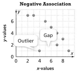
Construct Arguments Kyle says that every scatter plot will have a cluster, gap, and outlier. Is he correct? Explain.
Answer:
We know that,
A scatter plot might have a cluster, a gap, and an outlier or the association of any two but not all three are present
Hence, from the above,
We can conclude that Kyle is not correct
Do You Know How?
Question 4.
Phoebe constructs a scatter plot to show the data. What scales could she use for the x- and y-axes?
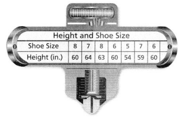
Answer:
It is given that
Phoebe constructs a scatter plot to show the data.
Note:
The scatter plot is drawn only for the relations that are functions and we know that the rate of change is constant for a function
Now,
The given data is:
From the given data,
The scale she could use for the x-axis will be 1 unit
The scale she might use for the y-axis will be: 1 unit
Hence, from the above,
We can conclude that
The scale used for the x-axis is:
1 unit = 1 inch (Shoe size)
The scale used for the y-axis is:
1 unit = 1 inch (Height)
Question 5.
Germaine constructs a scatter plot to show how many people visit different theme parks in a month. Why might clusters and outliers be present?
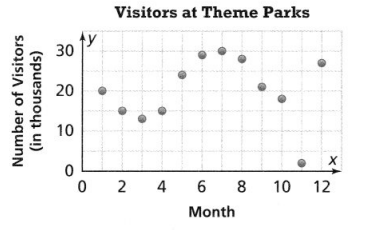
Answer:
It is given that
Germaine constructs a scatter plot to show how many people visit different theme parks in a month
Now,
The given scatter plot is:
From the given scatter plot,
We can observe that the graph is non-linear
We know that,
A cluster is a group of objects, numbers, data points (information), or even people that are located close together
An outlier is a value in a data set that is very different from the other values. That is, outliers are values unusually far from the middle
So,
From the given scatter plot,
We can observe that there are 2 points that are far from the pattern and those points are called “Outliers”
Since the scatter plot is non-linear, the points will be grouped together and the group of points is called “Clusters”
Practice & Problem Solving
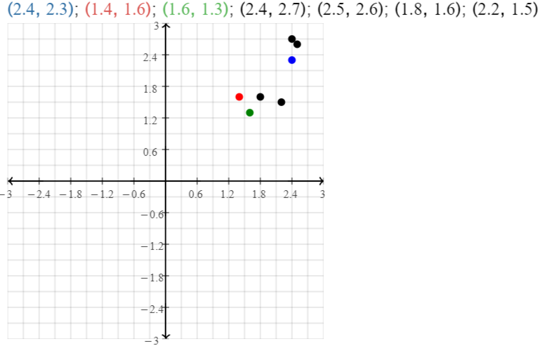
Question 6.
Leveled Practice The table shows the racing times in minutes for the first two laps in a race. Complete the scatter plot.
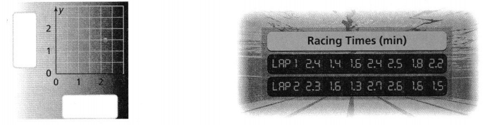
Answer:
It is given that
The table shows the racing times in minutes for the first two laps in a race
Now,
In the graph,
The x-axis represents: The racing times of Lap 1
The y-axis represents: The racing times of Lap 2
Hence,
The completed scatter plot with the x-axis and y-axis is:
Question 7.
The scatter plot represents the prices and number of books sold in a bookstore.
a. Identify the cluster in the scatter plot and explain what it means.
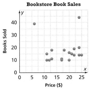
Answer:
It is given that
The scatter plot represents the prices and number of books sold in a bookstore.
Now,
The given scatter plot is:
Now,
We know that,
A cluster is a group of objects, numbers, data points (information), or even people that are located close together
So,
From the above scatter plot,
We can observe that the clusters are present between the intervals of 10 books sold and 20 books sold
b. Generalize How does the scatter plot show the relationship between the data points? Explain.
Answer:
The scatter diagram graphs pairs of numerical data, with one variable on each axis, to look for a relationship between them. If the variables are correlated, the points will fall along a line or curve. The better the correlation, the tighter the points will hug the line.
Question 8.
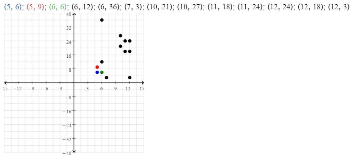
The table shows the monthly attendance in thousands at museums in one country over a 12-month period.
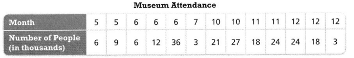
a. Complete the scatter plot to represent the data.
Answer:
It is given that
The table shows the monthly attendance in thousands at museums in one country over a 12-month period.
Now,
The given data is:
Hence,
The representation of the scatter plot for the given data is:
b. Identify any outliers in the scatter plot.
Answer:
We know that,
A value that “lies outside” (is much smaller or larger than) most of the other values in a set of data is called an “Outlier”
Hence, from the above,
We can conclude that
The outliers in the scatterplot are at (12, 3), (6, 36)
c. What situation might have caused an outlier?
Answer:
From part (b),
The outliers in the scatterplot are at (12, 3), (6, 36)
So,
From the given points,
We can conclude that the number of people is very low at that particular month to cause the situation of outliers
Question 9.
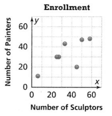
Higher-Order Thinking The table shows the number of painters and sculptors enrolled in seven art schools. Jashar makes an incorrect scatter plot to represent the data.
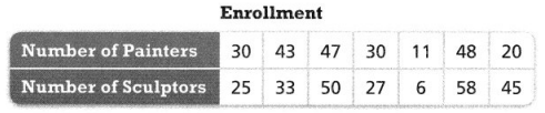
a. What error did Jashar likely make?
Answer:
It is given that
The table shows the number of painters and sculptors enrolled in seven art schools.
Now,
The given data is:
So,
From the given data,
We can observe that
The variable that will be on the x-axis (Independent variable) is: Number of painters
The variable that will be on the y-axis (Dependent variable) is: Number of sculptors
But,
From the scatter plot drawn by Jashar,
He interchanged the variables of the axes i.e., he took the independent variable at the y-axis and the dependent variable at the x-axis
Hence, from the above,
We can conclude that the error made by Jashar is the interchange of the variables of the axes
b. Explain the relationship between the number of painters and sculptors enrolled in the art schools.
Answer:
From the given data,
We can observe that for the increase in painters, the number of sculptors also increases
Hence, from the above,
We can conclude that the relationship between the number of painters and sculptors enrolled in the art schools is:
Number of painters ∝ Number of sculptors
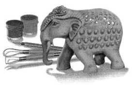
c. Reasoning Jashar’s scatter plot shows two possible outliers. Identify them and explain why they are outliers.
Answer:
We know that,
A value that “lies outside” (is much smaller or larger than) most of the other values in a set of data is called an “Outlier”
Now,
The scatter plot for the given data is:
Hence, from the above,
We can conclude that the two possible outliers identified by Jashar are: (11, 6), and (20, 45)
Assessment Practice
Use the scatter plot to answer 10 and 11.
Question 10.
Ten athletes in the Florida Running Club ran two races of the same length. The scatter plot shows their times. Select all statements that are true.
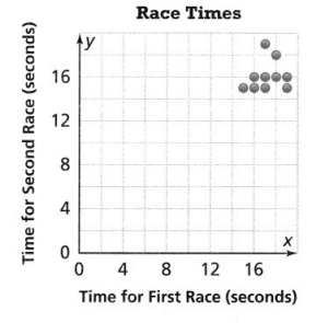
![]() Nine of the times for the first race were at least 16 seconds.
Nine of the times for the first race were at least 16 seconds.
![]() Eight of the times for the second race were less than 17 seconds.
Eight of the times for the second race were less than 17 seconds.
![]() There were seven athletes who were faster in the second race than in the first.
There were seven athletes who were faster in the second race than in the first.
![]() There were three athletes who had the same time in both races.
There were three athletes who had the same time in both races.
![]() There were three athletes whose times in the two races differed by exactly 1 second.
There were three athletes whose times in the two races differed by exactly 1 second.
Answer:
It is given that
Ten athletes in the Florida Running Club ran two races of the same length. The scatter plot shows their times.
Now,
The given scatter plot is:
Hence,
The correct statements about the given scatter plot is: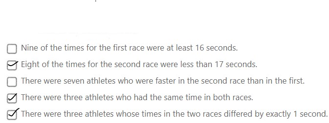
Question 11.
What was the greatest difference for a single runner in finishing times in the races?
A. 3 seconds
B. 4 seconds
C. 5 seconds
D. 7 seconds
Answer:
From the given scatter plot,
We can observe that
The lowest time a runner takes for completing a race is approximately 14 seconds
The highest time a runner takes for completing a race is approximately 17 seconds
So,
The greatest difference for a single runner in finishing times in the races is: 3 seconds
Hence, from the above,
We can conclude that option A matches the given situation
Lesson 4.2 Analyze Linear Associations
Solve & Discuss It!
Angus has a big test coming up. Should he stay up and study or go to bed early the night before the test? Defend your recommendation.
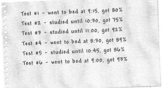
Answer:
It is given that
Angus has a big test coming up
Now,
The relationship between the sleeping time and the percentage of marks is also given
Now,
From the given data,
We can observe that
If he went to bed early i.e., at 9:00, then he got 93%
If he studied until 11:00, then he got only 92%
Hence, from the above,
We can conclude that Angus has to go to bed early before the big test
Generalize
Can you make a general statement about which option leads to a better result?
Answer:
Generally, going to bed early will lead to better results before a test
Focus on math practices
Construct Arguments What other factors should Angus also take into consideration to make a decision? Defend your response.
Answer:
The other factors that Angus should also take into consideration when making a decision are:
A) Nature of the exam
B) Coverage of the topics for the particular exam
C) Number of revisions
? Essential Question
How can you describe the association of two data sets?
Answer:
Association (or relationship) between two variables will be described as strong, weak, or none; and the direction of the association may be positive, negative, or none
Try It!
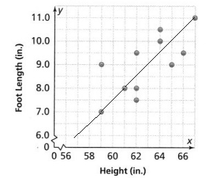
Georgia and her classmates also measured their foot length. Use a pencil to find the trend line. Sketch the trend line for the scatter plot.
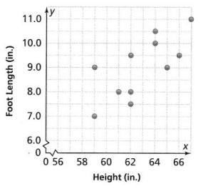
Answer:
It is given that
Georgia and her classmates also measured their foot length
Hence,
The representation of a trend line for the given scatter plot is:
Try It!
For each scatter plot, identify the association between the data. If there is no association, state so.
a.
Answer:
The given scatter plot is:
From the above scatter plot,
We can observe that the points are all scattered
Hence, from the above,
We can conclude that the given scatter plot has a weaker association
b.
Answer:
The given scatter plot is:
From the given scatter plot,
The points are all in a non-linear shape
Hence, from the above,
We can conclude that the given scatter plot has a non-linear association
c.
Answer:
The given scatter plot is:
From the scatter plot,
We can observe that the points are all scattered
Hence, from the above,
We can conclude that the given scatter plot has a weaker association
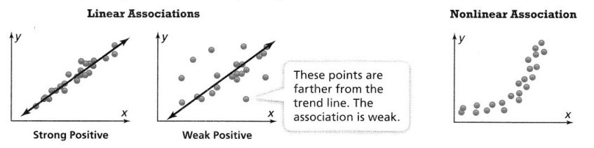
KEY CONCEPT
Scatter plots can show a linear association, a nonlinear association, or no association. For scatter plots that suggest a linear association, you can draw a trend line to show the association. You can assess the strength of the association by looking at the distances of plotted points from the trend line.
Do You Understand?
Question 1.
? Essential Question How can you describe the relationship between the two sets of data?
Answer:
Association (or relationship) between two variables will be described as strong, weak, or none; and the direction of the association may be positive, negative, or none
Question 2.
Look for Relationships How does a trend line describe the strength of the association?
Answer:
The straight line is a trend line, designed to come as close as possible to all the data points. The trend line has a positive slope, which shows a positive relationship between X and Y. The points in the graph are tightly clustered about the trend line due to the strength of the relationship between X and Y.
Question 3.
Construct Arguments How does the scatter plot of a nonlinear association differ from that of a linear association?
Answer:
Scatterplots with a linear pattern have points that seem to generally fall along a line while nonlinear patterns seem to follow along some curve. Whatever the pattern is, we use this to describe the association between the variables.
Do You Know How?
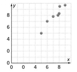
Question 4.
Describe the association between the two sets of data in the scatter plot.
Answer:
The given scatter plot is:
From the given scatter plot,
We can observe that all the points are tightly hugged by a trend line
Hence, from the above,
We can conclude that the given scatter plot has a stronger association
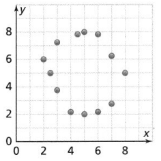
Question 5.
Describe the association between the two sets of data in the scatter plot.
Answer:
The given scatter plot is:
From the given scatter plot,
We can observe that the points are all in a non-linear shape and are closely connected
Hence, from the above,
We can conclude that the given scatter plot has a non-linear association
Practice & Problem Solving
Scan for Multimedia
Question 6.
The scatter plot shows the average heights of children ages 2-12 in a certain country. Which line is the best model of the data?
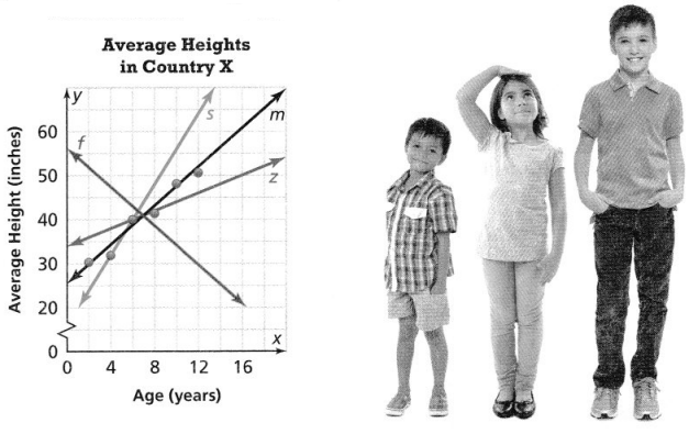
Answer:
It is given that
The scatter plot shows the average heights of children ages 2-12 in a certain country.
Now,
The best line in the given scatter plot is that line that tightly hugs the maximum points in a scatter plot
Hence, from the above,
We can conclude that line m is the best model of the given data
Question 7.
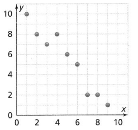
Does the scatter plot shows a positive, a negative, or no association?
Answer:
The given scatter plot is:
From the given scatter plot,
We can observe that as the value of x increases, the value of y also increases
Hence, from the above,
We can conclude that the given scatter plot has a positive association
Question 8.
Determine whether the scatter plot of the data for the following situation would have a positive or negative linear association.
time working and amount of money earned
Answer:
The given situation is:
Time working and amount of money earned
We know that,
The total amount of work done = Number of days × The amount earned for the work done
Let us suppose the number of days is constant
So,
The total amount of work done ∝ The amount earned for the work done
So,
The more time a person works, the more money that person will earn
Hence, from the above,
We can conclude that the scatter plot of the given data has a positive linear association
Question 9.
Describe the relationship between the data in the scatter plot.
Answer:
The given scatter plot is:
From the given scatter plot,
We can observe that the data in the scatter plot has a decreasing trend with the strong association of data with each other
Hence, from the above
We can conclude that the given scatter plot has a negative linear association
Question 10.
Describe the relationship between the data in the scatter plot.
Answer:
The given scatter plot is:
From the given scatter plot,
We can observe that all the points are in a cyclic fashion
Hence, from the above,
We can conclude that the given scatter plot has a non-linear association
Question 11.
Higher-Order Thinking Describe a real situation that would fit the relationship described.
a. A strong, positive association
Answer:
The real-life examples for a strong, positive association are:
A) The more time you spend running on a treadmill, the more calories you will burn.
B) Taller people have larger shoe sizes and shorter people have smaller shoe sizes.
C) The longer your hair grows, the more shampoo you will need.
D) The less time I spend marketing my business, the fewer new customers I will have.
E) The more hours you spend in direct sunlight, the more severe your sunburn.
b. A strong, negative association
Answer:
The real-life examples for a strong, negative association are:
A) A student who has many absences has a decrease in grades.
B) As the weather gets colder, air conditioning costs decrease.
C) If a train increases speed, the length of time to get to the final point decreases.
D) If a chicken increases in age, the number of eggs it produces decreases.
E) If the sun shines more, a house with solar panels requires less use of other electricity.
Question 12.
A sociologist is studying how sleep affects the amount of money a person spends. The scatter plot shows the results of the study. What type of association does it show between the amount of sleep and money spent?
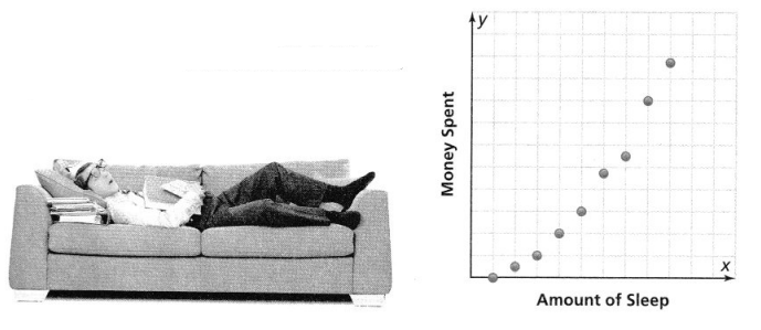
Answer:
It is given that
A sociologist is studying how sleep affects the amount of money a person spends. The scatter plot shows the results of the study
Now,
From the given scatter plot,
We can observe that the data that is related to the amount of sleep and the amount of money spent is in a cyclic fashion
Hence, from the above,
We can conclude that the association does it show between the amount of sleep and money spent is: Non-linear association
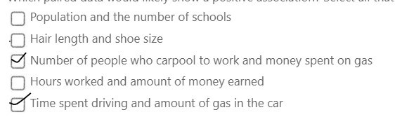
Assessment Practice
Question 13.
Which paired data would likely show a positive association? Select all that apply.
![]() Population and the number of schools
Population and the number of schools
![]() Hair length and shoe size
Hair length and shoe size
![]() Number of people who carpool to work and money spent on gas
Number of people who carpool to work and money spent on gas
![]() Hours worked and amount of money earned
Hours worked and amount of money earned
![]() Time spent driving and amount of gas in the car
Time spent driving and amount of gas in the car
Answer:
We know that,
A positive association is an association that as the value of x increases, the value of y also increases
Hence,
The paired data that would likely show a positive association is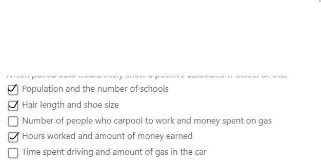
Question 14.
Which paired data would likely show a negative association? Select all that apply.
![]() Population and the number of schools
Population and the number of schools
![]() Hair length and shoe size
Hair length and shoe size
![]() Number of people who carpool to work and money spent on gas
Number of people who carpool to work and money spent on gas
![]() Hours worked and amount of money earned
Hours worked and amount of money earned
![]() Time spent driving and amount of gas in the car
Time spent driving and amount of gas in the car
Answer:
We know that,
A negative association is an association that as the value of x increases, the value of y also decreases
Hence,
The paired data that would likely show a negative association is:
Lesson 4.3 Use Linear Models to Make Predictions
Solve & Discuss It!
Bao has a new tracking device that he wears when he exercises. It sends data to his computer. How can Bao determine how long he should exercise each day if he wants to burn 5,000 Calories per week?
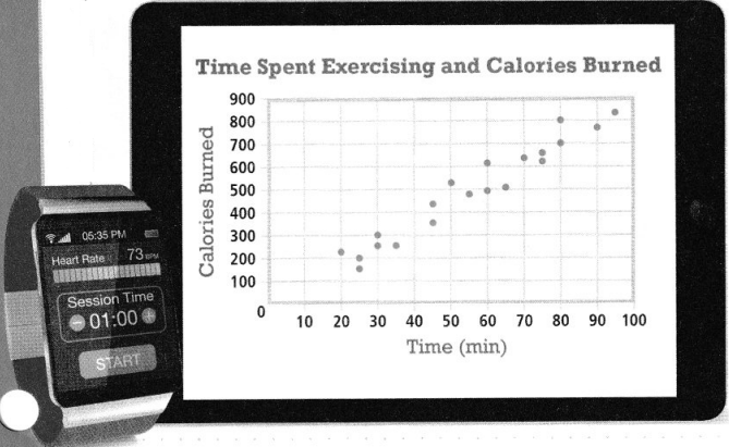
Answer:
It is given that
Bao has a new tracking device that he wears when he exercises. It sends data to his computer
Now,
It is also given that Bao wants to burn 5,000 calories per week
So,
The number of calories Bao wants to burn per day = \(\frac{5,000}{7}\)
= 714.2 calories
= 714 calories
≅ 720 calories
Now,
From the given scatter plot,
We can observe that
For approximately 720 calories to burn, Bao has to exercise 80 – 90 minutes each day
Hence, from the above,
We can conclude that Bao should exercise 80 – 90 minutes each day if he wants to burn 5,000 Calories per week
Focus on math practices
Reasoning Suppose another set of data were plotted with a trend line passing through (25, 100) and (80, 550). Would this indicate that more or fewer calories were burned per minute? Explain.
Answer:
? Essential Question
How do linear models help you to make a prediction?
Answer:
While linear models do not always accurately represent data, and this occurs when actual data does not clearly show a relationship between its two variables, linear models are helpful in determining the future points of data, the expected points of data, and the highest possible accuracy of data.
Try It!
Assuming the trend shown in the graph continues, use the equation of the trend line to predict average fuel consumption in miles per gallon in 2025.
The equation of the trend line is y =  x + . In 2025, the average fuel consumption is predicted to be about mpg.
Answer:
The given scatter plot is:
From the scatter plot,
We can observe that
The initial value (y-intercept) is: 15
Now,
We know that,
The equation of the line in the slope-intercept form is:
y = mx + b
Where,
m is the slope
b is the initial value (or) y-intercept
Now,
To find the slope,
The points from the given scatter plot is: (15, 21), (30, 24)
Now,
Compare the given points with (x1, y1), (x2, y2)
We know that,
Slope = y2 – y1 / x2 – x1
So,
Slope = \(\frac{24 – 21}{30 – 15}\)
= \(\frac{1}{5}\)
So,
The equation of the line is:
y = 0.20x + 15
Now,
The average fuel consumption in 2025 is:
y = 0.20 (2025 – 1980) + 15
y = 0.20 (45) + 15
y = 9 + 15
y = 24 mpg
Hence, from the above,
We can conclude that
The equation of the trend line is:
y = 0.20x + 15
In 2025, the average fuel consumption is predicted to be about 24 mpg
Convince Me!
Why can you use a linear model to predict the y-value for a given x-value?
Answer:
We can use the regression line to predict values of Y was given values of X. For any given value of X, we go straight up to the line and then move horizontally to the left to find the value of Y. The predicted value of Y is called the predicted value of Y, and is denoted Y’.
Try It!
A smoothie café has the ingredients needed to make 50,000 smoothies on a day when the high temperature is expected to reach 90°F. Should the café employees expect to have enough ingredients for the day’s smoothie sales? Explain.
Answer:
KEY CONCEPT
Scatter plots can be used to make predictions about current or future trends.
Look for the corresponding y-value for a given x-value.
Find the equation of the trend line and find the y-value of a given x-value.
Do You Understand?
Question 1.
?Essential Question How do linear models help you to make a prediction?
Answer:
While linear models do not always accurately represent data, and this occurs when actual data does not clearly show a relationship between its two variables, linear models are helpful in determining the future points of data, the expected points of data, and the highest possible accuracy of data.
Question 2.
Model with Math
How do you find the equation of a linear model when you are given the graph but not given the equation?
Answer:
To simplify what has already been said, the easiest way to find the equation of a line is to look for the x and y-intercepts.
One point will be (x, 0) and the other will be (0, y), where x and y are numerical values.
The slope is simply
m = \(\frac{y}{x}\).
When you have the y-intercept, (0, y),
you can use the form
y = mx + b to find the equation for the line.
Consequently, with the notation used, you can represent this as
y=\(\frac{y}{x}\)x + b
where b is the value from (0, y)
x is the value from (x, 0)
Question 3.
Reasoning Can the linear model for a set of data that is presented in a scatter plot always be used to make a prediction about any x-value? Explain.
Answer:
Yes, we can use the linear model to predict values of Y was given values of X. For any given value of X, we go straight up to the line and then move horizontally to the left to find the value of Y. The predicted value of Y is called the predicted value of Y, and is denoted Y’.
Do You Know How?
Question 4.
The graph shows a family’s grocery expenses based on the number of children in the family,
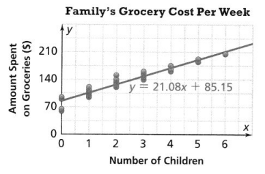
a. Using the slope, predict the difference in the amount spent on groceries between a family with five children and a family with two children.
Answer:
It is given that
The graph shows a family’s grocery expenses based on the number of children in the family,
Now,
The given scatter plot is:
Now,
From the given scatter plot,
The pair that represents the amount spent on groceries in a family with five children is: (5, 175)
The pair that represents the amount spent on groceries in a family with two children is: (2, 140)
Now,
Compare the given points with (x1, y1), (x2, y2)
Now,
We know that,
Slope = y2 – y1 / x2 – x1
So,
Slope = \(\frac{140 – 175}{2 – 5}\)
Slope = \(\frac{-35}{-3}\)
Slope = \(\frac{35}{3}\)
Hence, from the above,
We can conclude that using the slope, the difference in the amount spent on groceries between a family with five children and a family with two children is: \(\frac{35}{3}\)
b. How many children can you predict a family has if the amount spent on groceries per week is $169.47?
Answer:
From the given scatter plot,
The trend line equation is:
y = 21.08x + 85.15
Now,
It is given that the amount spent on groceries per week is $169.47
So,
169.47 = 21.08x + 85.15
21.08x = 169.47 – 85.15
21.08x = 84.32
x = \(\frac{84.32}{21.08}\)
x = 4
Hence, from the above,
We can predict 4 children in a family if he has the amount spent on groceries per week is $169.47
Practice & Problem Solving
Question 5.
Leveled Practice The scatter plot shows the number of people at a fair based on the outside temperature. How many fewer people would be predicted to be at the fair on a 100°F day than on a 75°F day?
The slope is 
For each degree that the outside temperature increases, the fair attendance decreases by thousand people.
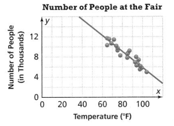
The difference between 75°F and 100°F is °F.
-0.16 . =
About thousand fewer people are predicted to be at the fair on a 100°F day than on a 75°F day.
Answer:
It is given that
The scatter plot shows the number of people at a fair based on the outside temperature
Now,
The given scatter plot is:
Now,
We know that,
The equation of the trend line that is passing through two points is:
y = mx + b
Where,
m is the slope
b is the initial value (or) y-intercept
Now,
To find the slope,
The given points are: (75, 10K), (100, 6K)
Where,
K is 1000
Now,
Compare the given points with (x1, y1), (x2, y2)
Now,
We know that,
Slope = y2 – y1 / x2 – x1
So,
Slope = \(\frac{6K – 10K}{100 – 75}\)
= –\(\frac{4,000}{25}\)
= -160
So,
The equation of the trend line is:
y = -160x + b
Substitute (100, 6K) in the above equation
So,
6K = -160 (100) + b
6K + 16K = b
b = 22K
So,
The equation of the trend line is:
y = -160x + 22,000
Now,
At 75° F,
y = -160 (75) + 22,000
y = 10,000
At 100° F,
y = -160 (100) + 22,000
y = 6,000
Hence,
The difference of the people between 75° F and 100° F = 10,000 – 6,000
= 4,000
The difference between 100° F and 75° F = 25° F
Question 6.
Make Sense and Persevere If x represents the number of years since 2000 and y represents the gas price, predict what the difference between the gas prices in 2013 and 2001 is? Round to the nearest hundredth.
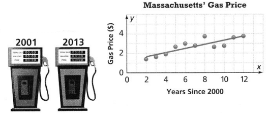
Answer:
It is given that
x represents the number of years since 2000 and y represents the gas price,
Now,
We know that,
The equation of the trend line in the slope-intercept form is:
y = mx + b
Where,
m is the slope
b is the y-intercept
Now,
To find the slope of the trend line,
The given points are: (7, 3), (12, 4)
Now,
Compare the given points with (x1, y1), (x2, y2)
Now,
We know that,
Slope = y2 – y1 / x2 – x1
So,
Slope = \(\frac{4 – 3}{12 – 7}\)
Slope = \(\frac{1}{5}\)
So,
y = \(\frac{1}{5}\)x + b
Now,
Substitute (7, 3) or (12, 4) in the above equation
So,
3 = \(\frac{1}{5}\) (7) + b
\(\frac{8}{5}\) = b
So,
The equation of the trend line is:
5y = x + 8
Now,
The gas prices in 2001 is:
5y = 1 + 8
y = \(\frac{9}{5}\)
y = $1.40
The gas prices in 2013 is:
5y = 13 + 8
y = \(\frac{21}{5}\)
y = $4.20
So,
The difference between the gas prices in 2013 and 2001 = $4.20 – $1.40
= $2.80
Hence, from the above,
We can conclude that the difference between the gas prices in 2013 and 2001 is: $2.80
Question 7.
Make Sense and Persevere If x represents the number of months since the beginning of 2016, and y represents the total precipitation to date, predict the amount of precipitation received between the end of March and the end of June.
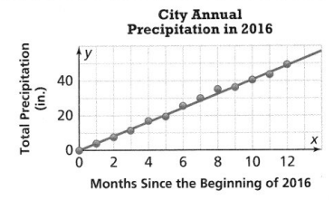
Answer:
It is given that
x represents the number of months since the beginning of 2016, and y represents the total precipitation to date
Now,
The given scatter plot is:
Now,
From the given scatter plot,
We can observe that the trend line starts from the origin
So,
The equation of the trend line that is passing through the origin is:
y = mx
where,
m is the slope
Now,
To find the slope.
The given points are: (2, 10), (10, 40)
Compare the given points with (x1, y1), (x2, y2)
Now,
We know that,
Slope = y2 – y1 / x2 – x1
So,
Slope = \(\frac{40 – 10}{10 – 2}\)
= \(\frac{30}{8}\)
= \(\frac{15}{4}\)
So,
The equation of the trend line is:
y = \(\frac{15}{4}\)x
Now,
At the end of the march,
The amount of precipitation is:
y = \(\frac{15}{4}\) (4)
y = 15 in
At the end of June,
The amount of precipitation is:
y = \(\frac{15}{4}\) (6)
y = \(\frac{45}{2}\)
y = 22.5 inches
So,
The amount of precipitation between the end of March and the end of June = 22.5 – 15
= 7.5 in
Hence, from the above,
We can conclude that the amount of precipitation between the end of March and the end of June is: 7.5 in
Question 8.
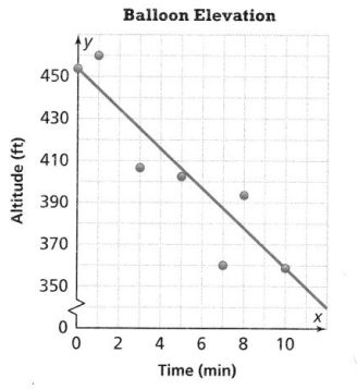
The scatter plot shows a hiker’s elevation above sea level over time. The equation of the trend line shown is y = 8.77x + 686. To the nearest whole number, predict what the hiker’s elevation will be after 145 minutes.
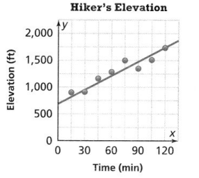
Answer:
It is given that
The scatter plot shows a hiker’s elevation above sea level over time.
The equation of the trend line shown is
y = 8.77x + 686.
Where,
8.77 is the slope
686 is the initial value (or) y-intercept
Now,
From the graph,
We can observe that
The x-axis variable – Time
The y-axis variable – Elevation
So,
The hiker’s elevation after 145 minutes is:
y = 8.77 (145) + 686
y = 1,957.65 ft
Hence, from the above,
We can conclude that the hiker’s elevation after 145 minutes will be: 1,957.65 ft
Question 9.
Make Sense and Persevere The graph shows the number of gallons of water in a large tank as it is being filled. Based on the trend line, predict how long it will take to fill the tank with 375 gallons of water.
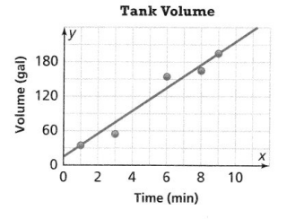
Answer:
It is given that
The graph shows the number of gallons of water in a large tank as it is being filled
Now,
The given scatter plot is:
Now,
From the given scatter plot,
We can observe that
The initial value (or) y-intercept is: 15
Now,
We know that,
The equation of the trend line that has the initial value is:
y = mx + b
Where,
m is the slope
b is the y-intercept (or) initial value
Now,
To find the slope,
The required points are: (1, 30), (0, 15)
Compare the given points with (x1, y1), (x2, y2)
Now,
We know that,
Slope = y2 – y1 / x2 – x1
So,
Slope = \(\frac{15 – 30}{0 – 1}\)
= \(\frac{-15}{-1}\)
= 15
So,
The equation of the trend line is:
y = 15x + 15
Now,
The time taken to fill 375 gallons of water is:
375 = 15x + 15
15x = 375 – 15
15x = 360
x = \(\frac{360}{15}\)
x = 24 minutes
Hence, from the above,
We can conclude that the time taken to fill 375 gallons of water is: 24 minutes
Question 10.
Higher-Order Thinking The graph shows the temperature, y, in a freezer x minutes after it was turned on. Five minutes after being turned on, the temperature was actually three degrees from what the trend line shows. What values could the actual temperature be after the freezer was on for five minutes?
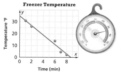
Answer:
It is given that
The graph shows the temperature, y, in a freezer x minutes after it was turned on. Five minutes after being turned on, the temperature was actually three degrees from what the trend line shows.
Now,
From the given scatter plot,
We can observe that,
At 5 minutes of time, the freezer temperature is 15°F
So,
At x = 5, y = 15
But,
According to the given information
At x = 5, y = 15 + 3
So,
y = 18°F
Hence, from the above,
We can conclude that the actual temperature after the freezer was on for five minutes is: 18°F
Assessment Practice
Question 11.
The graph shows the altitude above sea level of a weather balloon over time. The trend line passes through the points (0, 453) and (10, 359). Which statements about the graph are true?
![]() The data show a positive correlation.
The data show a positive correlation.
![]() The trend line is -9.4x – 453.
The trend line is -9.4x – 453.
![]() In general, the balloon is losing altitude.
In general, the balloon is losing altitude.
![]() The weather balloon started its flight at about 455 feet above sea level.
The weather balloon started its flight at about 455 feet above sea level.
![]() After 4 minutes, the weather balloon had an altitude of about 415 feet above sea level.
After 4 minutes, the weather balloon had an altitude of about 415 feet above sea level.
![]() After 395 minutes, the weather balloon had an altitude of about 8 feet above sea level.
After 395 minutes, the weather balloon had an altitude of about 8 feet above sea level.
Answer:
Let the given options be named as A, B, C, D, E and F respectively
It is given that
The graph shows the altitude above sea level of a weather balloon over time.
The trend line passes through the points (0, 453) and (10, 359)
We know that,
The equation of the trend line that is passing through two points is:
y = mx + b
Where,
m is the slope
b is the initial value (or) y-intercept
We know that
The “y-intercept” is the value of y when x= 0
Now,
Compare the given points with (x1, y1), (x2, y2)
Now,
We know that,
Slope = y2 – y1 / x2 – x1
So,
Slope = \(\frac{359 – 453}{10 – 0}\)
= \(\frac{-94}{10}\)
= -9.4
So,
The equation of the trend line is:
y = -9.4x + 453
Hence, from the above,
We can conclude that options C, D, and E matches the given situation
Topic 4 MID-TOPIC CHECKPOINT
Question 1.
Vocabulary How can you use a trend line to determine the type of linear association for a scatter plot? Lesson 4.2
Answer:
The straight line is a trend line, designed to come as close as possible to all the data points. The trend line has a positive slope, which shows a positive relationship between X and Y. The points in the graph are tightly clustered about the trend line due to the strength of the relationship between X and Y.
The scatter plot shows the amount of time Adam spent studying and his test scores. Use the scatter plot for Items 2-4.
Question 2.
What relationship do you see between the amount of time spent studying and the test scores? Is the relationship linear? Lesson 4.1
A. In general, Adam scores higher on a test when he spends more time studying. There is not a linear relationship.
B. In general, Adam scores higher on a test when he spends more time studying. There is a positive linear relationship.
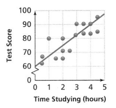
C. In general, Adam scores lower on a test when he spends more time studying. There is a negative linear relationship.
D. In general, Adam scores lower on a test when he spends more time studying. There is no relationship.
Answer:
It is given that
The scatter plot shows the amount of time Adam spent studying and his test scores
Now,
The given scatter plot is:
From the given scatter plot,
We can observe that
The association or correlation is positive and there is a linear relationship
Adam is scoring higher on a test when he is studying for more hours
Hence, from the above,
We can conclude that option B matches the given situation
Question 3.
Use the y-intercept and the point (4,90) from the line on the scatter plot. What is the equation of the linear model? Lesson 4.3
Answer:
The given scatter plot is (From Question 2):
Now,
From the given scatter plot,
We can observe that
The initial value (or) y-intercept is: 60
We know that,
The “y-intercept” is the value of y when x = 0
So,
The points required to find the equation of the scatter plot is: (0, 60), (4, 90)
We know that,
The equation of the trend line that has y-intercept is:
y = mx + b
Where,
m is the slope
b is the initial value (or) y-intercept
Now,
Compare the given points with (x1, y1), (x2, y2)
Now,
We know that,
Slope = y2 – y1 / x2 – x1
So,
Slope = \(\frac{90 – 60}{4 – 0}\)
= \(\frac{30}{4}\)
= \(\frac{15}{2}\)
So,
The equation of the trend line is:
y = \(\frac{15}{2}\)x + 60
Hence, from the above,
We can conclude that the equation of the linear line is:
y = \(\frac{15}{2}\)x + 60
Question 4.
Predict Adam’s test score when he studies for 6 hours. Lesson 4.3
Answer:
We know that,
From the given scatter plot,
The variable on the x-axis is: Time
The variable on the y-axis is: Test scores
Now,
From Problem 3,
The equation of the trend line is:
y = \(\frac{15}{2}\)x + 60
At 6 hours,
y = \(\frac{15}{2}\) (6) + 60
y = 105
Hence, from the above,
We can conclude that Adam’s test score is 105 when he studies for 6 hours
Question 5.
Describe the relationship between the data in the scatter plot. Lesson 4.2
Answer:
The given scatter plot is:
From the above scatter plot,
We can observe that as the value of x increases, the value of y decreases
Hence, from the above,
We can conclude that the given scatter plot has the negative association
Question 6.
The scatter plot shows the mean annual temperature at different elevations. Select all the observations that are true about the scatter plot. Lesson 4.1
![]() The majority of the elevations are in a cluster between 1,250 meters and 2,250 meters.
The majority of the elevations are in a cluster between 1,250 meters and 2,250 meters.
![]() There is a gap in the data between 500 meters and 1,250 meters.
There is a gap in the data between 500 meters and 1,250 meters.
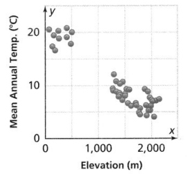
![]() There is an outlier at about (50, 21).
There is an outlier at about (50, 21).
![]() In general, the mean annual temperature decreases as the elevation increases.
In general, the mean annual temperature decreases as the elevation increases.
![]() Because there is a gap in the values, there is no association between the temperature and elevation.
Because there is a gap in the values, there is no association between the temperature and elevation.
Answer:
Let the given options be named as A, B, C, D, and E
It is given that
The scatter plot shows the mean annual temperature at different elevations
Now,
The given scatter plot is:
From the given scatter plot,
We can observe that
There is a cluster between 1,250 m and 2,250m
There is a gap between 500m and 1,250m
In general, the mean annual temperature decreases as the elevation increases.
Because there is a gap in the values, there is no association between the temperature and elevation.
Hence, from the above,
We can conclude that A, B, D, and E matches the given situation
How well did you do on the mid-topic checkpoint? Fill in the stars. 
Topic 4 MID-TOPIC PERFORMANCE TASK
A pitcher’s ERA (earned run average) is the average number of earned runs the pitcher allows every 9 innings pitched. The table shows the ERA and the number of wins for starting pitchers in a baseball league.
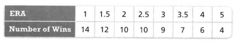
PART A
Construct a scatter plot of the data in the table.
Answer:
It is given that
A pitcher’s ERA (earned run average) is the average number of earned runs the pitcher allows every 9 innings pitched. The table shows the ERA and the number of wins for starting pitchers in a baseball league.
Now,
The given table is:
Hence,
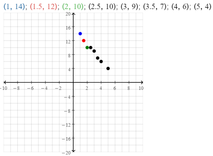
The representation of the scatter plot for the given data is:
PART B
Identify the association between the data. Explain the relationship between ERA and the number of wins shown in the scatter plot.
Answer:
From the above scatter plot,
We can observe that
As the value of x increases, the value of y decreases
Hence, from the above,
We can conclude that the relationship between ERA and the number of wins as shown in the above scatter plot is a “Negative Correlation”
PART C
Draw a trend line. Write an equation of the linear model. Predict the number of wins of a pitcher with an ERA of 6.
Answer:
We know that,
The equation of the trend line between two points is:
y = mx + b
Where,
m is the slope
b is the initial value (or) y-intercept
Now,
To find the slope,
The points are: (5, 4), (2, 10)
Now,
Compare the given points with (x1, y1), (x2, y2)
Now,
We know that,
Slope = y2 – y1 / x2 – x1
So,
Slope = \(\frac{10 – 4}{2 – 5}\)
= –\(\frac{6}{3}\)
= -2
So,
The equation of the trend line is:
y = -2x + b
Now,
Substitute (5, 4) in the above equation
So,
4 = -2 (5) + b
4 + 10 = b
b = 14
So,
The equation of the trend line is:
y = -2x + 14
Now,
From the given table,
We can observe that
The x-axis variable is: ERA
The y-axis variable is: The number of wins
So,
For x = 6,
y = -2 (6) + 14
y = 14 – 12
y = 2
Hence, from the above,
We can conclude that the number of wins of a pitcher with an ERA of 6 is: 2
Lesson 4.4 Interpret Two-Way Frequency Tables
Explore It!
The owners of a ski resort want to know which is more popular, skiing or snowboarding. The resort conducts a poll, asking visitors their age and which activity they prefer. The results are shown in the table.
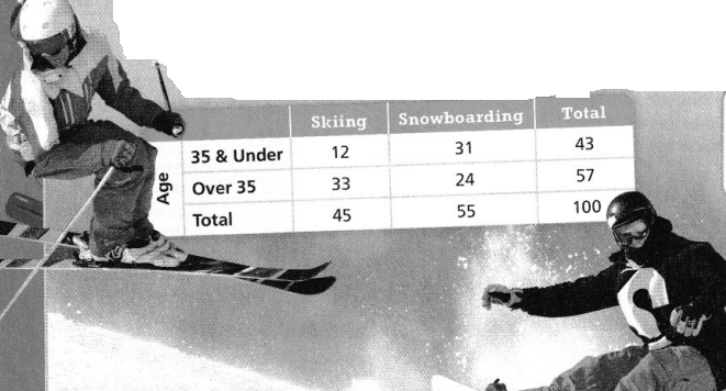
A. Use the table to describe the visitors polled.
Answer:
It is given that
The owners of a ski resort want to know which is more popular, skiing or snowboarding. The resort conducts a poll, asking visitors their age and which activity they prefer. The results are shown in the table.
Now,
From the given table,
We can observe that the visiters polled are of the age below 35 and above 35
The activities for which the visitors polled are: Skiing, Snowboarding
B. What information can the owners of the resort determine from the data in the table?
Answer:
From the given table,
We can observe that
The number of visitors that had polled for Skiing and snowboarding
Hence, from the above,
We can conclude that the information the owners of the resort determine from the data in the table is the number of visitors that had polled for Skiing and Snowboarding
C. Make a statement that is supported by the data.
Answer:
The statement that is supported by the given data is:
The number of visitors that are over 35 years is the majority who polled for Skiing
Focus on math practices
Model with Math
How else might you display the data to show the relationship between people’s ages and which activity they prefer?
Answer:
The other way to display the data to show the relationship between people’s ages and the activity they prefer is:
Essential Question
How does a two-way frequency table show the relationships between sets of paired data?
Answer:
Two-way frequency tables are a visual representation of the possible relationships between two sets of categorical data. The categories are labeled at the top and the left side of the table, with the frequency (count) information appearing in the four (or more) interior cells of the table.
Try It!
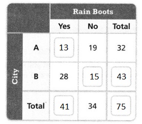
A weatherman asks 75 people from two different cities if they own rain boots. Complete the two-way frequency table to show the results of the survey.
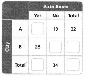
Answer:
It is given that
A weatherman asks 75 people from two different cities if they own rain boots.
So,
The total number of people who say whether they own rain boots or not are: 75
So,
(The people who say yes + The people who say no)City A + (The people who say yes + the people who say no)City B = 75
Hence,
The complete two-way frequency table that shows the results of the survey is:
Convince Me!
What pattern do you see in the two-way frequency table?
Answer:
Two-way frequency tables are a visual representation of the possible relationships between two sets of categorical data. The categories are labeled at the top and the left side of the table, with the frequency (count) information appearing in the four (or more) interior cells of the table.
Try It!
One hundred students were asked how they traveled to school. Of the girls, 19 rode in a car, 7 rode the bus, and 27 took the train. Of the boys, 12 took the train, 25 rode in a car, and 10 rode the bus. Construct a two-way frequency table. Then tell which mode of transportation is the most popular. Explain.
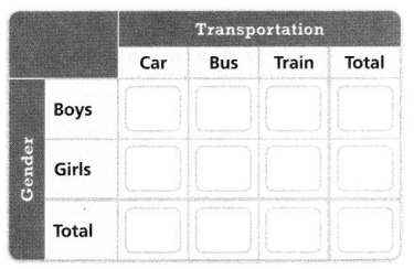
Answer:
It is given that
One hundred students were asked how they traveled to school. Of the girls, 19 rode in a car, 7 rode the bus, and 27 took the train. Of the boys, 12 took the train, 25 rode in a car, and 10 rode the bus
So,
The complete two-way frequency table for the given situation is:
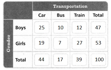
Now,
From the above, two-way frequency table,
We can observe that more number of people preferred car mode of transportation
Hence, from the above,
We can conclude that the car mode of transportation is the most popular
KEY CONCEPT
A two-way frequency table displays the relationship between paired categorical data. You can interpret the data in the table to draw conclusions.
Do You Understand?
Question 1.
?Essential Question How does a two-way frequency table show the relationship between sets of paired categorical data?
Answer:
Two-way frequency tables are a visual representation of the possible relationships between two sets of categorical data. The categories are labeled at the top and the left side of the table, with the frequency (count) information appearing in the four (or more) interior cells of the table.
Question 2.
Model with Math
How do you decide where to start filling in a two-way frequency table when some of the data are already there?
Answer:
In a two-way frequency table, when there is already data present,
You have to start filling in where there is more data in the table so that all the frequencies can be counted easily and filling of the frequency table will also be fast
Question 3.
Use Structure How can you use the structure of a two-way frequency table to complete it?
Answer:
The steps that are used to complete the two-way frequency table is:
Step 1:
Identify the variables. There are two variables of interest here: the commercial viewed and opinion
Step 2:
Determine the possible values of each variable. For the two variables, we can identify the following possible values
Step 3:
Set up the table
Step 4:
Fill in the frequencies
Do You Know How?
Question 4.
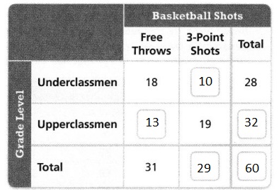
A basketball coach closely watches the shots of 60 players during basketball tryouts. Complete the two-way frequency table to show her observations.
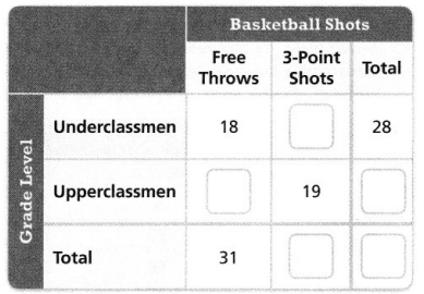
Answer:
It is given that
A basketball coach closely watches the shots of 60 players during basketball tryouts.
So,
Underclassmen + Upperclassmen = 60
Hence,
The complete two-way frequency table that shows the basketball coach’s observations is:
Question 5.
Do the data in the two-way frequency table support the following statement? Explain.
There are more middle school students who wear glasses than high school students who wear contacts.
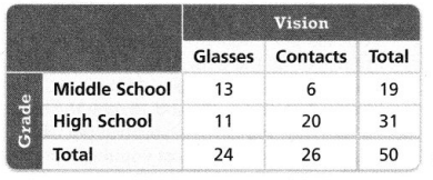
Answer:
The given statement is:
There are more middle school students who wear glasses than high school students who wear contacts.
Now,
The given two-way frequency table is:
From the given two-way frequency table,
The number of middle school students who wear glasses is: 13
The number of high school students who wear contacts is: 20
So,
The number of middle school students who wear glasses < The number of high school students who wear contacts
Hence, from the above,
We can conclude that the given statement can’t be supported
Practice & Problem Solving
Leveled Practice in 6-8, complete the two-way frequency tables.
Question 6.
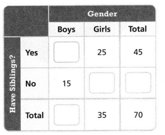
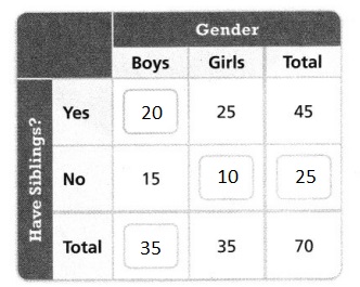
You ask 70 of your classmates if they have any siblings. Complete the two-way frequency table to show the results of the survey.
Answer:
It is given that
You ask 70 of your classmates if they have any siblings
So,
(The number of boys and girls who have siblings) + (The number of girls who do not have siblings) = 70
Hence,
The complete two-way frequency table that shows the survey results is:
Question 7.
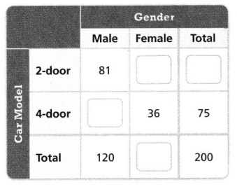
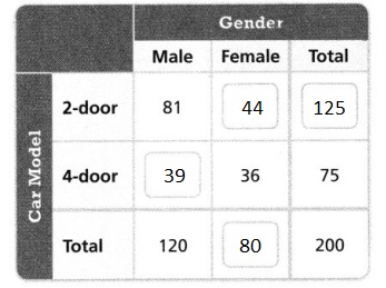
A company surveyed 200 people and asked which car model they preferred. Complete the two-way frequency table to show the results of the survey.
Answer:
It is given that
A company surveyed 200 people and asked which car model they preferred
So,
(The number of males and females who preferred 2-door car model) + (The number of males and females who preferred 4-door car model) = 200
Hence,
The complete two-way frequency table that shows the results of the survey is:
Question 8.
Make Sense and Persevere
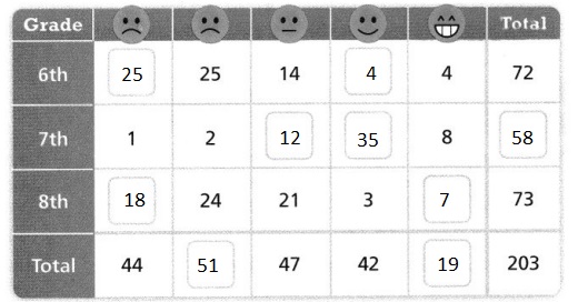
You ask 203 of your classmates how they feel about the school year being made longer. Complete the two-way frequency table to show the results of the survey.
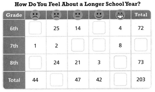
Answer:
It is given that
You ask 203 of your classmates how they feel about the school year being made longer
So,
6th Grade students + 7th Grade students + 8th Grade students = 203
Hence,
The complete two-way frequency table that shows the complete survey results is:
Question 9.
Students at a local school were asked, “About how many hours do you spend on homework each week?” The two-way frequency table shows the results of the survey. Classify the statement below as true or false. Explain.
More students study for 5 to 6 hours than for 1 to 2 hours.
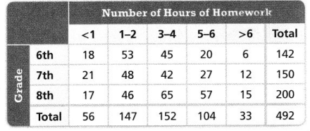
Answer:
It is given that
The two-way frequency table shows the results of the survey.
Now,
The given statement is:
More students study for 5 to 6 hours than for 1 to 2 hours.
Now,
The given two-way frequency table is:
From the given two-way frequency table,
We can observe that
The number of students who study for 5 – 6 hours is: 104
The number of students who study for 1 – 2 hours is: 147
So,
The number of students who study for 1 – 2 hours > The number of students who study for 5 – 6 hours
Hence, from the above,
We can conclude that the given statement is false
Question 10.
Higher-Order Thinking Demi and Margaret record the weather in their respective cities on weekend days over the summer. a. Construct a single, two-way frequency table to show the results.
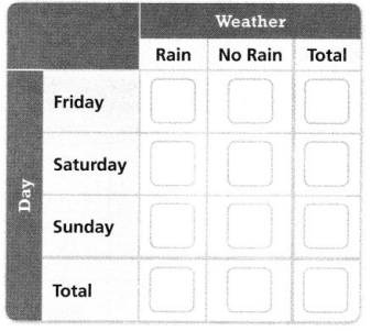
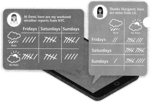
Answer:
It is given that
Demi and Margaret record the weather in their respective cities on weekend days over the summer
Now,
The given information regarding the given situation is:
Let the struck lines be the number of times that have no rain
Let the non-struck lines be the number of lines that have rain
Hence,
The complete two-way frequency table that shows the results is:
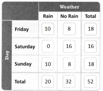
b. Which day saw the least rain? Explain.
Answer:
The condition for the least rain is: The number of times rain occurs + The number of times that no rain occurs
Hence, from the above,
We can conclude that Saturday saw the least rain
Assessment Practice
Question 11.
At one point last year, the local animal shelter had only cats and dogs. There were 74 animals in all. Of the cats, 25 were male and 14 were female. Of the dogs, 23 were male and 12 were female.
PART A
Construct a two-way frequency table of
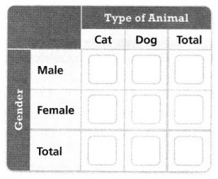
Answer:
It is given that
At one point last year, the local animal shelter had only cats and dogs. There were 74 animals in all. Of the cats, 25 were male and 14 were female. Of the dogs, 23 were male and 12 were female.
Hence,
The complete two-way table that shows the survey results is:
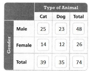
PART B
For which gender, male or female, is there the data.
a greater need for pet adoption? Explain.
A. There are almost twice as many female pets, so there is a greater need for people to adopt female dogs and cats.
B. There are almost twice as many male pets, so there is a greater need for people to adopt male dogs and cats.
C. There are almost twice as many female pets, so there is a greater need for people to adopt male dogs and cats.
D. There are almost twice as many male pets, so there is a greater need for people to adopt female dogs and cats.
Answer:
From part (A),
the two-way frequency table that matches the given situation is:
So,
From the above two-way frequency table,
We can observe that
There are almost twice as males as females
Hence, from the above,
We can conclude that option D matches the given situation perfectly
Lesson 4.5 Interpret TwoWay Relative Frequency Tables
Solve & Discuss It!
Mr. Day’s math class asked 200 cell phone owners which size phone they prefer. They presented the results in a two-way frequency table. How can you use the data to compare the percent of students who chose the small screen to the percent of adults who chose the small screen?
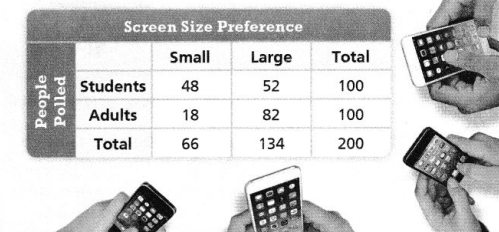
Answer:
It is given that
Mr. Day’s math class asked 200 cell phone owners which size phone they prefer. They presented the results in a two-way frequency table
Now,
From the given two-way frequency table,
We can observe that
The number of students who chose the small screen is: 48
The number of adults who chose the small screen is: 18
Now,
The percent of students who chose the small screen = \(\frac{The number of small screens chosen by the students}{The total number of screens}\) × 100
= \(\frac{48}{200}\) × 100
= 24%
The percent of adults who chose the small screen = \(\frac{The number of small screens chosen by the adults}{The total number of screens}\) × 100
= \(\frac{18}{200}\) × 100
= 9%
So,
The percent of students who chose the small screen to the percent of adults who chose the small screen
= \(\frac{9}{24}\) × 100
= \(\frac{9 × 100}{24}\)
= 37.5%
Hence, from the above,
We can conclude that the percent of students who chose the small screen to the percent of adults who chose the small screen is: 37.5%
Make Sense and Persevere
How do two-way frequency tables allow you to interpret relationships between categorical data using rows and columns?
Answer:
Two-way frequency tables are a visual representation of the possible relationships between two sets of categorical data. The categories are labeled at the top and the left side of the table, with the frequency (count) information appearing in the four (or more) interior cells of the table.
Focus on math practices
Make Sense and Persevere How does know a percentage change the way you interpret the results?
Answer:
First: work out the difference (increase) between the two numbers you are comparing. Then: divide the increase by the original number and multiply the answer by 100.
So,
% increase = Increase ÷ Original Number × 100.
If your answer is a negative number, then this is a percentage decrease.
? Essential Question
What is the advantage of a two-way relative frequency table for showing relationships between sets of paired data?
Answer:
Two-way relative frequency tables show us percentages rather than counts. They are good for seeing if there is an association between two variables
Try It!
Asha asked 82 classmates whether they play sports on the weekend. The results are shown in the two-way frequency table below.
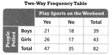
Convince Me!
How is a two-way relative frequency table different from a two-way frequency table?
Answer:
When a two-way table displays percentages or ratios (called relative frequencies), instead of just frequency counts, the table is referred to as a two-way relative frequency table. These two-way tables can show relative frequencies for the whole table, for rows, or for columns.
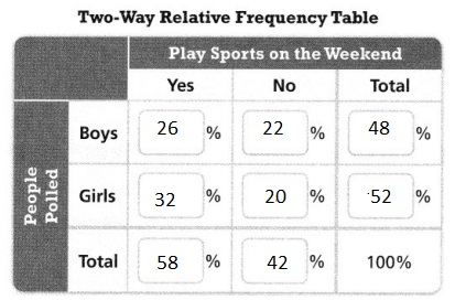
Use Asha’s two-way frequency table to complete the two-way relative frequency table.
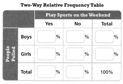
Answer:
The given two-way table is:
Now,
We know that,
The % of boys or girls who say yes = \(\frac{The number of boys or girls who say yes}{The total number of people}\) × 100
The % of boys or girls who say no = \(\frac{The number of boys or girls who say no}{The total number of people}\) × 100
From the given two-way frequency table,
The total number of people is: 82
Hence,
The complete two-way relative frequency table for the given situation is:
Try It!
Use the data in the table below.
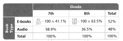
a. How does the percent of students who choose e-books compare to the percent of students who choose audiobooks?
Answer:
From the given two-way relative frequency table,
We can observe that
The % of students who choose e-books is: 52%
The % of students who choose Audiobooks is: 48%
So,
The % of students who choose e-books to the % of students who choose audiobooks
= \(\frac{48}{52}\) × 100
= 92.3%
Hence, from the above,
We can conclude that the % of students who choose e-books to the % of students who choose audiobooks is: 92.3%
b. Is there evidence that 7th graders have a greater tendency to choose audiobooks? Explain.
Answer:
From the given two-way relative frequency table,
The % of 7th-grade students who choose audiobooks is: 58.9%
The % of the 6th-grade students who choose audiobooks is: 36.5%
So,
The % of 7th-grade students who choose audiobooks > The % of 6th-grade students who choose audiobooks
Hence, from the above,
We can conclude that there is a piece of evidence that 7th-graders have a greater tendency to choose audiobooks
KEY CONCEPT
Relative frequency is the ratio of a data value to the total of a row, a column, or the entire data set. It is expressed as a percent. A total two-way relative frequency table gives the percent of the population that is in each group.
In a row two-way relative frequency table, the percents in each row add up to 100%.
In a column two-way relative frequency table, the percents in each column add up to 100%.
Do You Understand?
Question 1.
? Essential Question
What is the advantage of a two-way relative frequency table for showing relationships between sets of paired data?
Answer:
Two-way relative frequency tables show us percentages rather than counts. They are good for seeing if there is an association between two variables
Question 2.
Reasoning when comparing relative frequency by rows or columns only, why do the percentages not total 100%? Explain.
Answer:
When comparing relative frequency by rows or columns only, the individual percentages will not be 100%
So, their total will also not be equal to 100%
Question 3.
Critique Reasoning
Maryann says that if 100 people are surveyed, the frequency table will provide the same information as a total relative frequency table. Do you agree? Explain why or why not.
Answer:
It is given that
Maryann says that if 100 people are surveyed, the frequency table will provide the same information as a total relative frequency table
We know that,
The “Two-way frequency table” gives us information about the categories in the form of counts and frequencies
The “Two-way relative frequency table” gives us information about the categories in terms of percentages of frequencies
Hence, from the above,
We can agree with Maryann
Do You Know How?
In 4-6, use the table. Round to the nearest percent.
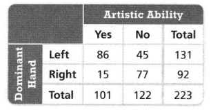
Question 4.
What percent of the people surveyed have the artistic ability?
Answer:
From the table,
The number of people who have the artistic ability is: 101
Now,
We know that,
The % of the people surveyed that have the artistic ability = \(\frac{The total number of people who have the artistic ability}{The total number of people}\) × 100
= \(\frac{101}{223}\) × 100
= 45%
Hence, from the above,
We can conclude that 45% of the people surveyed have the artistic ability
Question 5.
What percent of left-handed people surveyed have the artistic ability?
Answer:
From the table,
The number of left-handed people who have artistic ability is: 86
Now,
We know that,
The % of the left-handed people surveyed that have the artistic ability = \(\frac{The total number of left-handed people who have the artistic ability}{The total number of people}\) × 100
= \(\frac{86}{223}\) × 100
= 39%
Hence, from the above,
We can conclude that 39% of the left-handed people surveyed have the artistic ability
Question 6.
What percent of the people who have the artistic ability are left-handed?
Answer:
From the table,
The number of left-handed people who have artistic ability is: 86
Now,
We know that,
The % of the left-handed people surveyed that have the artistic ability = \(\frac{The total number of left-handed people who have the artistic ability}{The total number of people}\) × 100
= \(\frac{86}{223}\) × 100
= 39%
Hence, from the above,
We can conclude that 39% of the left-handed people surveyed have the artistic ability
Practice & Problem Solving
Leveled Practice in 7-8, complete the two-way relative frequency tables.
Question 7.
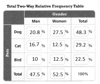
In a group of 120 people, each person has a dog, a cat, or a bird. The two-way frequency table shows how many people have each kind of pet. Complete the two-way relative frequency table to show the distribution of the data with respect to all 120 people. Round to the nearest tenth of a percent.
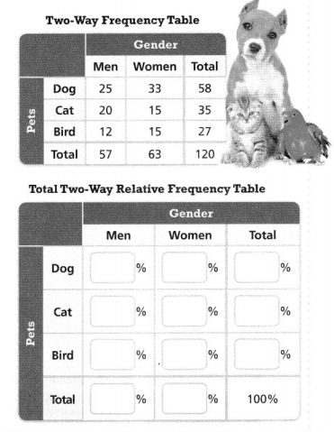
Answer:
It is given that
In a group of 120 people, each person has a dog, a cat, or a bird. The two-way frequency table shows how many people have each kind of pet
Hence,
The complete two-way relative frequency table for the given situation is:
Question 8.
There are 55 vehicles in a parking lot. The two-way frequency table shows data about the types and colors of the vehicles. Complete the two-way relative frequency table to show the distribution of the data with respect to color. Round to the nearest tenth of a percent.
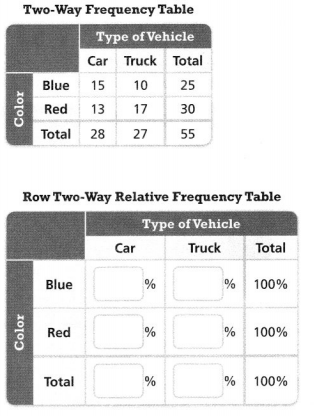
Answer:
It is given that
There are 55 vehicles in a parking lot. The two-way frequency table shows data about the types and colors of the vehicles.
Hence,
The completed two-way relative frequency table that shows the distribution of the data with respect to color is:
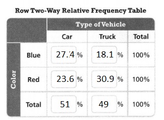
Question 9.
Men and women are asked what type of car they own. The table shows the relative frequencies with respect to the total population asked. Which type of car is more popular?
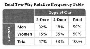
Answer:
It is given that
Men and women are asked what type of car they own. The table shows the relative frequencies with respect to the total population asked.
Now,
The given two-way relative frequency table is:
Now,
From the given table,
We can observe that
Most of the people have shown interest in the 4-door type of car
Hence, from the above,
We can conclude that the 4-door type of car is more popular
Question 10.
Make Sense and Persevere Students were asked if they like raspberries. The two-way relative frequency table shows the relative frequencies with respect to the response.
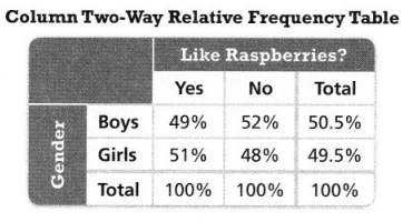
a. What percent of students who do not like raspberries are girls?
Answer:
It is given that
Students were asked if they like raspberries. The two-way relative frequency table shows the relative frequencies with respect to the response.
Now,
From the given two-way frequency table,
We can observe that the % of girls who do not like raspberries are: 48%
Hence, from the above,
We can conclude that the % of students who do not like raspberries are girls is: 48%
b. Is there evidence of an association between the response and the gender? Explain.
Answer:
From the given two-way relative frequency table,
We can observe that
The % of girls who like raspberries is more than the % of boys who like raspberries
The % of girls who do not like raspberries is less than the % of boys who do not like raspberries
Question 11.
Higher-Order Thinking All the workers in a company were asked a survey question. The two-way frequency table shows the responses from the workers in the day shift and night shift.
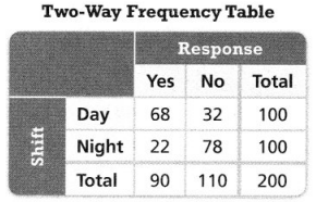
a. Construct a two-way relative frequency table to show the relative frequencies with respect to the shift.
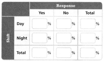
Answer:
It is given that
All the workers in a company were asked a survey question. The two-way frequency table shows the responses from the workers in the day shift and night shift.
Now,
The given two-way frequency table is:
Hence,
The completed two-way relative frequency table for the survey is:
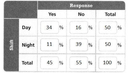
b. Is there evidence of an association between the response and the shift? Explain.
Answer:
From the two-way frequency table that is mentioned in part (a),
We can observe that
The % of people who opted for the day shift are more than the % of people who opted for the night shift
Assessment Practice
Question 12.
Patients in a blind study were given either Medicine A or Medicine B. The table shows the relative frequencies
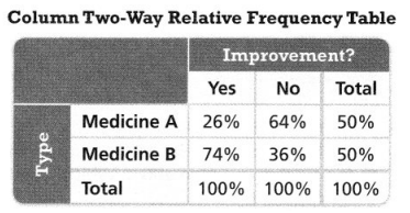
Is there evidence that improvement was related to the type of medicine? Explain.
A. The same number of people took each medicine, but the percent of people who reported improvement after taking Medicine B was significantly greater than the percent for Medicine A.
B. The same number of people took each medicine, but the percent of people who reported
improvement after taking Medicine A was significantly greater than the percent for Medicine B.
C. Different numbers of people took each medicine, but the percent of people who reported improvement after taking Medicine B was significantly greater than the percent for Medicine A.
D. Different numbers of people took each medicine, but the percent of people who reported improvement after taking Medicine A was significantly greater than the percent for Medicine B.
Answer:
It is given that
Patients in a blind study were given either Medicine A or Medicine B. The table shows the relative frequencies
We know that,
The number of people will be different
Now,
When we observe the given two-way related frequency table,
The improvement due to Medicine B > The improvement due to Medicine A
Hence, from the above,
We can conclude that option C matches the given situation
3-Act Mathematical Modeling: Reach Out
3-ACT MATH
ACT 1
Question 1.
After watching the video, what is the first question that comes to mind?
Answer:
Question 2.
Write the Main Question you will answer.
Answer:
Question 3.
Construct Arguments Predict an answer to this Main Question. Explain your prediction.
Answer:
Question 4.
On the number line below, write a number that is too small to be the answer. Write a number that is too large.
Answer:
Question 5.
Plot your prediction on the same number line.
Answer:
ACT 2
Question 6.
What information in this situation would be helpful to know? How would you use that information?
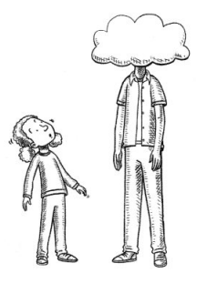
Answer:
Question 7.
Use Appropriate Tools What tools can you use to solve the problem? Explain how you would use them strategically.
Answer:
Question 8.
Model with Math
Represent the situation using mathematics. Use your representation to answer the Main Question.
Answer:
Question 9.
What is your answer to the Main Question? Is it higher or lower than your initial prediction? Explain why.
Answer:
ACT 3
Question 10.
Write the answer you saw in the video.
Answer:
Question 11.
Reasoning Does your answer match the answer in the video? If not, what are some reasons that would explain the difference?
Answer:
Question 12.
Make Sense and Persevere Would you change your model now that you know the answer? Explain.

Answer:
Reflect
Question 13.
Model with Math
Explain how you used a mathematical model to represent the situation. How did the model help you answer the Main Question?
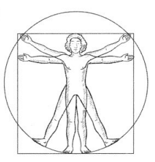
Answer:
Question 14.
Critique Reasoning Choose a classmate’s model. How would you adjust that model?
Answer:
SEQUEL
Question 15.
Model with Math Measure a classmate’s wingspan. Use your model to predict your classmate’s height. How well did your model predicts your classmate’s actual height?
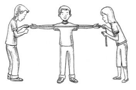
Answer:
Topic 4 REVIEW
? Topic Essential Question
How can you represent the relationship between paired data and use the representation to make predictions?
Answer:
The scatter diagram graphs pairs of numerical data, with one variable on each axis, to look for a relationship between them. If the variables are correlated, the points will fall along a line or curve. The better the correlation, the tighter the points will hug the line
Vocabulary Review
Match each example on the left with the correct word and then provide another example.
Answer:
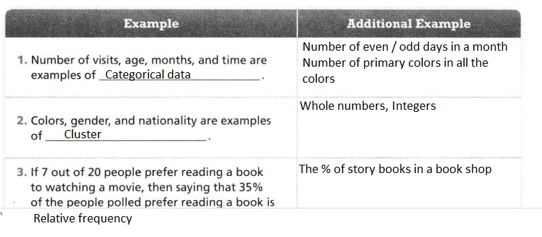
Use Vocabulary in Writing
Describe the scatter plot at the right. Use vocabulary terms in your description.
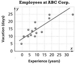
Answer:
The given scatter plot is:
Now,
From the given scatter plot,
We can observe that
With the help of measurement data, a trend line is drawn
There is a trend line that is not passing through the origin
There is an outlier present in the given scatter plot
Concepts and Skills Review
LESSON 4.1 Construct and Interpret Scatter Plots
Quick Review
A scatter plot shows the relationship between paired measurement data. Scatter plots can be used to interpret data by looking for clusters, gaps, and outliers.
Practice
The table shows the distance in miles and the price of airfare in dollars.
Question 1.
Construct a scatter plot.
Answer:
It is given that
The table shows the distance in miles and the price of airfare in dollars.
Hence,
The representation of the scatter plot that describes the relationship between the price of airfare and distance is:
Question 2.
Is there a relationship between distance and airfare? Explain.
Answer:
From the above scatter plot,
We can observe that there is no association between distance and airfare
Hence, from the above,
We can conclude that there is no relationship between distance and airfare
LESSON 4.2 Analyze Linear Associations
Quick Review
The association between the data in a scatter plot can be linear or nonlinear. A trend line is a line on a scatter plot, drawn near the points, which approximates the association between paired data. If the data are linear, the association can be positive or negative, and strong or weak.
Practice
Identify the association between the data on each scatter plot.
Question 1.
Answer:
The given scatter plot is:
Now,
From the given scatter plot,
We can observe that as the value of x increases, the value of y decreases
Hence, from the above,
We can conclude that there is a negative association between the data in the scatter plot
Question 2.
Answer:
The given scatter plot is:
From the given scatter plot,
We can observe that the data is in a non-linear trend
Hence, from the above,
We can conclude that there is a non-linear association between the data in the scatter plot
LESSON 4.3 Use Linear Models to Make Predictions
Quick Review
To make predictions, substitute known values into the equation of a linear model to solve for an unknown.
Practice
The scatter plot shows the wages of employees.
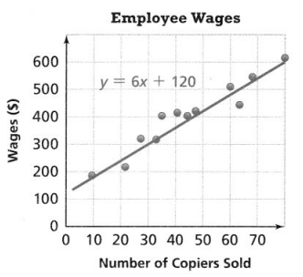
Question 1.
If an employee earns $570, what is the expected number of copies sold?
Answer:
It is given that
The scatter plot shows the wages of employees.
Now,
The given scatter plot is:
From the given scatter plot,
We can observe that
The equation of the trend line is:
y = 6x + 120
Where,
y is the wages
x is the number of copies sold
Now,
For y = $570,
570 = 6x + 120
6x = 570 – 120
6x = 450
x = \(\frac{450}{6}\)
x = 75
Hence, from the above,
We can conclude that for an employee wage of $570, the number of copies sold is: 75
Question 2.
If an employee sells 100 copies, what is the expected wage?
Answer:
For x = 100,
y = 6x + 120
y = 6 (100) + 120
y = 600 + 120
y = 720
Hence,f rom the above,
We can conclude that
If an employee sells 100 copies, then the expected wage is: $720
LESSON 4.4 Interpret Two-Way Frequency Tables
Quick Review
A two-way frequency table displays the relationship between paired categorical data.
Practice
Question 1.
The two-way frequency table shows the results of a random survey of movies watched by 100 students. Mrs. Leary said that according to the data, girls are more likely than boys to watch movie A. Is the statement true or false? Explain.
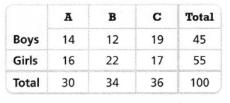
Answer:
It is given that
The two-way frequency table shows the results of a random survey of movies watched by 100 students.
Now,
The given statement is:
Mrs. Leary said that according to the data, girls are more likely than boys to watch movie A.
Now,
The given two-way frequency table is:
Now,
From the given two-way frequency table,
We can observe that
The number of girls who watch movie A > The number of boys who watch movie A
Hence, from the above,
We can conclude that the given statement is true
LESSON 4.5 Interpret Two-Way Relative Frequency Tables
Quick Review
Relative frequency is the ratio of a data value to the total of a row, a column, or the entire data set. It is expressed as a percent.
Practice
The two-way table shows the eye color of 200 cats participating in a cat show.
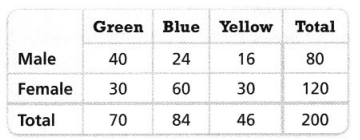
Question 1.
Make a two-way relative frequency table to show the distribution of the data with respect to gender. Round to the nearest tenth of a percent, as needed.
Answer:
It is given that
The two-way table shows the eye color of 200 cats participating in a cat show.
Now,
The given two-way frequency table is:
Hence,
The representation of the two-way relative frequency table that shows the distribution of the data wrt gender is:
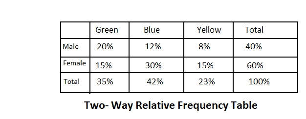
Question 2.
What percent of cats that are female have blue eyes?
Answer:
From the above two-way relative frequency table,
We can observe that there are 30% of cats that are females who have blue eyes
Hence, from the above,
We can conclude that the percent of cats that are females and have blue eyes is: 30%
Topic 4 Fluency Practice
Hidden Clue
For each ordered pair, solve the equation to find the unknown coordinate. Then locate and label the corresponding point on the graph. Draw line segments to connect the points in alphabetical order. Use the completed picture to help you answer the riddle below.

A (6, -0.5y + 20 – 0.5y = 13). 6, 
B (4 – 3x – 7x = -8, 7) , 7
C (2x + 4 – 6x = 24, 5) , 5
D (5x + 6 – 10x = 31, 1) , 1
E (7x – 3 – 3x = 13, -2) , -2
F (4, -12y + 8y – 21 = -5) 4,
G (44 = 6x – 1 + 9x, –5) 4, , -5
H(-5, 4y + 14 – 2y = 4) -5,
I (-5, 15+ y + 6 + 2y = 0) -5,
J (4, 3y + 32 – y = 18) 4,
K (6, 5y + 20 + 3y = -20) 6,
L (9x – 14 – 8x = -8, -1) , -1
M(-3, -5y + 10 – y = -2) -3,
N(-13 + x – 5 – 4x = -9, 4)
Answer:
The solutions of the above equations are: