Go Math Grade 6 Answer Key Chapter 13 deals with Variability and Data Distributions. The HMH Go Math 6th Grade Answer Key is a very helpful resource for students to prepare for the exams. The solutions are mentioned topic-wise to all the questions for chapter 13 Variability and Data Distributions. You can understand the problem-solving methods in a better way by using Go Math Grade 6 Answer Key Chapter 13 Variability and Data Distributions for free.
Go Math Grade 6 Answer Key Chapter 13 Variability and Data Distributions
The main concepts of chapter 13 Variability and Data Distributions are discussed in the below sections. So, tap the links and practice the problems. This Go Math Grade 6 Answer Key Ch 13 Variability and Data Distributions helps you to secure the highest marks in the exams. For better performance, you try to compare the problems with real time.
Chapter 13 – Lesson: 1
- Share and Show – Page No. 709
- Big Cats – Page No. 710
- Patterns in Data – Page No. 711
- Lesson Check – Page No. 712
Chapter 13 – Lesson: 2
- Share and Show – Page No. 715
- Problem Solving + Applications – Page No. 716
- Box Plots – Page No. 717
- Lesson Check – Page No. 718
Chapter 13 – Lesson: 3
- Share and Show – Page No. 721
- Problem Solving + Applications – Page No. 722
- Mean Absolute Deviation – Page No. 723
- Lesson Check – Page No. 724
Chapter 13 – Lesson: 4
- Share and Show – Page No. 727
- Problem Solving + Applications – Page No. 728
- Measures of Variability – Page No. 729
- Lesson Check – Page No. 730
Chapter – 13 – Mid-Chapter Checkpoint
Chapter 13 – Lesson: 5
- Share and Show – Page No. 735
- Unlock the Problem – Page No. 736
- Choose Appropriate Measures of Center and Variability – Page No. 737
- Lesson Check – Page No. 738
Chapter 13 – Lesson: 5
- Share and Show – Page No. 741
- Problem Solving + Applications – Page No. 742
- Apply Measures of Center and Variability – Page No. 743
- Lesson Check – Page No. 744
Chapter 13 – Lesson: 6
- Share and Show – Page No. 747
- Problem Solving + Applications – Page No. 748
- Describe Distributions – Page No. 749
- Lesson Check – Page No. 750
Chapter 13 – Lesson: 7
- Share and Show – Page No. 753
- On Your Own – Page No. 754
- Problem Solving Misleading Statistics – Page No. 755
- Lesson Check – Page No. 756
Chapter 13 – Review/Test
- Chapter 13 Review/Test – Page No. 757
- Chapter 13 Review/Test – Page No. 758
- Chapter 13 Review/Test – Page No. 759
- Chapter 13 Review/Test – Page No. 760
- Chapter 13 Review/Test – Page No. 761
- Chapter 13 Review/Test – Page No. 762
Share and Show – Page No. 709
For 1–3, use the dot plot.
Question 1.
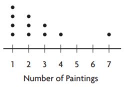
The dot plot shows the number of paintings students in the art club displayed at the art show. Does the dot plot contain any gaps?
If so, where?
Type below:
_________________
Answer: Between the intervals of 4 – 7 excluding 4 and 7
Explanation:

The dots are filled from 1 – 4 and 7 but the region between these two intervals is left unfilled so the region containing gaps is 5-6 including 5 and 6
Question 2.
Identify any clusters in the data.
Type below:
_________________
Answer: 1-4
Explanation:
A group of dots is called a cluster
The dots form a cluster at 1 – 4
Question 3.
Summarize the information in the dot plot.
Type below:
_________________
Answer: It says about the number of paintings done by each student in the art club.
Explanation:
The number of paintings is represented by the number line. The dots represent the students.
Therefore we can say that It says about the number of paintings done by each student in the art club.
On Your Own
Question 4.
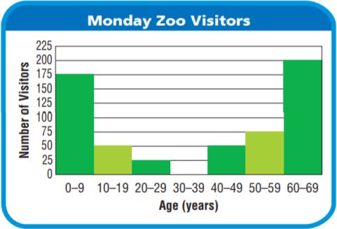
What patterns do you see in the histogram data?
Type below:
_________________
Answer:
Explanation:
STEP 1 Identify any peaks in the data.
The histogram has 6 peaks.
The interval representing the greatest number of visitors is for ages between 60 and 69 age group.
STEP 2 The data changes across the intervals.
The number of visitors increases from 0 to 29 age group and from 40 to 69 age group.
So, the data values increase to one peak in the interval from 0 to 9 age group and then decrease.
The visitors of the age group 30 – 39 did not visit the zoo.
Question 5.
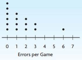
The dot plot shows the number of errors made by a baseball team in the first 16 games of the season. For numbers 5a-5e, choose Yes or No to indicate whether the statement is correct.
5a. There is a gap from 4 to 5.
5b. There is a peak at 0.
5c. The dot plot has symmetry.
5d. There are two modes.
5e. There is one cluster.
5a. __________
5b. __________
5c. __________
5d. __________
5e. __________
Answer:
5a. Yes
5b. Yes
5c. No
5d. No
5e. No
Explanation:
5a. There are dots between 4-5 so we can say that there is a gap from 4 to 5.
5b. The number of dots is more at the interval 0 So we can say that there is a peak at 0.
5c. The symmetrical view is nothing but having the same number of dots on both sides of the figure but we cannot observe it in the above figure. Therefore we can say that the dot plot has no symmetry.
5d. The most frequently occurring observation is known as a mode. One dot repeats in all the intervals so we can say that the mode is 1.
5e. A group of observations form a cluster, there are more than 1 group of dots in the figure given above.
Big Cats – Page No. 710
There are 41 species of cats living in the world today. Wild cats live in places as different as deserts and the cold forests of Siberia, and they come in many sizes. Siberian tigers may be as long as 9 feet and weigh over 2,000 pounds, while bobcats are often just 2 to 3 feet long and weigh between 15 and 30 pounds.
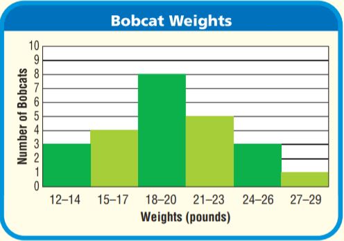
You can find bobcats in many zoos in the United States. The histogram below shows the weights of several bobcats. The weights are rounded to the nearest pound.
Use the histogram for 6 and 7.
Question 6.
Look for a Pattern Describe the overall shape of the histogram.
Type below:
_________________
Answer: The graph starts from a small interval and increases to the highest and then decreases to the smallest interval.
The histogram has rectangles which are closely packed.
Explanation:
STEP 1 Identify any peaks in the data.
The histogram has 1 peak(s).
The interval representing the greatest number of bobcats is for weights between 18 and 20 pounds.
STEP 2 Describe how the data changes across the intervals. The number of bobcats increases from 12 to 17 pounds and from 21 to 29 pounds.
STEP 3 Describe any symmetry the graph has. If I draw a vertical line through the interval for 18 to 20 pounds, the left and right parts of the histogram are very close to being mirror images. The histogram has line symmetry.
So, the data values increase to one peak in the interval for 18 to 20 pounds and then decrease. The data set has a vertical line
symmetry about the peak.
Question 7.
Sense or Nonsense? Sunny says that the graph might have a different shape if it was redrawn as a bar graph with one bar for each number of pounds. Is Sunny’s statement sense or nonsense? Explain.
Type below:
_________________
Answer: Sense
Explanation:
Bar graph also contains rectangles but they are not closely packed hence the statement is correct which is said by Sunny as a bar graph with one bar for each number of pounds.
Patterns in Data – Page No. 711
For 1–2, use the dot plot.
Question 1.
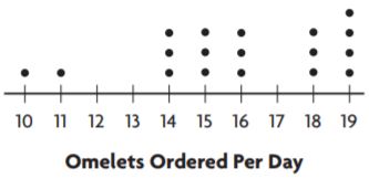
The dot plot shows the number of omelets ordered at Paul’s Restaurant each day. Does the dot plot contain any gaps?
Type below:
_________________
Answer: Yes, the dot plot contain gaps
Explanation:
The dots are filled from 10 – 11, from 14 – 16 and from 18 – 19 but the region between these two intervals is left unfilled so the region containing gaps is 12-13 including 12 and 13, 17 is also left unfilled.
Question 2.
Identify any clusters in the data.
Type below:
_________________
Answer: 14 – 16 and 18 – 19
Explanation:
A group of dots is called a cluster. The dots which form a cluster are 14 – 16 and from 18 – 19.
For 3–4, use the histogram.
Question 3.
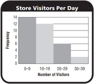
The histogram shows the number of people that visited a local shop each day in January. How many peaks does the histogram have?
Type below:
_________________
Answer: The histogram has only one peak.
Explanation:
The rectangle with tall length represents the highest peak in the graph given above.
The number of people who visited a local shop each day in January were among 0 – 9 visitors and this was the highest frequency having 14 days.
The highest peak is in the interval of 0 – 9.
Question 4.
Describe how the data values change across the intervals.
Type below:
_________________
Answer: They decrease from highest to low values in the given picture above.
Explanation:
The graph represents the number of visitors in the month of January the visitors of number 0 – 9 have the highest frequency,
10 – 19 are the second-highest among the visitors who went to the local shop in the month of January, followed by 20 – 29,
30 – 39
Problem Solving
Question 5.
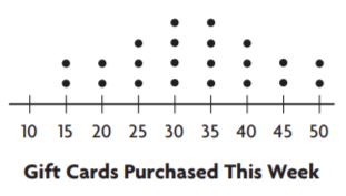
Look at the dot plot at the right. Does the graph have symmetry? Explain.
Type below:
_________________
Answer: Yes, the graph has a symmetry
Explanation:
If I draw a vertical line through the interval for _ to_ pounds, the left and right parts of the histogram are very close to being mirror images. The histogram __ line symmetry.
A geometric figure has line symmetry if you can draw a line through it so that the two parts are mirror images of each other.
So, the data values increase to one peak in the interval for _ to _ pounds and then decrease. The data set __ line symmetry about the peak.
Question 6.
A histogram that shows the ages of students at a library has intervals 1–5, 6–10, 11–15, 16–20, and 21–25. There is a peak at 11–15 years and the graph is symmetric. Sketch what the histogram could look like and describe the patterns you see in the data.
Type below:
_________________
Answer:
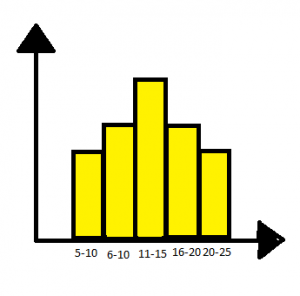
The histogram shows the ages of students at a library has intervals 1–5, 6–10, 11–15, 16–20, and 21–25. There is a peak at 11–15 years and the graph is symmetric.
Explanation:

The histogram is a graph with continuous rectangles which are closely packed.
The asymmetric graph is a graph which has a mirror-like view with equal rectangles on each side.
The graph with the highest peak represents the highest number of students who visit the library in that age group 11 – 15
Lesson Check – Page No. 712
Question 1.
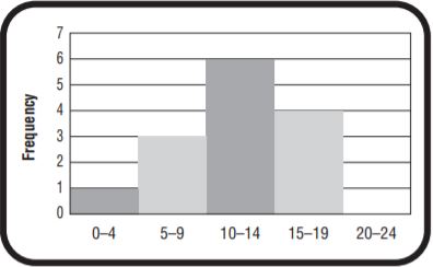
What interval in the histogram has the greatest frequency?
Type below:
_________________
Answer: 10 – 14 interval has highest frequency of 6
Explanation:
The rectangle with a peak can be said as it has the greatest frequency. The interval with a peak is 11 – 15 and the frequency of the peak is 6
Question 2.
Meg makes a dot plot for the data 9, 9, 4, 5, 5, 3, 4, 5, 3, 8, 8, 5. Where does a gap occur?
Type below:
_________________
Answer: 6 – 7 including 6 and 7
Explanation:
Let us consider an axis with 3 to 9 numbers on it plot the dots as given in the question at the points 3,4,5,8 and 9 the gap occurs between 6 and 7 including 6 and 7.
Spiral Review
Question 3.
A rectangular fish tank is 20 inches long, 12 inches wide, and 20 inches tall. If the tank is filled halfway with water, how much water is in the tank?
________ in.
Answer: 37500 cubic centimeter
Explanation:
The length of the rectangle of the rectangular fish tank = 20 inches x 2.5 cm = 50 cm (since 1 inch = 2.5 cm)
The breadth of the rectangle of the rectangular fish tank = 12 inches x 2.5 cm = 30 cm (since 1 inch = 2.5 cm)
The height of the rectangle of the rectangular fish tank = 20 inches x 2.5 cm = 50 cm (since 1 inch = 2.5 cm)
Water filled in the tank = Volume of the tank = 50 x 50 x 30 = 75000 cubic centimeter
If the tank is filled halfway = volume of the tank / 2 = 37500 cubic centimeter
Question 4.
Look at the histogram below. How many students scored an 81 or higher on the math test?
________ students
Answer: 14
Explanation:
The interval 81 – 90 has 10 frequency and the interval 91 – 100 has 4 frequency. So the total number of students = 14
Question 5.
The Little League coach uses a radar gun to measure the speed of several of Kyle’s baseball pitches. The speeds, in miles per hour, are 52, 48, 63, 47, 47. What is the median of Kyle’s pitch speeds?
The median is ________ miles.
Answer: Median is 48
Explanation:
First, write the observations in ascending order or descending order.
The formula to calculate the median is (n+1/2)th observation, for odd number of observations
n = 5 (odd)
Median = (5 + 1 / 2) = (6/2) = 3rd observation = 48
Therefore the median is 48.
Share and Show – Page No. 715
Find the median, lower quartile, and upper quartile of the data.
Question 1.
the scores of 11 students on a geography quiz:
87, 72, 80, 95, 86, 80, 78, 92, 88, 76, 90
Type below:
_________________
Answer: Median: 86, lower quartile: 72, upper quartile: 95
Explanation:
First, write the observations in ascending order or descending order.
The formula to calculate the median is (n+1/2)th observation, for odd number of observations
n = 11 (odd)
Median = (11 + 1 / 2) = (12/2) = 6th observation = 86
Therefore the median is 86.
Lower quartile: 72 Upper quartile: 95
Question 2.
the lengths, in seconds, of 9 videos posted online:
50, 46, 51, 60, 62, 50, 65, 48, 53
Type below:
_________________
Answer: Median: 51 Lower quartile: 46 Upper quartile: 65
Explanation:
First, write the observations in ascending order or descending order.
The formula to calculate the median is (n+1/2)th observation, for odd number of observations
n = 9 (odd)
Median = (9 + 1 / 2) = (10/2) = 5th observation = 51
Therefore the median is 51.
Lower quartile: 46 Upper quartile: 65
Question 3.
Make a box plot to display the data set in Exercise 2.
Type below:
_________________
Answer: The box plot is drawn on the topic: Lengths of the videos (in seconds) posted in the online.

Explanation:
The box is drawn to understand the clear view of the raw data, in a precise manner.
This box gives us information about lengths of the videos posted in the online. We can directly say the median, lower quartile, upper quartile seeing the box plot.
On Your Own
Find the median, lower quartile, and upper quartile of the data.
Question 4.
13, 24, 37, 25, 56, 49, 43, 20, 24
Type below:
_________________
Answer: 25
Explanation:
First, write the observations in ascending order or descending order.
The formula to calculate the median is (n+1/2)th observation, for odd number of observations
n = 9 (odd)
Median = (9 + 1 / 2) = (10/2) = 5th observation =25
Therefore the median is 25.
Question 5.
61, 23, 49, 60, 83, 56, 51, 64, 84, 27
Type below:
_________________
Answer: 58
Explanation:
First, write the observations in ascending order or descending order.
The formula to calculate the median is mean of (n/2) and (n/2+1)th observations, for even number of observations
n = 10 (even)
Median = Mean of (5)th and (6)th observations = 56 + 60 divided by 2 = 116/2 = 58
Therefore the median is 58.
Question 6.
The chart shows the height of trees in a park. Display the data in a box plot.

Type below:
_________________
Answer:

Explanation:
Lower limit: 8
Upper limit: 30
Median:
First, write the observations in ascending order or descending order.
The formula to calculate the median is mean of (n/2) and (n/2+1)th observations, for even number of observations
n = 12 (even)
Median = Mean of (6)th and (7)th observations = 18 + 20 divided by 2 = 38/2 = 19
Therefore the median is 19.
Question 7.
Analyze Eric made this box plot for the data set below. Explain his error.


Type below:
_________________
Answer: The lower and upper limits are marked wrong.
Explanation:
The box drew above the number line is wrong.
It does not show the correct upper and lower limits.
The lower limit is 5 and the upper limit is 35.
Problem Solving + Applcations – Page No. 716
Pose a Problem
Question 8.
The box plots show the number of flights delayed per day for two different airlines. Which data set is more spread out?
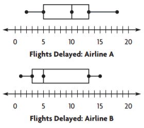
Airline A: greatest value − least value = _____
Airline B: greatest value − least value = _____
So, the data for _____ is more spread out.
Write a new problem that can be solved using the data in the box plots.
Type below:
_________________
Answer:
Airline A: greatest value − least value = 8
Airline B: greatest value − least value = 10
The data for airline B is more spread out.
A problem which can be solved using the box plot can be:

Find the median, lower and upper limits.
Explanation:
The greatest value and lowest value can be identified by seeing the box drew above the number line. The ends represent the lower and upper limits in both the box plots.
The solution to the question framed:
The start and end of the rectangle represent the lower and upper limits. And the middle line represents the median.
The lower limit is 5
Upper limit is 35
Median:
First, write the observations in ascending order or descending order.
The formula to calculate the median is mean of (n/2) and (n/2+1)th observations, for even number of observations
n = 6 (even)
Median = Mean of (3)th and (4)th observations = 15 + 25 divided by 2 = 40/2 = 20
Therefore the median is 20.
Question 9.
The data set shows the cost of the dinner specials at a restaurant on Friday night.

The median is _____.
The lower quartile is _____.
The upper quartile is _____.
Answer:
Median: 24
The lower quartile is 16.
The upper quartile is 30.
Explanation:
Seeing the data in the box we can identify the lower and upper quartiles.
Median:
First, write the observations in ascending order or descending order.
The formula to calculate the median is (n+1/2)th observation, for odd number of observations
n = 11 (odd)
Median = (11 + 1 / 2) = (12/2) = 6th observation =24
Therefore the median is 24.
Box Plots – Page No. 717
Find the median, lower quartile, and upper quartile of the data.
Question 1.
the amounts of juice in 12 glasses, in fluid ounces:
11, 8, 4, 9, 12, 14, 9, 16, 15, 11, 10, 7
Type below:
_________________
Answer:
Median: 10.5
Lower quartile: 4
Upper quartile: 16
Explanation:
Median:
First, write the observations in ascending order or descending order.
The formula to calculate the median is mean of (n/2) and (n/2+1)th observations, for even number of observations
n = 12 (even)
Median = Mean of (6)th and (7)th observations = 10 + 11 divided by 2 = 21/2 = 10.5
Therefore the median is 10.5.
After writing in ascending or descending order the first and last terms justify the lower and upper limits respectively.
They are:
Lower quartile: 4
Upper quartile: 16
Question 2.
the lengths of 10 pencils, in centimeters:
18, 15, 4, 9, 14, 17, 16, 6, 8, 10
Type below:
_________________
Answer:
Median: 12
Lower quartile: 4
Upper quartile: 18
Explanation:
Median:
First, write the observations in ascending order or descending order.
The formula to calculate the median is mean of (n/2) and (n/2+1)th observations, for even number of observations
n = 10 (even)
Median = Mean of (5)th and (6)th observations = 10 + 14 divided by 2 = 24/2 = 12
Therefore the median is 12.
After writing in ascending or descending order the first and last terms justify the lower and upper limits respectively.
They are:
Lower quartile: 4
Upper quartile: 18
Question 3.
Make a box plot to display the data set in Exercise 2.
Type below:
_________________
Answer:

The above box plot represents the lower and upper quartiles, the median.
Explanation:
Box plot is drawn using the number line and the rectangle which is drawn above it.
The ends of the rectangles say about the lower and upper limits and the middle line indicates the median.
Question 4.
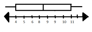
The numbers of students on several teams are 9, 4, 5, 10, 11, 9, 8, and 6. Make a box plot for the data.
Type below:
_________________
Answer:
Explanation:
Box plot is drawn using the number line and the rectangle which is drawn above it.
The ends of the rectangles say about the lower and upper limits and the middle line indicates the median.
Therefore the lower and upper quartiles are 4 and 11 respectively.
Median:
First, write the observations in ascending order or descending order.
The formula to calculate the median is mean of (n/2) and (n/2+1)th observations, for even number of observations
n = 8 (even)
Median = Mean of (4)th and (5)th observations = 8 + 9 divided by 2 = 17/2 = 8.5
Therefore the median is 8.5.
Problem Solving
Question 5.
The amounts spent at a gift shop today are $19, $30, $28, $22, $20, $26, and $26. What is the median? What is the lower quartile?
Type below:
_________________
Answer:
Median: $26
Lower quartile: $19
Upper quartile: $30
Explanation:
Median:
First, write the observations in ascending order or descending order.
The formula to calculate the median is (n+1/2)th observation, for odd number of observations
n = 7 (odd)
Median = (7 + 1 / 2) = (8/2) = 4th observation =26
Therefore the median is 26.
After writing in ascending or descending order the first and last terms justify the lower and upper limits respectively.
They are:
Lower quartile: $19
Upper quartile: $30
Question 6.
The weights of six puppies in ounces are 8, 5, 7, 5, 6, and 9. What is the upper quartile of the data?
Type below:
_________________
Answer: Upper quartile: 9
Explanation:
The highest value in the data is defined as the upper quartile.
The highest value in the raw data given is 9
Question 7.
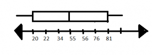
Draw a box plot to display this data: 81, 22, 34, 55, 76, 20, 56.
Type below:
_________________
Answer:
Explanation:
A box plot gives information about the lower and upper quartiles and about the median.
The box plot is drawn using a rectangle and the number line.
Lesson Check – Page No. 718
Question 1.
The values in a data set are 15, 7, 11, 12, 6, 3, 10, and 6. Where would you draw the box in a box plot for the data?
Type below:
_________________
Answer: The box is drawn above the number line.
Explanation:
Example:

The rectangle which can be seen above the number line is the box plot which is drawn.
The box plot gives information about the lower and upper quartiles and about the median.
Question 2.
What is the lower quartile of the following data set?
22, 27, 14, 21, 22, 26, 18
Type below:
_________________
Answer: 14
Explanation:
The value which is lowest in the given data is called the lowest quartile.
Therefore the lowest quartile in the given data is 14.
Spiral Review
Question 3.
Jenn says that “What is the average number of school lunches bought per day?” is a statistical question. Lisa says that “How many lunches did Mark buy this week?” is a statistical question. Who is NOT correct?
Type below:
_________________
Answer: Lisa’s statement is wrong.
Explanation:
Question 4.
The prices of several chairs are $89, $76, $81, $91, $88, and $70. What is the mean of the chair prices?
The mean is $ _________
Answer: $82.5
Explanation:
Number of observations= 6
Mean of the observations= $89 + $76 + $81+ $91+$88+ $70/ 6= 495/6 = $82.5
Question 5.
By how much does the mean of the following data set change if the outlier is removed?
13, 19, 16, 40, 12
Type below:
_________________
Answer: The mean shows a difference if the lower limit is removed the mean increases and if the upper limit is removed the mean decreases.
Explanation:
Outliers are nothing but both upper and lower limits.
The actual mean is 20
But when the lower limit is removed the mean increases to 22 while when the upper limit is removed the mean decreases to 15.
Therefore, we can say that the mean shows a difference when the outliers are removed.
Question 6.
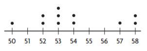
Where in the dot plot does a cluster occur?
Type below:
_________________
Answer: 52 – 54
Explanation:
A cluster is nothing but a group of dots.
In the intervals 52 – 54 a cluster has occurred.
Share and Show – Page No. 721
Use counters, a dot plot, or iTools to find the mean absolute deviation of the data.
Question 1.
Find the mean absolute deviation for both data sets. Explain which data set is more spread out.
the number of laps Shawna swam on 5 different days:
5, 6, 6, 8, 10
mean = 7
the number of laps Lara swam on 5 different days:
1, 3, 7, 11, 13
mean = 7
Type below:
_________________
Answer: Case 2 is more spread out.
Explanation:
CASE1
The number of laps Shawna swam on 5 different days:
5,6,6,8,10
Mean = 7
Deviations:
7 – 5 = 2
7 – 6 = 1
7 – 6 = 1
7 -8 = -1
7 -10=-3
Mean of deviations = 2+1+1+1+3/5 = 8/5 = 1.6
CASE2
The number of laps Lara swam on 5 different days:
1, 3, 7, 11, 13
Mean = 7
Deviations:
7 – 1 = 6
7 – 3 = 4
7 – 7 = 0
7 -11= -4
7 -13= -6
Mean of deviations = 6+ 4 + 0 + 4 + 6 / 5 = 20/5 = 4
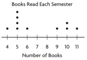
Use the dot plot to find the mean absolute deviation of the data.
Question 2.
mean = 7 books
______ books
Answer: Mean absolute deviation is 2.4
Explanation:
STEP 1 Label each dot with its distance from the mean.
Starting from left to right:
4: 7-4=3
5: 7-5=2
6: 7-6=1
9: 7-9=-2
10: 7-10=-3
11: 7-11=-4
STEP 2 Find the mean of the distances.
(3) + (2) +(2) +(2) +(2) +(1) + (2) +(3) +(3) +(4) / 10 = 24/10 = 2.4
So, the mean absolute deviation of the data is 2.4
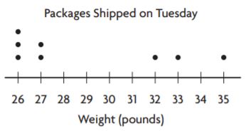
Question 3.
mean = 29 pounds
_______ pounds
Answer: Mean Absolute deviation is 3.2
Explanation:
STEP 1 Label each dot with its distance from the mean.
Starting from left to right:
26: 29-26=03
27: 29-27=02
32: 29-32=-3
33: 29-33=-4
35: 29-35=-6
STEP 2 Find the mean of the distances.
(3) + (2) +(3) +(4) +(6) +(3) + (3) +(2) / 8 = 26/8 = 3.2
So, the mean absolute deviation of the data is 3.2
Question 4.
The mean absolute deviation of the number of daily visits to Scott’s website for February is 167.7. In March, the absolute mean deviation is 235.9. In which month did the number of visits to Scott’s website vary more? Explain how you know.
Type below:
_________________
Answer: As the mean absolute deviation is more in the month of February we can say that there are more visitors in this month.
Explanation:
As the mean of the month of February is less it means that the number of observations are more.
Similarly, as the mean of the month of March is more it means that the number of observations are less.
Therefore we can say that the number of visitors were more in the month of February compared to March.
Question 5.
Write an Inequality Algebra In April, the data for Scott’s website visits are less spread out than they were in February. Use a to represent the mean absolute deviation for April. Write an inequality to describe the possible values of a.
Type below:
_________________
Answer: a < February
Explanation:
Since the data is more spread out in the month of April than they were in February. Therefore the inequality represents “less than” sign.
Problem Solving + Applcations – Page No. 722
Question 6.
Use the table.

The mean of the data is 11. What is the mean absolute deviation of the data?
_______ days
Answer: 3
Explanation:
STEP 1 Label each observation with its distance from the mean.
Starting from left to right:
10: 11-10= 1
12: 11-12=-1
13: 11-13=-2
18: 11-18=-7
10: 11-10= 1
08: 11-08= 3
07: 11-07= 4
06: 11-06= 5
16: 11-16=-5
14: 11-14=-3
08: 11-08= 3
10: 11-10= 1
STEP 2 Find the mean of the distances.
1+1 +2 +7 +1 +3 +4 +5+5+3+3+1/ 12
= 36/12 = 3
So, the mean absolute deviation of the data is 3.
Question 7.
Suppose all of the players on a basketball team had the same height. Explain how you could use reasoning to find the mean absolute deviation of the players’ heights.
Type below:
_________________
Answer: 0
Explanation:
If the players on a basketball team had the same height.
The mean deviation will be equal to the 0 because the difference between the mean and the observations is 0.
Let the observations be 2,2,2,2,2
Mean = 10/5 = 2
Mean deviation = (2-2)+(2-2)+(2-2)+(2-2)+(2-2)/5 = 0/5 = 0
Question 8.
Explain Tell how an outlier that is much greater than the mean would affect the mean absolute deviation of the data set. Explain your reasoning.
Type below:
_________________
Answer: An outlier increases the mean absolute deviation of the data set.
Explanation:
The difference between the outlier and the mean is a greater number when added in the sum of observations the mean absolute deviation increases.
Question 9.
The data set shows the number of soccer goals scored by players in 3 games.
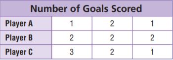
For numbers 9a–9c, choose Yes or No to indicate whether the statement is correct.
9a. The mean absolute deviation of Player A is 1.
9b. The mean absolute deviation of Player B is 0.
9c. The mean absolute deviation of Player C is greater than the mean absolute deviation of Player A.
9a. __________
9b. __________
9c. __________
Answer:
9a. No
9b. Yes
9c. No
Explanation:
Player A
Mean = 1+2+3/3 = 6/3 = 2
Mean absolute deviation = 1+0+1/3 = 2/3 = 0.6
Player B
Mean =2+2+2/3 = 6?3 = 2
Mean absolute deviation = 0/3 = 0
Player C
Mean = 1+2+1/3 = 4/3 = 1.3
Mean absolute deviation = 0.3+0+0.3/3 = 0.2
Mean Absolute Deviation – Page No. 723
Use counters and a dot plot to find the mean absolute deviation of the data.
Question 1.
the number of hours Maggie spent practicing soccer for 4 different weeks:
9, 6, 6, 7
mean = 7 hours
_______ hour
Answer: The mean absolute deviation of the data is 1.
Explanation:
STEP 1 Label each observation with its distance from the mean.
Starting from left to right:
9: 7-9=-2
6: 7-6=-1
6: 7-6=-1
7: 7-7= 0
STEP 2 Find the mean of the distances.
2 +1 +1+0/ 4
= 4 /4 = 1
So, the mean absolute deviation of the data is 1.
Question 2.
the heights of 7 people in inches:
60, 64, 58, 60, 70, 71, 65
mean = 64 inches
_______ inches
Answer: The mean absolute deviation of the data is 4.
Explanation:
STEP 1 Label each observation with its distance from the mean.
Starting from left to right:
60: 64-60= 4
64: 64-64= 0
58: 64-58= 6
60: 64-60= 4
70: 64-70=-6
71: 64-71=-7
65: 64-65=-1
STEP 2 Find the mean of the distances.
4+0+6+ 4+6+7+1/7
= 28/7 = 4
So, the mean absolute deviation of the data is 4.
Use the dot plot to find the mean absolute deviation of the data.
Question 3.
mean = 10
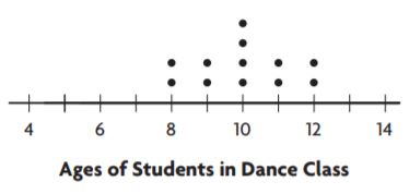
_______ year
Answer: The mean absolute deviation of the data is 1
Explanation:
STEP 1 Label each dot with its distance from the mean.
Starting from left to right:
08: 10-08=02
09: 10-09=01
10: 10-10= 0
11: 10-11=-1
12: 10-12=-2
STEP 2 Find the mean of the distances.
(2) + (1) +(0) +(1) +(2) +(2)+(1)+(0)+(0)+(0)+(1)+(2) /12 = 12/12= 1
So, the mean absolute deviation of the data is 1
Question 4.
mean = 8
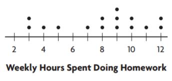
_______ hours
Answer: The mean absolute deviation of the data is 2.4
Explanation:
STEP 1 Label each dot with its distance from the mean.
Starting from left to right:
03: 8-03=05
04: 8-04=04
05: 8-05=03
07: 8-07=01
08: 8-08= 0
09: 8-09=-1
10: 8-10=-2
11: 8-11=-3
12: 8-12=-4
STEP 2 Find the mean of the distances.
(5) + (4) +(3) +(1) +(0) +(1) + (2) +(3) +(4)+(5)+(0)+(1)+(1)+(2)+(4)/ 15 = 36/15 = 2.4
So, the mean absolute deviation of the data is 2.4
Problem Solving
Question 5.
In science class, Troy found the mass, in grams, of 6 samples to be 10, 12, 7, 8, 5, and 6. What is the mean absolute deviation?
_______ grams
Answer: The mean absolute deviation of the data is 2.
Explanation:
Mean = 10+12+7+8+5+6/6 = 48/6 = 8
Mean absolute deviation:
STEP 1 Label each observation with its distance from the mean.
Starting from left to right:
10: 8-10= -2
12: 8-12= -4
07: 8-07= 01
08: 8-08= 0
05: 8-05=03
06: 8-06=02
STEP 2 Find the mean of the distances.
2+4+1+0+3+2/6
= 12/6 = 2
So, the mean absolute deviation of the data is 2.
Question 6.
Five recorded temperatures are 71°F, 64°F, 72°F, 81°F, and 67°F. What is the mean absolute deviation?
_______ °F
Answer: The mean absolute deviation of the data is 4.4.
Explanation:
Mean = 71+64+72+81+67/5 = 355/5 = 71
Mean absolute deviation:
STEP 1 Label each observation with its distance from the mean.
Starting from left to right:
71: 71-71= 0
64: 71-64= 07
72: 71-72= -1
81: 71-81=-10
67: 71-67= 04
STEP 2 Find the mean of the distances.
0+7+1+10+4/5
= 22/5 = 4.4
So, the mean absolute deviation of the data is 4.4.
Question 7.
Make a dot plot of the following data: 10, 10, 11, 12, 12, 13, 13, 15. Use the dot plot to find the mean absolute deviation.
Type below:
_________________
Answer: The mean absolute deviation of the data is 1.25
Explanation:
Mean = 10+10+11+12+12+13+13+15/8 = 96/8 = 12
Mean absolute deviation:
Box plot:

STEP 1 Label each dot with its distance from the mean.
Starting from left to right:
10: 12-10=02
11: 12-11=01
12: 12-12=0
13: 12-13=-1
15: 12-15=-3
STEP 2 Find the mean of the distances.
(2) + (2) +(1) +(0) +(0) +(1) + (1) +(3) / 8 = 10/8 = 1.25
So, the mean absolute deviation of the data is 1.25
Lesson Check – Page No. 724
Question 1.
Six test grades are 86, 88, 92, 90, 82, and 84. The mean of the data is 87. What is the mean absolute deviation?
_______
Answer: The mean absolute deviation of the data is 3.5
Explanation:
Mean absolute deviation:
STEP 1 Label each observation with its distance from the mean.
Starting from left to right:
86: 87-86= 01
88: 87-88= -1
92: 87-92= -5
90: 87-81= 06
82: 87-82= 05
84: 87-84= 03
STEP 2 Find the mean of the distances.
1+5+1+6+5+3/6
= 21/6 = 3.5
So, the mean absolute deviation of the data is 3.5
Question 2.
Eight heights in inches are 42, 36, 44, 46, 48, 42, 48, and 46. The mean of the data is 44. What is the mean absolute deviation?
_______ inches
Answer:
Explanation: The mean absolute deviation of the data is 3
Mean absolute deviation:
STEP 1 Label each observation with its distance from the mean.
Starting from left to right:
42: 44-42= 02
36: 44-36= 08
44: 44-44= 0
46: 44-46= -2
48: 44-48= -4
42: 44-42= 02
48: 44-48= -4
46: 44-46= -2
STEP 2 Find the mean of the distances.
2+8+2+4+0+2+4+2/8
= 24/8 = 3
So, the mean absolute deviation of the data is 3
Spiral Review
Question 3.
What is the volume of a rectangular prism with dimensions 4 meters, 1 \(\frac{1}{2}\) meters, and 5 meters?
_______ m3
Answer: 30m3
Explanation:
Dimentions: 4 meters, 1 1/2 meters, 5 meters
Change the mixed fraction into improper fraction = 3/2
Volume of the rectangle = 4 x 3/2 x 5 = 30m3
Question 4.
Carrie is making a frequency table showing the number of miles she walked each day during the 30 days of September. What value should she write in the Frequency column for 9 to 11 miles?
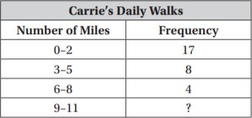
_______
Answer: 1
Explanation:
Total number of days in the month of September = 30
Number of days given in the frequency table = 17+8+4 = 29
Frequency in the interval 9 – 11 = 30 – 29 = 1 day
Question 5.
The following data shows the number of laps each student completed. What number of laps is the mode?
9, 6, 7, 8, 5, 1, 8, 10
The mode is _______ laps.
Answer: The mode is 8 laps.
Explanation:
The most frequently occurring observation is known as mode.
8 is the mode in the above raw data given.
Question 6.
What is the upper quartile of the following data?
43, 48, 55, 50, 58, 49, 38, 42, 50
The upper quartile is _______
Answer: The upper quartile is 58
Explanation:
The highest observation in the data given is known as upper quartile. The upper quartile is 58
Share and Show – Page No. 727
Question 1.
Find the range and interquartile range of the data in the box plot.
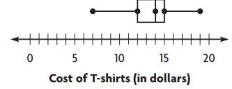
The range is $ __________ .
The interquartile range is $ __________ .
Answer: $12, $3
Explanation:
The difference between the highest observation and the lowest observation is called a range.
Range = 19 – 7 = $12
The difference and the highest and the lowest dots of the dot plot is called as interquartile range.
Interquartile range = 15 – 12 = $3
Practice: Copy and Solve Find the mean absolute deviation for the data set.
Question 2.
heights in inches of several tomato plants:
16, 18, 18, 20, 17, 20, 18, 17
_______ inch
Answer: The mean absolute deviation of the data is 1
Explanation:
Mean:
Mean = 16+18+18 +20+17+20+18+17/8 = 144/8 = 18
Mean absolute deviation:
STEP 1 Label each observation with its distance from the mean.
Starting from left to right:
16: 18-16= 02
18: 18-18= 0
18: 18-18= 0
20: 18-20= -2
17: 18-17= 01
20: 18-20= -2
18: 18-18= 0
17: 18-17= 01
STEP 2 Find the mean of the distances.
2+0+0+2+1+2+0+1/8
= 8/8 = 1
So, the mean absolute deviation of the data is 1
Question 3.
times in seconds for students to run one lap:
68, 60, 52, 40, 64, 40
_______ seconds
Answer: The mean absolute deviation of the data is 10
Explanation:
Mean:
Mean = 68+60+52+40+64+40/6 = 54
Mean absolute deviation:
STEP 1 Label each observation with its distance from the mean.
Starting from left to right:
68: 54-68= -14
60: 54-60= -6
52: 54-52= 02
40: 54-40= 14
64: 54-64= -10
40: 54-40= 14
STEP 2 Find the mean of the distances.
14+6+2+14+10+14/6
= 60/6 = 10
So, the mean absolute deviation of the data is 10
On Your Own
Use the box plot for 4 and 5.
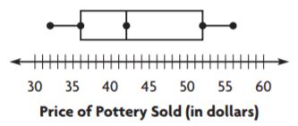
Question 4.
What is the range of the data?
$ _______
Answer: $24
Explanation:
The difference between the highest observation and the lowest observation is called a range.
Range = $56 – $32 = $24
Question 5.
What is the interquartile range of the data?
$ _______
Answer: $16
Explanation:
The difference and the highest and the lowest dots of the dot plot is called as interquartile range.
Interquartile range = $52 – $36 = $16
Practice: Copy and Solve Find the mean absolute deviation for the data set.
Question 6.
times in minutes spent on a history quiz:
35, 35, 32, 34, 34, 32, 34, 36
_______ minute
Answer: The mean absolute deviation of the data is 1
Explanation:
Mean:
Mean = 35+ 35+ 32+ 34+34+ 32+ 34+36/8 = 272/8 = 34
Mean absolute deviation:
STEP 1 Label each observation with its distance from the mean.
Starting from left to right:
35: 34-35= -1
35: 34-35= -1
32: 34-32= 02
34: 34-34= 0
34: 34-34= 0
32: 34-32=02
34: 34-34=0
36: 34-36=-2
STEP 2 Find the mean of the distances.
1+1+2+0+0+2+0+2/8
= 8/8 = 1
So, the mean absolute deviation of the data is 1
Question 7.
number of excused absences for one semester:
1, 2, 1, 10, 9, 9, 10, 6, 1, 1
_______
Answer: The mean absolute deviation of the data is 3.8
Explanation:
Mean:
Mean =1+2+1+10+9+9+10+6+1+1 /10 = 50/10 = 5
Mean absolute deviation:
STEP 1 Label each observation with its distance from the mean.
Starting from left to right:
1: 5-1= 4
2: 5-2= 3
1: 5-1= 4
10: 5-10= -5
9: 5-9= -4
9: 5-9=-4
10: 5-10=-5
6: 5-6=-1
1: 5-1=4
1: 5-1=4
STEP 2 Find the mean of the distances.
4+3+4+5+4+4+5+1+4+4/10
=38/10 = 3.8
So, the mean absolute deviation of the data is 3.8
Question 8.
The chart shows the price of different varieties of dog food at a pet store. Find the range, interquartile range, and the mean absolute deviation of the data set.

Type below:
_________________
Answer:
The mean absolute deviation of the data is 3.6
Range = 32-16 = 16
Interquartile range = 24 – 20 = 4
Explanation:
Mean:
Mean =18+24+20+26+24+20+32+20+16+20 /10 = 220/10 = 22
Mean absolute deviation:
STEP 1 Label each observation with its distance from the mean.
Starting from left to right:
18: 22-18= 4
24: 22-24= -2
20: 22-20= 2
26: 22-26= -4
24: 22-24= -2
20: 22-20= 2
32: 22-32=-10
20: 22-20= 2
16: 22-16= 6
20: 22-20= 2
STEP 2 Find the mean of the distances.
4+2+2+4+2+2+10+2+6+2/10
=36/10 = 3.6
So, the mean absolute deviation of the data is 3.6
The difference between the highest observation and the lowest observation is called a range.
Range = 32-16 = 16
The difference and the highest and the lowest dots of the dot plot is called as interquartile range.
Interquartile range = 24 – 20 = 4
Problem Solving + Applications – Page No. 728
Question 9.
Hyato’s family began a walking program. They walked 30, 45, 25, 35, 40, 30, and 40 minutes each day during one week. At the right, make a box plot of the data. Then find the interquartile range.
_______ minutes
Answer: 35 minutes
Explanation:
Ascending order: 25,30,30,35,40,40,45
n=7 (odd)
Median= Number of (n+1/2) = 8/2 = 4th observation = 35
Median:(four terms of the data)
Median = 30+30/2 = 60/2 = 30
Median:(last 3 terms of the data)
Median = (n+1/2) = 2nd observation = 40
Interquartile range = 30+40/2 = 70/2 = 35
Question 10.
Compare Jack recorded the number of minutes his family walked each day for a month. The range of the data is 15. How does this compare to the data for Hyato’s family?
Type below:
_________________
Answer: Jack’s family walked less number of minutes each day compared to Hyato’s family.
Explanation:
The range of Hyato’s family is 20 while the range of Jack’s family is 15. Therefore we can say that Hyato’s family walked more minutes compared to Jack’s family in a day.
Range can define the data with large observations and the data with least observations.
Question 11.
Sense or Nonsense? Nathan claims that the interquartile range of a data set can never be greater than its range. Is Nathan’s claim sense or nonsense? Explain.
Type below:
_________________
Answer: Nonsense, Interquartile range of a data set can be less than or greater than range.
Explanation:
The interquartile range is the difference between the medians of the observations.
Nathan’s claim is nonsense as he said that, ” The interquartile range can never be greater than its range.”
The range is the difference between the highest observation and the lowest observation.
The interquartile range can be less than greater than the range.
Example:
Ascending order: 25,30,30,35,40,40,45
n=7 (odd)
Median= Number of (n+1/2) = 8/2 = 4th observation = 35
Median:(four terms of the data)
Median = 30+30/2 = 60/2 = 30
Median:(last 3 terms of the data)
Median = (n+1/2) = 2nd observation = 40
Interquartile range = 30+40/2 = 70/2 = 35
Range= 45-25 = 20
In the above case the interquartile range is more than the range proving that the given statement is nonsense.
Question 12.
The box plot shows the heights of corn stalks from two different farms.
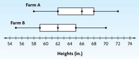
The range of Farm A’s heights is _____ the range of Farm B’s heights.
Answer: greater than
Explanation:
The range is the difference between the highest and the lowest observations.
Range of Farm A: 72-58 = 14
Range of Farm B: 70-55 = 15
Therefore, The range of Farm A’s heights is greater than the range of Farm B’s heights.
Measures of Variability – Page No. 729
Question 1.
Find the range and interquartile range of the data in the box plot.
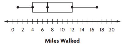
The range is __________ miles.
The interquartile range is __________ miles.
Answer: 16, 8
Explanation:
The difference between the highest and the lowest observations is range.
Range = 17 – 1 = 16
The difference between the highest and lowest observations of the box is the interquartile range.
Interquartile range = 12 – 4 = 8
Use the box plot for 2 and 3.
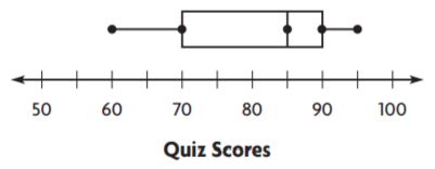
Question 2.
What is the range of the data?
_____
Answer: 35
Explanation:
The difference between the highest and the lowest observations is range.
Range = 95 – 60 = 35
Question 3.
What is the interquartile range of the data?
_____
Answer: 20
Explanation:
The difference between the highest and lowest observations of the box is the interquartile range.
Interquartile range = 90 – 70 = 20
Find the mean absolute deviation for the set.
Question 4.
heights in centimetres of several flowers:
14, 7, 6, 5, 13
_____ cm
Answer: The mean absolute deviation of the data is 3.6
Explanation:
Mean:
Mean =14+7+ 6+5+13/5= 45/5 = 9
Mean absolute deviation:
STEP 1 Label each observation with its distance from the mean.
Starting from left to right:
14: 9-14= -5
07: 9-07= 02
06: 9-06= 03
05: 9-05= 04
13: 9-13= -4
STEP 2 Find the mean of the distances.
5+2+3+4+4/5
= 18/5 = 3.6
So, the mean absolute deviation of the data is 3.6
Question 5.
ages of several children:
5, 7, 4, 6, 3, 5, 3, 7
_____ years
Answer: The mean absolute deviation of the data is 1.25
Explanation:
Mean:
Mean = 5+7+4+6+ 3+5+3+7/8 = 40/8 = 5
Mean absolute deviation:
STEP 1 Label each observation with its distance from the mean.
Starting from left to right:
5: 5-5= 0
7: 5-7= -2
4: 5-4= 01
6: 5-6= -1
3: 5-3= 02
5: 5-5= 0
3: 5-3= 02
7: 5-7=-2
STEP 2 Find the mean of the distances.
0+2+1+1+2+0+2+2/8
= 10/8 = 1.25
So, the mean absolute deviation of the data is 1.25
Problem Solving
Question 6.
The following data set gives the amount of time, in minutes, it took five people to cook a recipe. What is the mean absolute deviation for the data?
33, 38, 31, 36, 37
_____ minutes
Answer: The mean absolute deviation of the data is 2.4
Explanation:
Mean:
Mean = 33+38+31+36+37/5 = 175/5 = 35
Mean absolute deviation:
STEP 1 Label each observation with its distance from the mean.
Starting from left to right:
33: 35-33= 02
38: 35-38= -3
31: 35-31= 04
36: 35-36= -1
37: 35-37= -2
STEP 2 Find the mean of the distances.
2+3+4+1+2/5
= 12/5 = 2.4
So, the mean absolute deviation of the data is 2.4
Question 7.
The prices of six food processors are $63, $59, $72, $68, $61, and $67. What are the range, interquartile range, and mean absolute deviation for the data?
Type below:
_________________
Answer: Range = $9 The mean absolute deviation of the data is 4
Explanation:
The difference between the highest and the lowest observations is range.
Range = $68 – $59 = $9
The difference between the highest and lowest observations of the box is the interquartile range.
Interquartile range = 12 – 4 = 8
Mean:
Mean = $63+$59+$72+$68+$61+$67/6 = 390/6 = 65
Mean absolute deviation:
STEP 1 Label each observation with its distance from the mean.
Starting from left to right:
63: 65-63= 02
59: 65-59= 06
72: 65-72= -7
68: 65-68= -3
61: 65-61= -4
67: 65-67= -2
STEP 2 Find the mean of the distances.
2+6+7+3+4+2/6
= 24/6 = 4
So, the mean absolute deviation of the data is 4
Question 8.
Find the range, interquartile range, and mean absolute deviation for this data set: 41, 45, 60, 61, 61, 72, 80.
Type below:
_________________
Answer: The mean absolute deviation of the data is 9.7
Explanation:
Mean:
Mean = 41+45+60+61+61+72+80 /7 = 420/7 = 60
Mean absolute deviation:
STEP 1 Label each observation with its distance from the mean.
Starting from left to right:
41: 60-41= 19
45: 60-45= 15
60: 60-60= 0
61: 60-61= -1
61: 60-61= -1
72: 60-72= -12
80: 60-80= -20
STEP 2 Find the mean of the distances.
19+15+0+1+1+12+20/7
= 68/7 = 9.7
So, the mean absolute deviation of the data is 9.7
Lesson Check – Page No. 730
Question 1.
Daily high temperatures recorded in a certain city are 65°F, 66°F, 70°F, 58°F, and 61°F. What is the mean absolute deviation for the data?
_____ °F
Answer: The mean absolute deviation of the data is 3.6
Explanation:
Mean:
Mean = 65+66+70+58+61 /5 = 320/5 = 64
Mean absolute deviation:
STEP 1 Label each observation with its distance from the mean.
Starting from left to right:
65: 64-65=-1
66: 64-66=-2
70: 64-70=-6
58: 64-58=06
61: 64-61=03
STEP 2 Find the mean of the distances.
1+2+6+6+3/5
= 18/5 = 3.6
So, the mean absolute deviation of the data is 3.6
Question 2.
Eight different cereals have 120, 160, 135, 144, 153, 122, 118, and 134 calories per serving. What is the interquartile range for the data?
_____ calories
Answer: 42cereals
Explanation:
Ascending order of the data: 118,120,122,134,135,144,153,160
Median:(for first 4 terms)
Median= 120+122/2 = 242/2 = 121
Median:(for first 4 terms)
Median= 144+153/2 = 297/2 = 148.5
The difference and the highest and the lowest dots of the dot plot is called as interquartile range.
Interquartile range = 148.5 – 121 = 27.5
Spiral Review
Question 3.
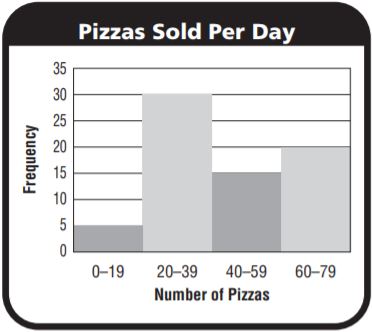
Look at the histogram. How many days did the restaurant sell more than 59 pizzas?

________
Answer: 20
Explanation:
After 59 there is 1 interval 60-79
Number of days the restaurant sell more than 59 pizzas = 20
Question 4.
Look at the histogram. Where does a peak in the data occur?
Type below:
_________________
Answer: 20 – 39
Explanation:
Number of days the restaurant sold the maximum pizzas = 30
Number pizzas sold in each day = 20 – 39
Question 5.
What is the mode of the data set?
14, 14, 18, 20
The mode is ________
Answer: 14
Explanation:
The most frequently occurring observation is known as a mode.
In the above data mode is 14.
Question 6.
The data set below lists the ages of people on a soccer team. The mean of the data is 23. What is the mean absolute deviation?
24, 22, 19, 19, 23, 23, 26, 27, 24
________
Answer: The mean absolute deviation of the data is 2
Explanation:
Mean absolute deviation:
STEP 1 Label each observation with its distance from the mean.
Starting from left to right:
24: 23-24=-1
22: 23-22= 1
19: 23-19= 4
19: 23-19= 4
23: 23-23=0
23: 23-23=0
26: 23-26=-3
27: 23-27=-4
24: 23-24=-1
STEP 2 Find the mean of the distances.
1+1+4+4+3+4+1+0+0/9
= 18/9 = 2
So, the mean absolute deviation of the data is 2
Mid-Chapter Checkpoint – Vocabulary – Page No. 731
Choose the best term from the box to complete the sentence.
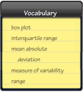
Question 1.
The _____ is the difference between the upper quartile and the lower quartile of a data set.
Type below:
_________________
Answer: Range
Explanation:
The difference between the upper and lower quartiles of the data is known as range.
Question 2.
A graph that shows the median, quartiles and least and greatest values of a data set is called a(n) _____.
Type below:
_________________
Answer: Box plot
Explanation:
The figure which shows the median, quartiles and least and greatest values of a data set is called a box plot, a box plot is a figure which represents median with a horizontal line and the starting and ending line represents the upper and lower quartiles and the end dots represent the upper limit and the lower limit.
Question 3.
The difference between the greatest value and the least value in a data set is the _____.
Type below:
_________________
Answer: Range
Explanation:
Each data set consists of upper and lower limits the difference between these limits is called as range.
Question 4.
The _____ is the mean of the distances between the values of a data set and the mean of the data set.
Type below:
_________________
Answer: Mean absolute
Explanation:
Mean absolute deviation is calculated by subtracting each observation from the mean and then the mean is calculated for these observations.
Therefore we can say that the mean absolute is the mean of the distances between the values of a data set and the mean of the data set.
Concepts and Skills
Question 5.
Make a box plot for this data set: 73, 65, 68, 72, 70, 74.
Type below:
_________________
Answer: Median = 71
Explanation:
Median:
Ascending order: 65, 68, 70, 72, 73,74
n = even = 6
Median = Mean of 3rd and 4th terms
= 70+72/2 = 142/2 = 71
Find the mean absolute deviation of the data.
Question 6.
43, 46, 48, 40, 38
________
Answer: The mean absolute deviation of the data is 3.2
Explanation:
Mean:
Mean = 43+46+48+40+38/5 = 215/5 = 43
Mean absolute deviation:
STEP 1 Label each observation with its distance from the mean.
Starting from left to right:
43: 43-43=0
43: 43-46=-3
43: 43-48=-5
43: 43-40= 3
43: 43-38= 5
STEP 2 Find the mean of the distances.
0+3+5+3+5/5 = 16/5 = 3.2
So, the mean absolute deviation of the data is 3.2
Question 7.
26, 20, 25, 21, 24, 27, 26, 23
________
Answer: The mean absolute deviation of the data is 2.125
Explanation:
Mean:
Mean = 26+20+25+21+24+27+26+23/8 = 192/8 = 24
Mean absolute deviation:
STEP 1 Label each observation with its distance from the mean.
Starting from left to right:
26: 24-26=-3
20: 24-20= 4
25: 24-25= -1
21: 24-21= 3
24: 24-24=0
27: 24-27=-3
26: 24-26=-2
23: 24-23=1
STEP 2 Find the mean of the distances.
3+4+1+3+0+3+2+1/8
= 17/8 = 2.125
So, the mean absolute deviation of the data is 2.125
Question 8.
99, 70, 78, 85, 76, 81
________
Answer: The mean absolute deviation of the data is 2
Explanation:
Mean:
Mean = 99+70+78+85+76+81/6 = 489/6 = 81.5
Mean absolute deviation:
STEP 1 Label each observation with its distance from the mean.
Starting from left to right:
24: 23-24=-1
22: 23-22= 1
19: 23-19= 4
19: 23-19= 4
23: 23-23=0
23: 23-23=0
26: 23-26=-3
27: 23-27=-4
24: 23-24=-1
STEP 2 Find the mean of the distances.
1+1+4+4+3+4+1+0+0/9
= 18/9 = 2
So, the mean absolute deviation of the data is 2
Find the range and interquartile range of the data.
Question 9.
2, 4, 8, 3, 2
The range is _________ .
The interquartile range is _________ .
Answer: 6
Explanation:
The difference between the upper quartile and lower quartile.
Range = 8 – 2 =6
Question 10.
84, 82, 86, 87, 88, 83, 84
The range is _________ .
The interquartile range is _________ .
Answer: 6
Explanation:
The difference between the upper quartile and lower quartile.
Range = 88 – 82 = 6
Question 11.
39, 22, 33, 45, 42, 40, 28
The range is _________ .
The interquartile range is _________ .
Answer: 23
Explanation:
The difference between the upper quartile and lower quartile.
Range = 45 – 22 = 23
Page No. 732
Question 12.
Yasmine keeps track of the number of hockey goals scored by her school’s team at each game. The dot plot shows her data.
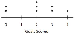
Where is there a gap in the data?
Type below:
_________________
Answer: There is a gap in the data in the intervals: between 1 and 2
Explanation:
As shown in the dot plot there is a gap between 1 and 2. This means that Yasmine’s team did not score only one goal when they played the game.
Question 13.
What is the interquartile range of the data shown in the dot plot with Question 12?
The interquartile range is _________ .
Answer: 2
Explanation:
The interquartile range is the difference between the lower and upper quartiles.
Interquartile range = 3-1 = 2
Question 14.
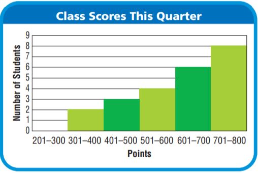
Randall’s teacher added up the class scores for the quarter and used a histogram to display the data. How many peaks does the histogram have? Explain how you know.
Type below:
_________________
Answer: The graph has only one peak
Explanation:
In the given graph there is are rectangles out of which one has a tall rectangle which can be addressed as peak.
Question 15.
In a box plot of the data below, where would the box be drawn?
55, 37, 41, 62, 50, 49, 64
Type below:
_________________
Answer: The box is drawn above the number line and this represents the median and the lower and upper limits.
Explanation:
A box is drawn to represent the median and the upper and lower limits in a box plot.
Share and Show – Page No. 735
Question 1.
The distances in miles students travel to get to school are 7, 1, 5, 9, 9, and 8. Decide which measure(s) of center best describes the data set. Explain your reasoning.
Type below:
_________________
Answer: Mean: 6.5
Median: 7.5
Mode: 9
Explanation:
Mean:
7+1+5+9+9+8/6 = 39/6 = 6.5
Median:
Ascending order: 1,5,7,8,9,9
Median = Mean of 7 and 8 = 7+8/2 = 15/2 = 7.5
Mode:
The most frequently occurring observation is known as the mode.
The mode is 9.
Question 2.
Use Graphs The numbers of different brands of orange juice carried in several stores are 2, 1, 3, 1, 12, 1, 2, 2, and 5. Make a box plot of the data and find the range and interquartile range. Decide which measure better describes the data set and explain your reasoning.
Type below:
_________________
Answer: Range: 11 Interquartile: 3 Interquartile range is the best way to represent the data.
Explanation:
Range = 12 – 1 = 11
Interquartile range :
Median(of first 4 terms):
Median = 1+1/2 = 2/2 = 1
Median (of last 4 terms):
Median = 3+5/2 = 8/2 = 4
Interquartile range = 4 – 1 = 3
On Your Own
Question 3.
Use Reasoning The ages of students in a computer class are 14, 13, 14, 15, 14, 35, 14. Decide which measure of center(s) best describes the data set. Explain your reasoning.
Type below:
_________________
Answer: Mean:17 Median:14 Mode:14 Median and mode is the best ways to represent the data.
Explanation:
Mean:
14+13+14+15+14+35+14/7 = 119/7 = 17
Median:
Ascending order: 13,14,14,14,14,15,35
Median = 14
Mode:
The most frequently occurring observation is known as the mode.
The mode is 14.
Question 4.
Mateo scored 98, 85, 84, 80, 81, and 82 on six math tests. When a seventh math test score is added, the measure of center that best describes his scores is the median. What could the seventh test score be? Explain your reasoning.
Type below:
_________________
Answer: Median is the best way to represent the data.
Explanation:
Median:
Ascending order: 80,81,82,84,85,98
Median = Mean of 3 and 4 = 82+84/2 = 166/2 = 83
The seventh score can be 83
Unlock the Problem – Page No. 736
Question 5.
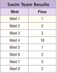
Jaime is on the community swim team. The table shows the team’s results in the last 8 swim meets. Jaime believes they can place in the top 3 at the next swim meet. Which measure of center should Jaime use to persuade her team that she is correct? Explain.
a. What do you need to find?
Type below:
_________________
Answer: Mean, median,mode
Explanation:
Mean= 1+2+2+3+3+1+18+2/8 = 32/8 = 4
Median:
Ascending order: 1,1,2,2,2,3,3,18
Median = 2+2/2 = 2
Mode:
The most frequently occurring observation is called a mode.
Mode=2
Question 5.
b. What information do you need to solve the problem?
Type below:
_________________
Answer: We need to have the data to find the centre of tendencies.
Explanation:
The given data can be used to find the mean, median and mode.
Question 5.
c. What are the measures of center?
Type below:
_________________
Answer: Mean = 4 Median = 2 Mode = 2
Explanation:
There are three measures to calculate their approximate values.
Question 5.
d. Which measure of center should Jaime use? Explain.
Type below:
_________________
Answer: Median or mode
Explanation:
Median or mode are nearer to the solution, therefore, they can be used.
Question 6.
The numbers of sit-ups students completed in one minute are 10, 42, 46, 50, 43, and 49. The mean of the data values is 40 and the median is 44.5. Which measure of center better describes the data, the mean or median? Use words and numbers to support your answer.
Type below:
_________________
Answer: Median is the better way to represent the data.
Explanation:
44.5 is closer and represents the more number of observations compared to the mean.
Choose Appropriate Measures of Center and Variability – Page No. 737
Question 1.
The distances, in miles, that 6 people travel to get to work are 14, 12, 2, 16, 16, and 18. Decide which measure(s) of center best describes the data set. Explain your reasoning.
Type below:
_________________
Answer: Mean= 13 miles Median= 15 miles Mode= 16 miles
Explanation:
Mean is less than the data points.
Median describes the data in the best way compared to mean and mode.
Question 2.
The numbers of pets that several children have are 2, 1, 2, 3, 4, 3, 10, 0, 1, and 0. Make a box plot of the data and find the range and interquartile range. Decide which measure better describes the data set and explain your reasoning.
Type below:
_________________
Answer: Range = 10-0 = 10
Interquartile range = 3.5 – 0.5 = 3
The interquartile range is the best way to represent the data.
Explanation:
Ascending order: 0,0,1,1,2,2,3,3,4,10
Median = 2+2/2 = 2
Lower quartile = 0.5
Upper quartile= 7/2 = 3.5
Highest observation= 10
Lowest observation = 0
Range = 10-0 = 10
Interquartile range = 3.5 – 0.5 = 3
The interquartile range is the best way to represent the data.
Problem Solving
Question 3.
Brett’s history quiz scores are 84, 78, 92, 90, 85, 91, and 0. Decide which measure(s) of center best describes the data set. Explain your reasoning.
Type below:
_________________
Answer: Mean is the best measure of centre to describe the data set.
Explanation:
Mean:
Mean= 84+78+92+90+85+91+0/7 = 74.2
Median:
Ascending order: 0,78,84,85,90,91,92
Median = 4th observation = 85
Question 4.
Eight students were absent the following number of days in a year: 4, 8, 0, 1, 7, 2, 6, and 3. Decide if the range or interquartile range better describes the data set, and explain your reasoning.
Type below:
_________________
Answer: 8 represents all the terms range is more preferable compared to the interquartile range.
Explanation:
Ascending order: 0,1,2,3,4,6,7,8
Range = 8-0 = 8
Median = Mean of 3 and 4 = 3+4/2 = 7/2 = 3.5
Median of first 3 terms = 1
Median of last 3 terms = 7
Interquartile range = 7-1 = 6
Since 8 represents all the terms range is more preferable compared to the interquartile range.
Question 5.
Create two sets of data that would be best described by two different measures of centre.
Type below:
_________________
Answer: The given below are the examples of two sets of data that would be best described by two different measures of centre.
Explanation:
Example 1:
The numbers of pets that several children have are 2, 1, 2, 3, 4, 3, 10, 0, 1, and 0. Make a box plot of the data and find the range and interquartile range. Decide which measure better describes the data set and explain your reasoning.
Type below:
_________________
Answer: Range = 10-0 = 10
Interquartile range = 3.5 – 0.5 = 3
The interquartile range is the best way to represent the data.
Explanation:
Ascending order: 0,0,1,1,2,2,3,3,4,10
Median = 2+2/2 = 2
Lower quartile = 0.5
Upper quartile= 7/2 = 3.5
Highest observation= 10
Lowest observation = 0
Range = 10-0 = 10
Interquartile range = 3.5 – 0.5 = 3
The interquartile range is the best way to represent the data.
Example 2:
Brett’s history quiz scores are 5,6,7,8,9,10. Decide which measure(s) of centre best describes the data set. Explain your reasoning.
Type below:
_________________
Answer: Mean and median are the best measure of centre to describe the data set.
Explanation:
Mean:
Mean= 5+6+7+8+9+10/6 = 7.5
Median:
Ascending order: 5,6,7,8,9,10
Median = Mean of 7 and 8 = 15/2 = 7.5
Lesson Check – Page No. 738
Question 1.
Chloe used two box plots to display some data. The box in the plot for the first data set is wider than the box for the second data set. What does this say about the data?
Type below:
_________________
Answer: The graphs say that the interquartile range is more for the second graph compared to the first.
Explanation:
The interquartile range is the difference between the lower and upper quartiles.
It is more for wider data compared to the compact data.
Question 2.
Hector recorded the temperature at noon for 7 days in a row. The temperatures are 20°F, 20°F, 20°F, 23°F, 23°F, 23°F, and 55°F. Which measure of center would best describe the data?
Type below:
_________________
Answer: Mode
Explanation:
The most frequently occurring observation is known as mode.
The mode of the above data describes the data well, the mode of the data is 20°F
Spiral Review
Question 3.
By how much does the median of the following data set change if the outlier is removed?
13, 20, 15, 19, 22, 26, 42
Type below:
_________________
Answer: 0.5
Explanation:
Median:
Ascending order: 13,15,19,20,22,26,42
Median = 20
If the outlier is removed then the median=
19+20/2 = 39/2 = 19.5
The difference in the medians = 0.5
Question 4.
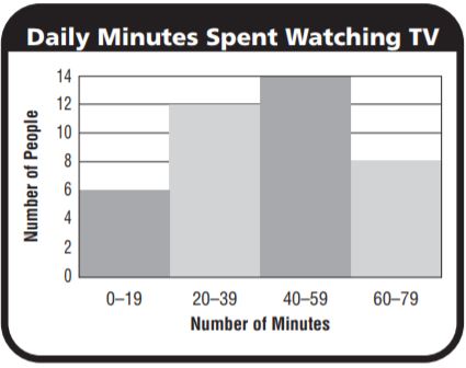
What percent of the people surveyed spent at least an hour watching television?
_______ %
Answer: 8 people
Explanation:
Total number of people= 40
Percentage = 8/40 x 100 = 20%
Question 5.
What is the lower quartile of the following data?
12, 9, 10, 8, 7, 12
The lower quartile is _______ .
Answer:
Explanation:
Ascending order: 7,8,9,10,12,12
Median = 9+10/2 = 9.5
Lower quartile = 8
Question 6.
What is the interquartile range of the data shown in the box plot?

The interquartile range is _______ .
Answer: 5
Explanation:
The difference between the upper and lower quartiles is called as interquartile range.
Interquartile range = 14 – 9 = 5
Share and Show – Page No. 741
Question 1.
Zoe collected data on the number of points her favourite basketball players scored in several games. Use the information in the table to compare the data.
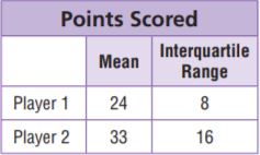
The mean of Player 1’s points is __ the mean of Player 2’s
points.
The interquartile range of Player 1’s points is __ the
interquartile range of Player 2’s points.
So, Player 2 typically scores __ points than Player 1, but
Player 2’s scores typically vary __ Player 1’s scores
Type below:
_________________
Answer: less than ; less than ; more ; more
Explanation:
The mean of Player 1’s points is less than the mean of Player 2’s points.
The interquartile range of Player 1’s points is less than the interquartile range of Player 2’s points.
So, Player 2 typically scores more points than Player 1, but Player 2’s scores typically vary in more Player 1’s scores
Question 2.
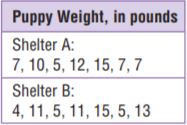
Mark collected data on the weights of puppies at two animal shelters. Find the median and range of each data set, and use these measures to compare the data.
Type below:
_________________
Answer: They differ slightly but on an average we can say that shalter B is more as compared to shelter A
Explanation:
Shelter A
Median:
Ascending order: 5,7,7,7,10,12,15
Median = 4th observation = 7
Range = 15-5 = 10
Shelter B
Median:
Ascending order: 4,5,5,11,11,13,15
Median = 4th observation = 11
Range = 15-4 = 11
On Your Own
Kwan analyzed data about the number of hours musicians in her band practice each week. The table shows her results. Use the table for Exercises 3–5.
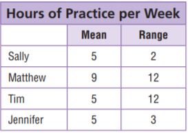
Question 3.
Which two students typically practised the same amount each week, with about the same variation in practice times?
Type below:
_________________
Answer: Sally and Jennifer
Explanation:
They are slightly different but on a whole, the average shows no difference and we can say that Sally and Jennifer practised for the same amount each week
Question 4.
Which two students typically practised the same number of hours, but had very different variations in their practice times?
Type below:
_________________
Answer: Tim and Sally
Explanation:
They are different in range but on a whole, the average shows no difference and we can say that Sally and Tim practised for the same number of hours, but had very different variations in their practice times.
Question 5.
Which two students had the same variation in practice times, but typically practised a different number of hours per week?
Type below:
_________________
Answer: Matthew and Tim
Explanation:
Matthew and Tim practised for the same number of hours but they had a high variation in the range.
Problem Solving + Applications – Page No. 742
Question 6.
Compare The table shows the number of miles Johnny ran each day for two weeks. Find the median and the interquartile range of each data set, and use these measures to compare the data sets.
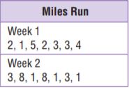
Type below:
_________________
Answer: Interquartile range is the best way to compare the data in the week 1
While the median is the best way to compare the data in the week 2
Explanation:
Week 1
Median:
Ascending order: 1,2,2,3,3,4,5
Median = 4th observation = 3
Lower quartile range= 2
Upper quartile range= 4
Interquartile range = 4-2 = 2
Week 2
Median:
Ascending order: 1,1,1,3,3,8,8
Median = 4th observation = 3
Lower quartile range= 1
Upper quartile range= 8
Interquartile range = 8-1 = 7
Question 7.
Sense or Nonsense? Yashi made the box plots at right to show the data he collected on plant growth. He thinks that the variation in bean plant growth was about the same as the variation in tomato plant growth. Does Yashi’s conclusion make sense? Why or why not?
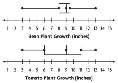
Type below:
_________________
Answer: Sense
Explanation:
Yashi said that thinks that the variation in bean plant growth was about the same as the variation in tomato plant growth.
It is a true statement because the range of both bean and tomato plants growth is the same and they have the same medians.
Question 8.
Kylie’s teacher collected data on the heights of boys and girls in a sixth-grade class. Use the information in the table to compare the data.

The mean of the boys’ heights is _____ the mean of the girls’ heights.
The range of the boys’ heights is _____ the range of the girls’ heights.
Answer: more than ; more than
Explanation:
Mean of boys height:
Mean = 72+68+70+56+58+62+64/7 = 64.2
Range= 72-56 = 16
Mean of girls height:
Mean = 55+60+56+51+60+63+65/7 = 58.5
Range= 65-51 = 14
The mean of the boys’ heights is _more than____ the mean of the girls’ heights.
The range of the boys’ heights is _more than____ the range of the girls’ heights.
Apply Measures of Center and Variability – Page No. 743
Solve.
Question 1.
The table shows temperature data for two cities. Use the information in the table to compare the data.
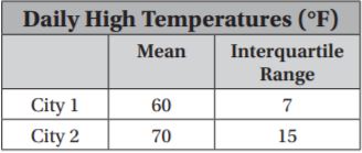
The mean of City 1’s temperatures is the ———————– mean of City 2’s temperatures.
The ———————- of City 1’s temperatures is————— the —————–of City 2’s temperatures.
So, City 2 is typically —————-City 1, but City 2’s temperatures
vary ——————-City 1’s temperatures.
Type below:
_________________
Answer: less than; interquartile range; less than; interquartile range; warmer than; more than
Explanation:
The mean of City 1’s temperatures is the —-less than———- mean of City 2’s temperatures.
The –interquartile range——— of City 1’s temperatures is—less than—– the —-interquartile range—–of City 2’s temperatures.
So, City 2 is typically —warmer than—–City 1, but City 2’s temperatures
vary —–more than——-City 1’s temperatures.
Question 2.
The table shows weights of fish that were caught in two different lakes. Find the median and range of each data set, and use these measures to compare the data.

Type below:
_________________
Answer: Lake A’s average is greater but varies more.
Explanation:
Lake A
Median:
Ascending order: 4,6,7,9,10,12
Median = Mean 3rd and 4th observation = 7+9/2 = 8
Range = 12 – 4 = 8
Lake B
Median:
Ascending order: 4,4,5,6,6,7
Median = Mean 3rd and 4th observation = 5+6/2 = 5.5
Range = 7 – 3 = 4
Problem Solving
Question 3.
Mrs. Mack measured the heights of her students in two classes. Class 1 has a median height of 130 cm and an interquartile range of 5 cm. Class 2 has a median height of 134 cm and an interquartile range of 8 cm. Write a statement that compares the data.
Type below:
_________________
Answer: Class 2 is greater but varies more.
Explanation:
The interquartile range is the difference between the lower and upper quartiles. Since the interquartile range is more for class 2 we can say that the extremes are greater while the interquartile range is less for class 1 which means that the data is compact.
Question 4.
Richard’s science test scores are 76, 80, 78, 84, and 80. His math test scores are 100, 80, 73, 94, and 71. Compare the medians and interquartile ranges.
Type below:
_________________
Answer: Medians are equal but the interquartile range varies a large, math test scores are more spread out compared to science test scores.
Explanation:
Science test scores:
Median:
Ascending order: 76,78,80,80,84
Median = 3rd observation = 80
Interquartile range = 84 – 76 = 10
Math test scores:
Median:
Ascending order: 71,73,80,94,100
Median = 3rd observation = 80
Interquartile range = 100 – 71 = 29
Medians are equal but the interquartile range varies a large, math test scores are more spread out compared to science test scores.
Question 5.
Write a short paragraph to a new student that explains how you can compare data sets by examining the mean and the interquartile range.
Type below:
_________________
Answer: average and consistency
Explanation:
If the mean is more it means that the data has more observations or observations with more value.
Interquartile range and median range say about the consistency.
Lesson Check – Page No. 744
Question 1.
Team A has a mean of 35 points and a range of 8 points. Team B has a mean of 30 points and a range of 7 points. Write a statement that compares the data.
Type below:
_________________
Answer: Similar variation but team A average is more than team B
Explanation:
The range has only a difference of 1 point which can be said as a slight variation but while the average/ mean has a large variation.
Question 2.
Jean’s test scores have a mean of 83 and an interquartile range of 4. Ben’s test scores have a mean of 87 and an interquartile range of 9. Compare the students’ scores.
Type below:
_________________
Answer: Ben’s average is more than Jean’s but Ben is less consistent compared to Jean.
Explanation:
Ben’s average score is more than the average scores of Jean while the interquartile range
Spiral Review
Question 3.
Look at the box plots below. What is the difference between the medians for the two groups of data?
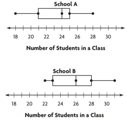
_______ students
Answer: 2 students
Explanation:
Median of students in a class of school A = 24
Median of students in a class of school B = 26
Difference between the medians of the schools = 26-24 = 2 students
Question 4.
The distances in miles that 6 people drive to get to work are 10, 11, 9, 12, 9, and 27. What measure of center best describes the data set?
Type below:
_________________
Answer: Median is the centre best describes the data set
Explanation:
Median:
AScending order: 9,9,10,11,12,27
Median= 3rd and 4th observations = 10+11/2 = 21/2 = 10.5
Question 5.
Which two teams typically practice the same number of hours, but have very different variations in their practice times?
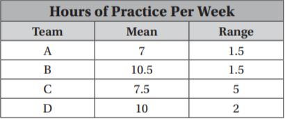
Type below:
_________________
Answer: Team A and C
Explanation:
Team A and C have medians which nare only slightly different but the consistency varies a lot that is range.
Share and Show – Page No. 747
Connie asked people their ages as they entered the food court at the mall. Use the histogram of the data she collected for 1–5.
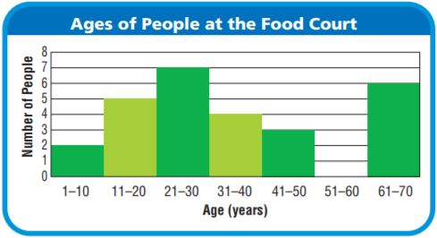
Question 1.
What statistical question could Connie ask about her data?
Type below:
_________________
Answer: Mean, Median, Mode
Explanation:
The graph shows the age and number of people. The questions which can be asked can be of mean, median, mode.
Question 2.
Describe any peak or gap in the data.
Type below:
_________________
Answer: Peak : 21-30 Gap : 61-70
Explanation:
There is a peak in the graph at the interval 21-30
There is a gap in between the bars of the histogram the bar which had a gap before it was 61-70
Question 3.
Does the graph have symmetry? Explain your reasoning.
Type below:
_________________
Answer: No the graph doesn’t have symmetry
Explanation:
The symmetry of the graph means there must be equal parts of the graph on both the sides of the line of the graph.
This is not possible in the above situation.
On Your Own
Question 4.
The lower quartile of the data set is 16.5 years, and the upper quartile is 51.5 years. Find the interquartile range. Is it a better description of the data than the range? Explain your reasoning.
Type below:
_________________
Answer: Interquartile range = 35; The interquartile range is better than the range.
Explanation:
The interquartile range is the difference between the upper quartile and the lower quartile.
Interquartile range = 51.5-16.5 = 35
The interquartile range is better than the range because if we take the example of the above graph we can see thatthe most of the data fall in the range of the interquartile range ie. 35.
Therefore we can say that the interquartile range is better than the range.
Question 5.
Make Arguments The mode of the data is 16 years old. Is the mode a good description of the center of the data? Explain
Type below:
_________________
Answer: No mode is not a good description of the data.
Explanation:
The mode is just a frequently occurring observation.
It cannot be the best way to describe the data.
Problem Solving + Applications – Page No. 748
Use the dot plot for 6–8.
Question 6.
Make Arguments Jason collected data about the number of songs his classmates bought online over the past 3 weeks. Does the data set have symmetry? Why or why not?
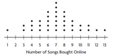
Type below:
_________________
Answer: No, the data has no symmetry.
Explanation:
No, the data has no symmetry. Because there are gaps between the dots drawn.
Question 7.
Jason claims that the median is a good description of his data set, but the mode is not. Does his statement make sense? Explain.
Type below:
_________________
Answer: Median can be a better centre of description. Therefore his statement makes a sense.
Explanation:
Median = 7+8/2 = 15/2 = 7.5
The number 7.5 represents more number of observations.
Question 8.
Trinni surveyed her classmates about how many siblings they have. A dot plot of her data increases from 0 siblings to a peak at 1 sibling and then decreases steadily as the graph goes to 6 siblings. How is Trinni’s dot plot similar to Jason’s? How is it different?
Type below:
_________________
Answer: Trinni graph represents a part of Jason’s graph
Explanation:
In Jason’s graph, there is a peak in the middle and then it decreases on both sides.
But according to Trinni graph, there is no peak in the middle.
Question 9.
Diego collected data on the number of movies seen last month by a random group of students.
![]()
Draw a box plot of the data and use it to find the interquartile range and range.
Type below:
_________________
Answer: Range = 12 Interquartile range = 2
Explanation:
The range is the difference between the highest and lowest observations.
Range = 12-0 = 12
The interquartile range is the difference between the upper and lower quartiles.
Ascending order: 0,0,1,1,2,2,2,2,3,3,3,5,12
Lower quartile = 1+1/2 = 2/2 = 1
Upper quartile = 3+3/2 = 6/2 = 3
Interquartile range = 3-1 = 2
Describe Distributions – Page No. 749
Chase asked people how many songs they have bought online in the past month. Use the histogram of the data he collected for 1–4.
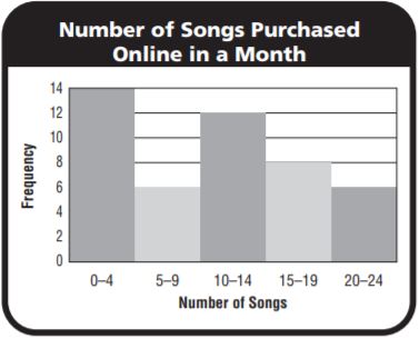
Question 1.
What statistical question could Chase ask about the data?
Type below:
_________________
Answer: What is the median number of songs purchased?
Explanation:
Many questions can be formed from the data given to us
We can ask about the mean, median, mode.
Question 2.
Describe any peaks in the data.
Type below:
_________________
Answer: Peak : 0-4
Explanation:
The peak is a bar in the histogram which has the highest value. The peak of the given graph is 0-4
Question 3.
Describe any gaps in the data.
Type below:
_________________
Answer: There are no gaps in the graph.
Explanation:
The gap is something between a bar of the histogram and all the other adjacent bars.
There no such case in the graph. Therefore there are no gaps in the graph.
Question 4.
Does the graph have symmetry? Explain your reasoning.
Type below:
_________________
Answer: No the graph doesn’t have symmetry
Explanation:
The symmetry of the graph means there must be equal parts of the graph on both the sides of the line of the graph.
This is not possible in the above situation.
Problem Solving
Question 5.
Mr. Carpenter teaches five classes each day. For several days in a row, he kept track of the number of students who were late to class and displayed the results in a dot plot. Describe the data.
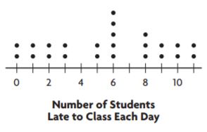
Type below:
_________________
Answer: Peaks: At 6 and 8
Gaps: Between 3 and 5 , 6 and 8
Clusters: Between 0-3 ; 9-11
Explanation:
The highest points in the graph are known as peaks.
They are at 6 and 8 in this graph.
The space between the dots in the dot plot graph is known as gaps.
Gaps are between 3 and 5; 6 and 8
The group of the dots in the dot plot are known as clusters.
The clusters are at the 0-3; 9-11
Question 6.
Describe how a graph of a data set can be used to understand the distribution of the data.
Type below:
_________________
Answer: Mean, median, mode
Explanation:
There are three measures of centre which can be used to describe the data given in the form of a graph.
The three measures of centre are mean, median, mode.
Lesson Check – Page No. 750
Question 1.
The ages of people in a restaurant are 28, 10, 44, 25, 18, 8, 47, and 30. What is the median age of the people in the restaurant?
_______ years old
Answer: Median age of the people in the restaurant is 26.5 approximately 27
Explanation:
Median:
Ascending order: 8,10,18,25,28,30,44,47
Median = Mean of 4th and 5th observations = 25+28/2 = 53/2 = 26.5
Question 2.
What is the median in the dot plot?
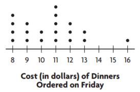
$ ________
Answer: 11
Explanation:
Median is the middlemost value and it is 11 in the above graph.
We need to consider the middle value by neglecting the same number on both the sides.
Spiral Review
Question 3.
Look at the dot plot. Where does a gap occur in the data?
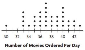
Type below:
_________________
Answer: 30-33
Explanation:
The gap is a space between the intervals.
The intervals are 30-33.
Question 4.
Look at the dot plot. Where does a peak occur in the data?

Type below:
_________________
Answer: 37
Explanation:
The highest point in the graph is known as the peak.
The peak in the dot plot is 37.
Question 5.
Which two teams had similar variations in points earned, but typically earned a different number of points per game?
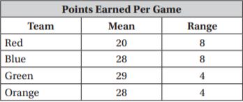
Type below:
_________________
Answer: Red and blue
Explanation:
The difference between the upper and lowest observations is called a range.
The range (consistency) in the data given is the same but they vary in the mean.
But we can say that Red and Blue teams typically earned a different number of points per game.
Question 6.
Manny’s monthly electric bills for the past 6 months are $140, $165, $145, $32, $125, and $135. What measure of center best represents the data?
Type below:
_________________
Answer: Median is the best way to represent the data. Median= 137.5
Explanation:
Median:
Ascending order: 32,125,135,140,145,165
Median = 135+140/2 = 275/2 = 137.5
Share and Show – Page No. 753
Question 1.
Josh is playing a game at the carnival. If his arrow lands on a section marked 25 or higher, he gets a prize. Josh will only play if most of the players win a prize. The carnival worker says that the average (mean) score is 28. The box plot shows other statistics about the game. Should Josh play the game? Explain your reasoning.
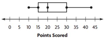
First, look at the median. The median is _ points.
Next, work backwards from the statistics.
The median is the __ value of the data.
So, at least __ of the values are scores
less than or equal to _.
Finally, use the statistics to draw a conclusion.
Type below:
_________________
Answer: middlemost value; 20; 15
Explanation:
First, look at the median. The median is 20 points.
Next, work backwards from the statistics.
The median is the middlemost value of the data.
So, at least 20 of the values are scores
less than or equal to 15.
Finally, use the statistics to draw a conclusion.
Question 2.
What if a score of 15 or greater resulted in a prize? How would that affect Josh’s decision? Explain.
Type below:
_________________
Answer: It doesn’t affect his decision.
Explanation:
Josh wanted to play only when most of the prizes were awarded.
Therefore if the minimum score was 15 or greater than it then they would get the prize. So there will be no difference in his decision.
Question 3.
A store collects data on the sales of DVD players each week for 3 months. The manager determines that the data has a range of 62 players and decides that the weekly sales were very inconsistent. Use the statistics in the table to decide if the manager is correct. Explain your answer.
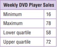
Type below:
_________________
Answer: No the manager is not correct.
Explanation:
The range is given to be 62.
The range is correct when we check it with the help of the given data, therefore, the data is not inconsistent.
On Your Own – Page No. 754
Question 4.
Gerard is fencing in a yard that is 21 feet by 18 feet. How many yards of fencing material does Gerard need? Explain how you found your answer.
_______ yards
Answer: 78 yards of the fencing material is required
Explanation:
Length = 21 feet Breadth = 18 feet
The perimeter of the rectangle = The number of yards of fencing material required = 2(l+b) = 2(21+18) = 2(39) = 78 yards
Question 5.
Susanna wants to buy a fish that grows to be about 4 in. long. Mark suggests she buys the same type of fish he has. He has five of these fish with lengths of 1 in., 1 in., 6 in., 6 in., and 6 in., with a mean length of 4 in. Should Susanna buy the type of fish that Mark suggests? Explain.
Type below:
_________________
Answer: Yes Susanna buy the type of fish that Mark suggests
Explanation:
The length of fish suggested by Mark is 4 in. long.
Mark has 5 fishes with a mean length of 4 in.
To buy a fish of that grows to be about 4 in. long. Susanna should buy the fishes suggested by Mark.
Question 6.
Look for a Pattern The graph shows the number of stamps that Luciano collected over several weeks. If the pattern continues, how many stamps will Luciano collect in Week 8? Explain.
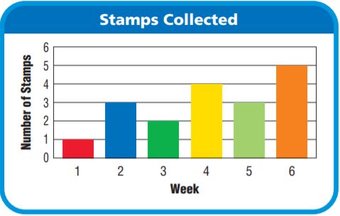
_______ stamps
Answer: 7 stamps
Explanation:
In week 4 and 6, the number of stamps are 4, 5. Therefore in week 6 and 8, the number of stamps are 5, 7
Question 7.
The data set shows the number of hours Luke plays the piano each week. Luke says he usually plays the piano 3 hours per week. Why is Luke’s statement misleading?

Type below:
_________________
Answer: According to the question he should spend 3 hours per week. His statement is correct.
Explanation:
Sum of the data = 1+2+1+3+2+10+2 = 21
Number of days in a week = 7
Mean = 21/7 = 3 hours
Problem Solving Misleading Statistics – Page No. 755
Mr Jackson wants to make dinner reservations at a restaurant that has most meals costing less than $16. The Waterside Inn advertises that they have meals that average $15. The table shows the menu items.
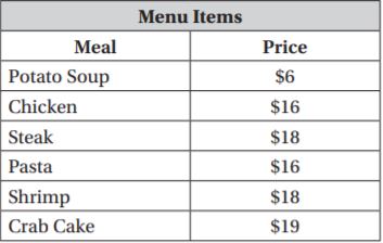
Question 1.
What is the minimum price and the maximum price?
minimum: $ _________
maximum: $ _________
Answer: minimum: $6
maximum: $19
Explanation:
The minimum value is the most minimum price in the given data.
The maximum value is the most maximum price in the given data.
Question 2.
What is the mean of the prices?
$ ________
Answer: $15
Explanation:
Mean = sum of all the observations/ total number of observations = 6+16+18+16+18+19/6 = 93/6 = 15.2
Approximately therefore the mean of the observations is $15
Question 3.
Construct a box plot for the data.
Type below:
_________________
Answer: The box plot is a diagram which signifies the information about the data.
Explanation:

The box plot represents the range, lower and upper quartiles.
Question 4.
What is the range of the prices?
$ ________
Answer: the range is $13
Explanation:
The difference between the upper and lower observations is known as the range.
Range = 19-6 = $13
Question 5.
What is the interquartile range of the prices?
$ ________
Answer: $7.5
Explanation:
Ascending order: $6, $16, $16, $18, $18, $19
Median = 16+18/2 = 34/2 = 17
Lower quartile = 6+16/2 = 11
Upper quartile = 18+19/2 = 18.5
Interquartile range = 18.5-11 = 7.5
Question 6.
Does the menu match Mr. Jackson’s requirements? Explain your reasoning.
Type below:
_________________
Answer: Yes the menu matches Mr Jackson’s requirements.
Explanation:
Mr Jackson wants to make dinner arrangements with cost less than $16.
The mean of the items in the menu:
Mean = $6+$16+$16+$18+$18+$19/6 = 93/6 = $15.5
Therefore the requirements of Mr Jackson is satisfied.
Question 7.
Give an example of a misleading statistic. Explain why it is misleading.
Type below:
_________________
Answer: The Waterside Inn advertises the misleading statement.
Explanation:
According to the information given in the question, The Waterside Inn advertises that they have meals that average $15. But it is more than that, so this is the misleading statement.
The mean of the items in the menu:
Mean = $6+$16+$16+$18+$18+$19/6 = 93/6 = $15.5
Therefore the requirements of Mr Jackson is satisfied.
Lesson Check – Page No. 756
Question 1.
Mary’s science test scores are 66, 94, 73, 81, 70, 84, and 88. What is the range of Mary’s science test scores?
________
Answer: 28
Explanation:
The difference between the highest and the lowest observations is called a range.
Range = 94 – 66 = 28
Question 2.
The heights in inches of students on a team are 64, 66, 60, 68, 69, 59, 60, and 70. What is the interquartile range?
________
Answer: Interquartile range = 9
Explanation:
Ascending order: 59,60,60,64,66,68,69,70
Median = Mean of 64 and 66 = 64+66/2 = 130/2 = 65
Lower quartile = 60
Upper quartile = 69
Interquartile range = 69 – 60 = 9
Spiral Review
Question 3.
By how much does the median of the following data set change if the outlier is removed?
26, 21, 25, 18, 0, 28
Type below:
_________________
Answer: The median changes by 3.5
Explanation:
Ascending order: 0,18,21,25,26,28
Median = 21+28/2 = 49/2 = 24.5
If the outlier is removed then the
Median = 21
Difference between the 1st and 2nd median = 24.5 – 21 = 3.5
Question 4.
Look at the box plot. What is the interquartile range of the data?

________
Answer: Interquartile range = 6
Explanation:
The difference between the lower and upper quartiles is known as the interquartile range.
Interquartile range = 50 – 44 = 6
Question 5.
Erin is on the school trivia team. The table shows the team’s scores in the last 8 games. Erin wants to build confidence in her team so that they will do well in the last game. If a score of 20 is considered a good score, what measure of center would be best for Erin to use to motivate her teammates?
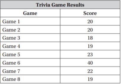
Type below:
_________________
Answer: Mean and median are the best centre of tendencies to compare the data.
Explanation:
Mean = 20+20+18+19+23+40+22+19/8 = 181/8 = 22.6
Median:
Ascending order: 18,19,19,20,20,22,23,40
Median = 40/2 = 20
Chapter 13 Review/Test – Page No. 757
Question 1.
The dot plot shows the number of chin-ups done by a gym class.

For numbers 1a–1e, choose Yes or No to indicate whether the statement is correct.
1a. There are two peaks.
1b. There are no clusters.
1c. There is a gap from 6 to 8.
1d. The most chin-ups anyone did was 15.
1e. The modes are 3, 4, and 9.
1a. ____________
1b. ____________
1c. ____________
1d. ____________
1e. ____________
Answer: 1a. Yes
1b. No
1c. Yes
1d. No
1e. Yes
Explanation:
1a. The highest point in the dot plot is called the peak. The peak in the given dot plot is at 5 and 11 the value of the peak is 3
1b. The group of dots form a cluster with 3 or more intervals.
1c. There is a gap between the intervals 6-8
1d. The maximum number of people did 11 chin-ups while only a single person did 15 chin-ups.
1e. The most frequently occurring observation is known as mode.
The mode of the given data is at the intervals 3,4 and 9.
Question 2.
The histogram shows the high temperatures in degrees Fahrenheit of various cities for one day in March.
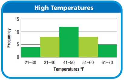
Select the best word to complete each sentence.
The histogram has _____ peak(s).
The histogram _____ symmetry.
Answer: The histogram has 1 peak(s).
The histogram is symmetry.
Explanation:
The is one and only one peak at the interval 41 – 50
We can say that the graph is symmetrical because if we draw a line between the graph we can observe that the graph has two parts symmetric to each other.
Chapter 13 Review/Test – Page No. 758
Question 3.
The data set shows the scores of the players on the winning team of a basketball game.

The median is _____.
The lower quartile is _____.
The upper quartile is _____.
Answer:Median = 6
Lower quartile = 1
Upper quartile =19.5
Explanation:
Ascending order: 0,0,1,1,4,5,6,9,13,17,22,30,47
Median = 6
Lower quartile = Mean of 1 and 1 = 1+1/2 = 2/2 = 1
Upper quartile = Mean of 17 and 22 = 17+22/2 = 39/2 = 19.5
Question 4.
The data set shows the number of desks in 12 different classrooms.

Find the values of the points on the box plot.

Type below:
_________________
Answer: A= 16 B=17 C= 20 D= 21 E=24
Explanation:
Ascending order: 16,17,17,18,19,20,20,21,21,21,22,24
Median = 20+20/2 = 20
Lower quartile = 17
Upper quartile = 21
Question 5.
The box plot shows the number of boxes sold at an office supply store each day for a week.

For numbers 5a–5d, select True or False for each statement.
5a. The median is 18.
5b. The range is 15.
5c. The interquartile range is 9.
5d. The upper quartile is 18.
5a. ____________
5b. ____________
5c. ____________
5d. ____________
Answer: 5a. false
5b. true
5c. true
5d. true
Explanation:
Median is the middlemost value of the given data.
Median of the data is 14
The range is the difference between the upper and lower observations.
Range = 21-6 = 15
The interquartile range is the difference between the upper and lower observations.
Upper quartile range: 18
Interquartile range = 18-9 = 9
Chapter 13 Review/Test – Page No. 759
Question 6.
The data set shows the number of glasses of water Dalia drinks each day for a week.

Part A
What is the mean number of glasses of water Dalia drinks each day?
_______ glasses
Answer: The mean number of glasses of water Dalia drinks each day is 8 glasses.
Explanation:
Mean = sum of all the observations/ total number of observations= 6+7+9+9+8+7+10/7 = 8
Question 6.
Part B
What is the mean absolute deviation of the number of glasses of water Dalia drinks each day? Round your answer to the nearest tenth. Use words and numbers to support your answer.
_______
Answer: Mean absolute deviation is 1.14
Explanation:
Mean:
Mean = sum of all the observations/ total number of observations= 6+7+9+9+8+7+10/7 = 8
Mean absolute deviation:
STEP 1 Label each observation with its distance from the mean.
Starting from left to right:
06: 8-6 = 02
07: 8-7 = 01
09: 8-9 = -1
09: 8-9 = -1
08: 8-8 = 0
07: 8-7 = 01
10: 8-10= -2
STEP 2 Find the mean of the distances.
2+1+1+1+0+1+2/7
= 8/7 = 1.14
So, the mean absolute deviation of the data is 1.14
Question 7.
The numbers of emails Megan received each hour are 9, 10, 9, 8, 7, and 2. The mean of the data values is 7.5 and the median is 8.5. Which measure of center better describes the data, the mean or median? Use words and numbers to support your answer.
Type below:
_________________
Answer: Mean is the best center of the tendency to represent the data given in the question
Explanation:
Ascending order of the data: 2,7,8,9,9,10
Mean = 7.5
Mean represents the observations 8,9,9,10 which come after 7.5
Therefore mean is the best way to represent the data.
Question 8.
The number of miles Madelyn drove between stops was 182, 180, 181, 184, 228, and 185. Which measure of center best describes the data?
Options:
a. mean
b. median
c. mode
Answer: b. Median
Explanation:
Ascending order: 180,181,182,184,185,228
Median = 182+184/2 = 183
183 represents all the observations after 182
So the median is the best way to represent the data.
Chapter 13 Review/Test – Page No. 760
Question 9.
The histogram shows the weekly earnings of part-time workers. What interval(s) represents the most common weekly earnings?
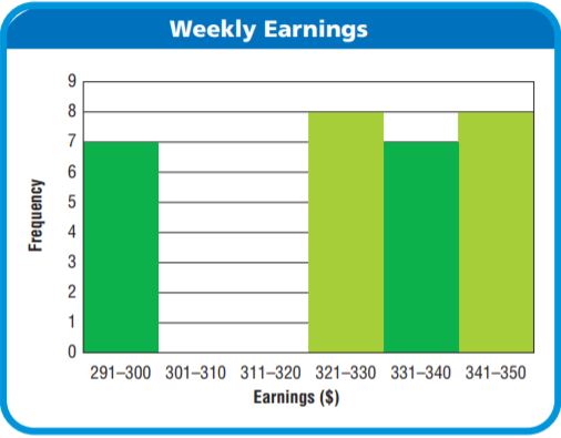
Type below:
_________________
Answer: 321-330 ; 341-350
Explanation:
The histogram has 2 intervals which show equal heights which means that the monthly earnings of these intervals is the same.
Question 10.
Jordan surveyed a group of randomly selected smartphone users and asked them how many applications they have downloaded onto their phones. The dot plot shows the results of Jordan’s survey. Select the statements that describe patterns in the data. Mark all that apply.
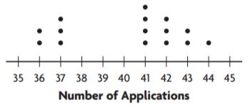
Options:
a. The modes are 37 and 42.
b. There is a gap from 38 to 40.
c. There is a cluster from 41 to 44.
d. There is a cluster from 35 to 36.
Answer: b. There is a gap from 38 to 40.
Explanation:
The dot plot represents a gap between 38-40. So we can say that there is a gap between the intervals 38 to 40.
Chapter 13 Review/Test – Page No. 761
Question 11.
Mrs. Gutierrez made a histogram of the birth month of the students in her class. Describe the patterns in the histogram by completing the chart.
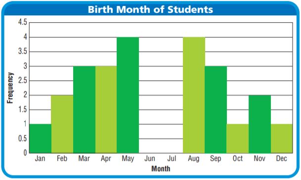
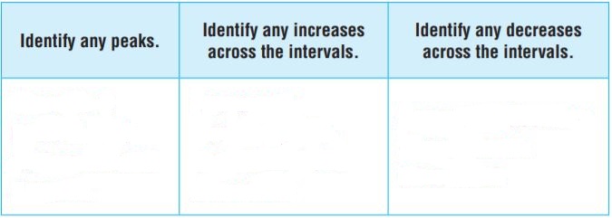
Type below:
_________________
Answer: There are 2 peaks, Yes there is an increase across the intervals, Yes there is a decrease across the intervals
Explanation:
The highest point in the histogram is called is as a peak.
There is a peak near the month’s May and August.
There is an increase between the bars in the bar graph.
At the months February, March, November there is an increase in the graph.
There is a decrease between the bars in the bar graph.
At the months September, October, December.
Question 12.
Ian collected data on the number of children in 13 different families.

Draw a box plot of the data and use it to find the interquartile range and range.
Type below:
_________________
Answer: Range = 8-0 = 8 Interquartile range = 3-1 = 2
Explanation:

Ascending order:
0,0,1,1,1,1,2,2,2,3,3,4,8
Median = 2
Lower quartile = 1+1/2 = 1
Upper quartile = 3+3/2 = 3
Range = 8-0 = 8
Interquartile range = 3-1 = 2
Chapter 13 Review/Test – Page No. 762
Question 13.
Gavin wants to move to a county where it rains about 5 inches every month. The data set shows the monthly rainfall in inches for a county. The mean of the data is 5 and the median is 4.35. After analyzing the data, Gavin says that this county would be a good place to move. Do you agree or disagree with Gavin? Use words and numbers to support your answer.

Type below:
_________________
Answer: Yes I agree that it is a good place to move.
Explanation:
After analyzing the data we can say that this country would be a good place to move for Gavin.
Gavin wants to move to a place which has an average of 5 cm rainfall. So this country is the best choice because it has a mean equal to 5 and median equal to 4.35
Question 14.
The data set shows the number of books Peyton reads each month. Peyton says she usually reads 4 books per month. Why is Peyton’s statement misleading?

Type below:
_________________
Answer: No Peyton’s statement is not misleading because the mean of the data is 4.
Therefore Peyton says she usually reads 4 books per month.
Explanation:
Mean = 2+3+2+4+3+11+3/7 = 28/7 = 4
Question 15.
The data set shows the scores of three players for a board game.
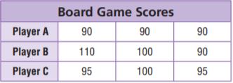
For numbers 15a–15d, choose Yes or No to indicate whether the statement is correct.
15a. The mean absolute deviation of Player B’s scores is 0.
15b. The mean absolute deviation of Player A’s scores is 0.
15c. The mean absolute deviation of Player B’s scores is greater than the mean absolute deviation of Player C’s scores.
15a. ___________
15b. ___________
15c. ___________
Answer:15a. No
15b. Yes
15c. Yes
Explanation:
Mean of player A = 90+90+90/3 = 90
Mean absolute deviation:
STEP 1 Label each observation with its distance from the mean.
Starting from left to right:
90: 90-90 = 0
90: 90-90 = 0
90: 90-90 = 0
STEP 2 Find the mean of the distances.
0+0+0/3 = 0
So, the mean absolute deviation of player A is 0
Mean of player B = 110+100+90/3 = 100
Mean absolute deviation:
STEP 1 Label each observation with its distance from the mean.
Starting from left to right:
100: 100-110 = -10
100: 100-100 = 0
100: 100-90 = 10
STEP 2 Find the mean of the distances.
10+0+10/3 = 20/3 = 6.67
So, the mean absolute deviation of player B is 6.67
Mean of player C = 95+100+95/3 = 96.67
Mean absolute deviation:
STEP 1 Label each observation with its distance from the mean.
Starting from left to right:
96.67: 96.67-95 = 1.67
96.67: 96.67-100 = -3.33
96.67: 96.67-95 = 1.67
STEP 2 Find the mean of the distances.
1.67+3.33+1.67/3 = 6.67/3 = 2.22
So, the mean absolute deviation of player C is 2.22
Conclusion:
The solutions with explanations to all the questions are prepared by the math experts as per the latest syllabus. So, go through the solutions and overcome your difficulties in this chapter. Keep in touch with this page to get the solutions to all the 6th-grade chapters.
