Engage NY Eureka Math Grade 6 Module 6 Lesson 8 Answer Key
Eureka Math Grade 6 Module 6 Lesson 8 Example Answer Key
Example 1: Comparing Two Data Distributions
Robert’s family is planning to move to either New York City or San Francisco. Robert has a cousin in San Francisco and asked her how she likes living in a climate as warm as San Francisco. She replied that it doesn’t get very warm in San Francisco. He was surprised by her answer. Because temperature was one of the criteria he was going to use to form his opinion about where to move, he decided to investigate the temperature distributions for New York City and San Francisco. The table below gives average temperatures (in degrees Fahrenheit) for each month for the two cities.

Exercises 1 – 2:
Use the data in the table provided in Example 1 to answer the following:
Exercise 1.
Calculate the mean of the monthly average temperatures for each city.
Answer:
The mean of the monthly temperatures for New York City is 63 degrees.
The mean of the monthly temperatures for San Francisco is 64 degrees.
Exercise 2.
Recall that Robert is trying to decide where he wants to move. What is your advice to him based on comparing the means of the monthly temperatures of the two cities?
Answer:
Since the means are almost the some, it looks like Robert could move to either city. Even though the question asks students to focus on the means, they might make a recommendation that takes variability into account.
For example, they might note that even though the means for the two cities are about the same, there are some much lower and much higher monthly temperatures for New York City and use this as a basis to suggest that Robert move to San Francisco.
Example 2: Understanding Variability
Maybe Robert should look at how spread out the New York City monthly temperature data are from the mean of the New York City monthly temperatures and how spread out the San Francisco monthly temperature data are from the mean of the San Francisco monthly temperatures. To compare the variability of monthly temperatures between the two cities, it may be helpful to look at dot plots. The dot plots of the monthly temperature distributions for New York City and San Francisco follow.
Dot Plot of Temperature for New York City

Dot Plot of Temperature for San Francisco

Exercises 3 – 7:
Use the dot plots above to answer the following:
Exercise 3.
Mark the location of the mean on each distribution with the balancing A symbol. How do the two distributions compare based on their means?
Answer:
Place ∆ at 63 for New York City and at 64 for Son Francisco. The means are about the same.
Exercise 4.
Describe the variability of the New York City monthly temperatures from the New York City mean.
Answer:
The temperatures are spread out around the mean. The temperatures range from a low of around 39 °F to a high of 85 °F.
Exercise 5.
Describe the variability of the San Francisco monthly temperatures from the San Francisco mean.
Answer:
The temperatures aæ clustered around the mean. The temperatures range from a low of 57 °F to a high of 70 °F.
Exercise 6.
Compare the variability in the two distributions. Is the variability about the same, or is it different? If different, which monthly temperature distribution has more variability? Explain.
Answer:
The variability is different. The variability in New York City is much greater than the variability in San Francisco.
Exercise 7.
If Robert prefers to choose the city where the temperatures vary the least from month to month, which city should he choose? Explain.
Answer:
He should choose San Francisco because the temperatures vary the least, from a low of 57 °F to a high of 70 °F. New York City has temperatures with more variability, from a low of 39°F to o high of 85°F.
Example 3: Considering the Mean and Variability in a Data Distribution
The mean is used to describe a typical value for the entire data distribution. Sabina asks Robert which city he thinks has the better climate. How do you think Robert responds?
Answer:
He responds that they both have about the same mean but that the mean is a better measure or a more precise measure of a typical monthly temperature for San Francisco than it is for New York City.
Sabina is confused and asks him to explain what he means by this statement. How could Robert explain what he means?
Answer:
The temperatures in New York City in the winter months are in the 40’s and in the summer months are in the 80’s. The mean of 63 isn’t very close to those temperatures. Therefore, the mean is not a good indicator of a typical monthly temperature. The mean is a much better indicator of a typical monthly temperature in SanFrancisco because the variability of the temperatures there is much smaller.
Exercises 8 – 14:
Consider the following two distributions of times it takes six students to get to school in the morning and to go home from school in the afternoon.

Exercise 8.
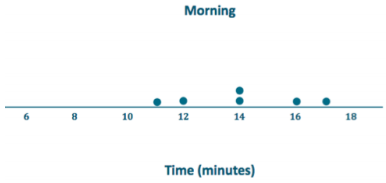
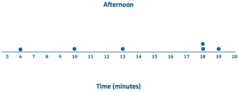
To visualize the means and variability, draw a dot plot for each of the two distributions.
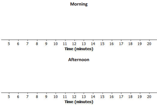
Answer:
Exercise 9.
What is the mean time to get from home to school in the morning for these six students?
Answer:
The mean is 14 minutes.
Exercise 10.
What is the mean time to get from school to home in the afternoon for these six students?
Answer:
The mean is 14 minutes.
Exercise 11.
For which distribution does the mean give a more accurate indicator of a typical time? Explain your answer.
Answer:
The morning mean is a more accurate indicator. The spread in the afternoon data is far greater than the spread in the morning data.
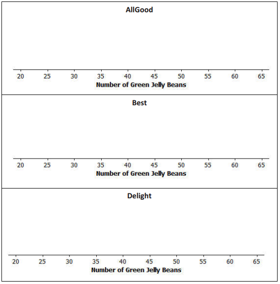
Distributions can be ordered according to how much the data values vary around their means. Consider the following data on the number of green jelly beans in seven bags of jelly beans from each of five different candy manufacturers (AllGood, Best, Delight, Sweet, and Vum). The mean in each distribution is 42 green jelly beans.

Exercise 12.
Draw a dot plot of the distribution of the number of green jelly beans for each of the five candy makers. Mark the location of the mean on each distribution with the balancing A symbol.
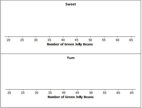
Answer:
The dot plots should each hove a balancing A symbol located at 42.


Exercise 13.
Order the candy manufacturers from the one you think has the least variability to the one with the most variability. Explain your reasoning for choosing the order.
Answer:
Note: Do not be critical; answers and explanations may vary. One possible answer:
In order from least to greatest: All Good, Sweet, Vum, Delight, Best. The data points are all close to the mean for all good, which indicates it has the least variability, followed by Sweet and Yum. The data points are spread farther from the mean for Delight and Best, which indicates they have the greatest variability.
Exercise 14.
For which company would the mean be considered a better indicator of a typical value (based on least variability)?
Answer:
The mean for All Good would be the best indicator of a typical value for the distribution.
Eureka Math Grade 6 Module 6 Lesson 8 Problem Set Answer Key
Question 1.
The number of pockets in the clothes worn by seven students to school yesterday was 4, 1, 3, 4, 2, 2, 5. Today, those seven students each had three pockets in their clothes.
a. Draw one dot plot of the number of pockets data for what students wore yesterday and another dot plot for what students wore today. Be sure to use the same scale.
Answer:
Yesterday

Today

b. For each distribution, find the mean number of pockets worn by the seven students. Show the means on the dot plots by using the balancing symbol.
Answer:
The mean of both dot plots is 3.
c. For which distribution is the mean number of pockets a better indicator of what is typical? Explain.
Answer:
There is certainly variability in the data for yesterday’s distribution, whereas today’s distribution has none. The mean of 3 pockets is a better indicator (more precise) for today’s distribution.
Question 2.
The number of minutes (rounded to the nearest minute) it took to run a certain route was recorded for each of five students. The resulting data were 9, 10, 11, 14, and 16 minutes. The number of minutes (rounded to the nearest minute) it took the five students to run a different route was also recorded, resulting in the following data: 6, 8, 12, 15, and 19 minutes.
a. Draw dot plots for the distributions of the times for the two routes. Be sure to use the same scale on both dot plots.
Answer:
First Route

Second Route

b. Do the distributions have the same mean? What is the mean of each dot plot?
Answer:
Yes, Both distributions have the same mean, 12 minutes.
c. In which distribution is the mean a better indicator of the typical amount of time taken to run the route? Explain.
Answer:
Looking at the dot plots, the times for the second route are more varied than those for the first route. So, the mean for the first route is a better indicator (more precise) of a typical value.
Question 3.
The following table shows the prices per gallon of gasoline (in cents) at five stations across town as recorded on
Monday, Wednesday, and Friday of a certain week.
| Day | R&C | Al’s | PB | Sam’s | Ann’s |
| Monday | 359 | 358 | 362 | 359 | 362 |
| Wednesday | 357 | 365 | 364 | 354 | 360 |
| Friday | 350 | 350 | 360 | 370 | 370 |
a. The mean price per day for the five stations is the same for each of the three days. Without doing any calculations and simply looking at Friday’s prices, what must the mean price be?
Answer:
Friday’s prices ore centered at 360 cents. The sum of the distances from 360 for values above 360 is equal to
the sum of the distances from 360 for values below 360, so the mean is 360 cents.
b. For which daily distribution is the mean a better indicator of the typical price per gallon for the five stations? Explain.
Answer:
From the dot plots, the mean for Monday is the best indicator of o typical price because there is the least variability in the Monday prices.
Eureka Math Grade 6 Module 6 Lesson 8 Exit Ticket Answer Key
Question 1.
Consider the following statement: Two sets of data with the same mean will also have the same variability. Do you agree or disagree with this statement? Explain.
Answer:
Answers will vary, but students should disagree with this statement. There are many examples in this lesson that could be used as the basis for an explanation.
Question 2.
Suppose the dot plot on the left shows the number of goals a boys’ soccer team has scored in 6 games so far this
season and the dot plot on the right shows the number of goals a girls’ soccer team has scored in 6 games so far this season.


a. Compute the mean number of goals for each distribution.
Answer:
The mean for each is 3 goals.
b. For which distribution, if either, would the mean be considered a better indicator of a typical value? Explain your answer.
Answer:
Variability in the distribution for girls is less than ¡n the distribution for boys, so the mean of 3 goals for the girls is a better indicator of a typical value.