
Statistics deals with the study of collecting data, analyzing the data, interpreting, organizing, and presenting the data. In statistics to represent the information or data, we use bar graphs, piecharts, tables, graphs, picturing, and so on. The frequency in statistics tends to represent a set of data by a representative value which would define the entire collection of data.
In this article, we learn one of the data representations used in statistics that is the pie chart. Here we are learning how to construct a pie chart, pie chart definition, formula, Examples on Pie charts, advantages and disadvantages of the pie chart.
Do Read: Construction of Bar Graphs
Pie Chart – Definition
A pie chart may be a sort of pictorial representation of information or data. It represents the data in the circular graph. A pie chart requires a list of numerical variables and categorical variables. The term ‘ pie’ represents the total, and also the slices represent the parts of the total. The slice of the pie shows the relative size of the data.
A pie chart is also called a pie diagram. A pie diagram is additionally referred to as a circle chart. Pie diagrams are also replaced by some other graphs such as graphs, line graphs, histograms, line plots, and etc. The statistical data is divided into sectors or slices. Each sector represents a proportionate part of the total. In order to find the composition of something pie charts are used.
Pie Chart Formula
A pie chart is one of the important types of data representation. The pie chart total of all is equal to 360 degrees and the total value of the pie chart is always 100%. It contains different segments and sectors It contains different in which each segment and sector of a pie chart form a certain portion of the total percentage.
The following are the steps given below, we consider these steps for the pie chart formula:
- Categorize the data into meaningful data.
- Calculate the total of collected data.
- According to the heads, divide the categories
- Convert numbers into percentages
- Finally, calculate the degrees means convert percentage into degrees.
Hence the pie chart formula is, (given data / Total value of data ) x 360
How to Construct a Pie Chart?
The pie chart is extensively used because it is easy to read the data and access the data. The pie chart makes the size of the portion easy to understand. Below are the steps the data can be represented by a pie chart by using the circle graph formula.
Step 1: Initially, the data will be entered into the table.
Step 2: Next, we add the values in the table to get the total.
Step 3: We get the total, that total divides each value by the total and multiply by 100 to get a percent.
Step 4: To know how many degrees needed for each pie sector, take a full circle of 360 degrees then we follow the calculations below,
The central angle of each component = (Value of every component/ sum of values all the components) x 360°.
Step 5: By using the protractor draw the circle and measure the degree of each sector.
Advantages of Pie Chart
The pie chart will be used to represent the data and comparing the data with others is easy. The advantages of the pie chart are listed below:
- Pie charts give the audience the best visual of statistics.
- It can summarize an outsized large set of information with minimal explanation.
- You can comprehend it with little knowledge of math.
- Compared to other graphs pie chart will be easy to understand and easy to set up.
- It clearly indicates the part to the whole relationship between the values.
- We can manipulate pieces of information within the kind of sectors during a pie chart.
Disadvantages of Pie Chart
Some of the disadvantages also there for using pie charts to represent the information. The disadvantages of the pie chart are listed below,
- Angles are difficult to estimate.
- No exact numerical data.
- A pie chart can only have one set of information.
- Sometimes it is hard to tell which sections are bigger.
- You can only use it for expressing data out of an entire.
Example Problems on Pie Chart
Example 1:
The following pie charts the data shows the percentage of types of transport, suppose of 100 people use most often
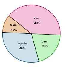
i) How many people use the car most often?
b) How many people don’t use trains most often?
c) How many people use bicycles or buses most often?
Solution:
Given the 100 people most often used transport vehicle data.
The total frequency is denoted by N. So N = 100.
(i) Given the data of 100 people’s vehicle usage
now we can find the number of people’s often car
40% of 100 people use cars most often.
So, 40%. 100 = 0.4 x 100 = 40 people.
(ii) Given the data of 100 people’s vehicle usage
Now we can find the number of people’s don’t often train
10% of 100 people use train most often.
Therefore, (100%- 10%) x 100 = 0.9 x 100= 90 people.
So, based on the result 90 people don’t use the train most often.
Now we can find the number of people’s often buses or bicycle
30% of 100 people use bicycles most often and 20% of them use the bus most often.
So, we get ( 30% + 20%) x 100 = 50%. 100 = 0.5 x 100 = 50
Therefore, 50 people use bicycles or buses most often.
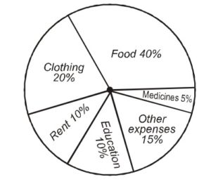
Example 2:
‘A ‘ lists down her monthly expenditure as follows. Based on the given data draw the Pie Chart?
| Expenditure | Amount (Percentage) |
|---|---|
| Food | 40% |
| Clothing | 20% |
| Rent | 10% |
| Education | 10% |
| Medicines | 5% |
| Other Expenses | 15% |
Solution:
Given the ‘A’ monthly expenditure in the table follow.
Now, Construct a pie chart of the given data.
Steps of construction of chart for a given data
- First, find the central angle for each component using the formula of given data.
- Draw a circle of any radius and horizontal radius.
- Starting with the horizontal radius, draw radii, making central angles likes the values of respective components.
- Repeat the method for all the components of the given data.
- These radii divide the entire circle into various sectors.
- Now, shade the sectors with different colors to denote various components. Thus we obtained the required pie chart.
Frequently Asked Questions on Pie Chart
1. List the examples of a pie chart?
Many real-time examples of a pie chart are there. Some of them are listed,
- Representation of marks obtained by students during a class.
- Representation of mobile brands in the market.
- Different brands sales comparison.
- Types of Movie comparison.
2. How do you explain Pie Chart?
A Pie Chart is a type of graph that displays data in a circular graph. The pieces of the graph are proportional to the fraction of the entire in each category. In other words, each slice of the pie is relative to the dimensions of that category within the group as an entire.
3. How to calculate the percentage of data in the pie chart?
Measure the angle of each slice of the pie chart and divide by 360 degrees. Now multiply the value by 100. The percentage of particular data will be calculated.
4. How do you find the angle for a pie chart?
To measure the angle of every segment in the pie chart. Keep the straight 0° line marked on the protractor on one among the straight sides of a segment and browse the degrees marked on the protractor on the opposite straight side of the segment. The answer is that the angle of the segment or the slice.